Chartbrew v5.3.0, multi-series charts, clearer data controls, and faster dashboards
Chartbrew v5.3.0 is out
This release introduces a new semantic visualization engine that makes it easier to turn one dataset into clear, consistent chart series.
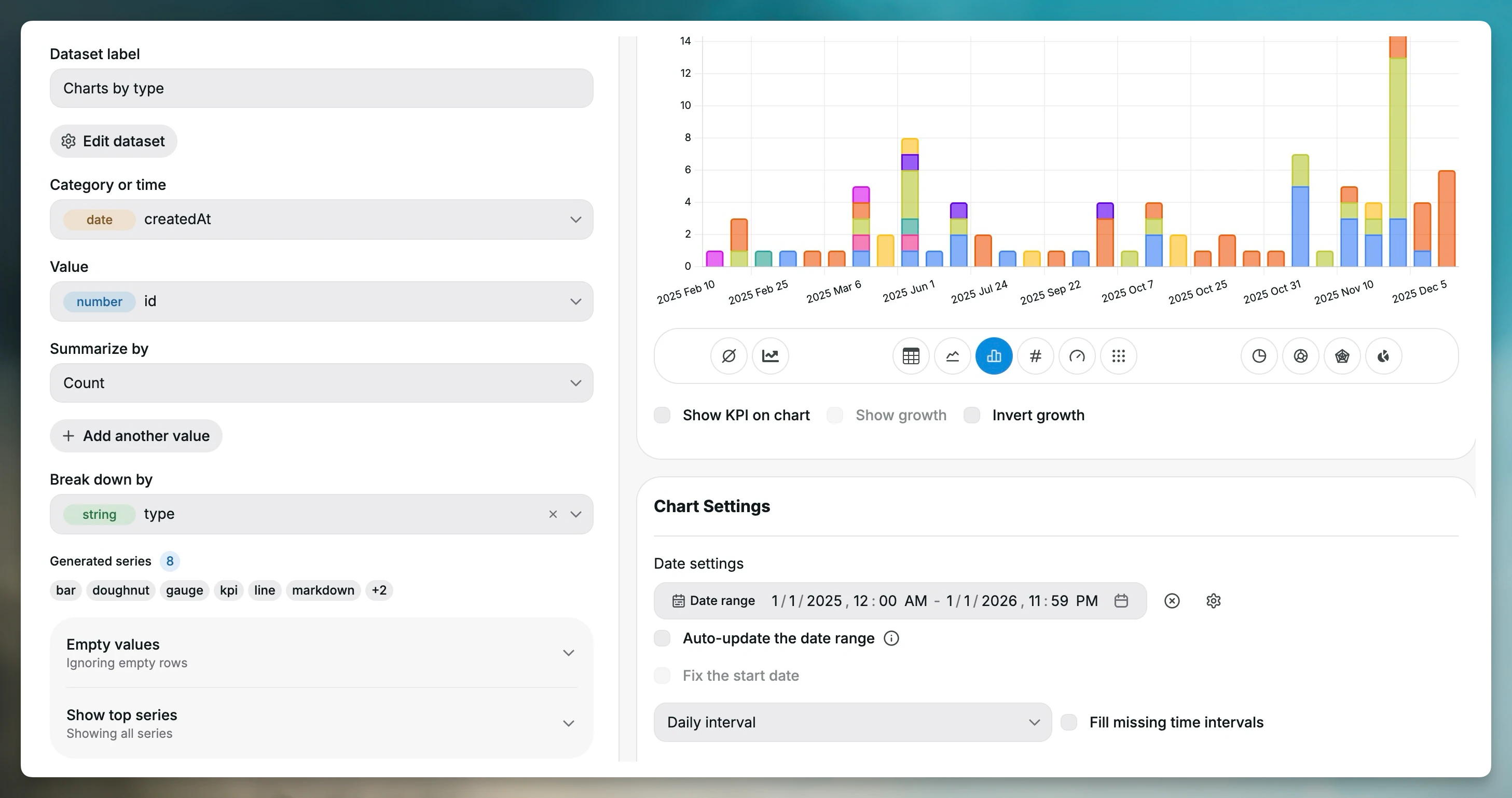
The main highlight is the new Break down by field. It can generate multiple stable series from a single dataset, so you can compare categories, regions, products, or other dimensions without building each series by hand.
Chart data configuration has also been redesigned around the meaning of your data. The new controls bring grouping, values, aggregation, breakdowns, missing values, series limits, goals, colors, visibility, and ordering into one clearer workflow.
What's new
Build multiple series from one dataset
Charts can now use Break down by to split a dataset into multiple series automatically.
For example, a revenue dataset grouped by month can be broken down by product, region, or plan. Chartbrew creates a series for each value and keeps its color, visibility, and order stable as the data changes.
This makes comparison charts easier to build and keeps them predictable when new data arrives.
Redesigned chart data controls
The chart data configuration now uses semantic controls that describe what each field should do in the visualization.
You can configure:
- Grouping and value fields
- Aggregation and breakdowns
- Missing-value handling
- Series limits and ordering
- Goals
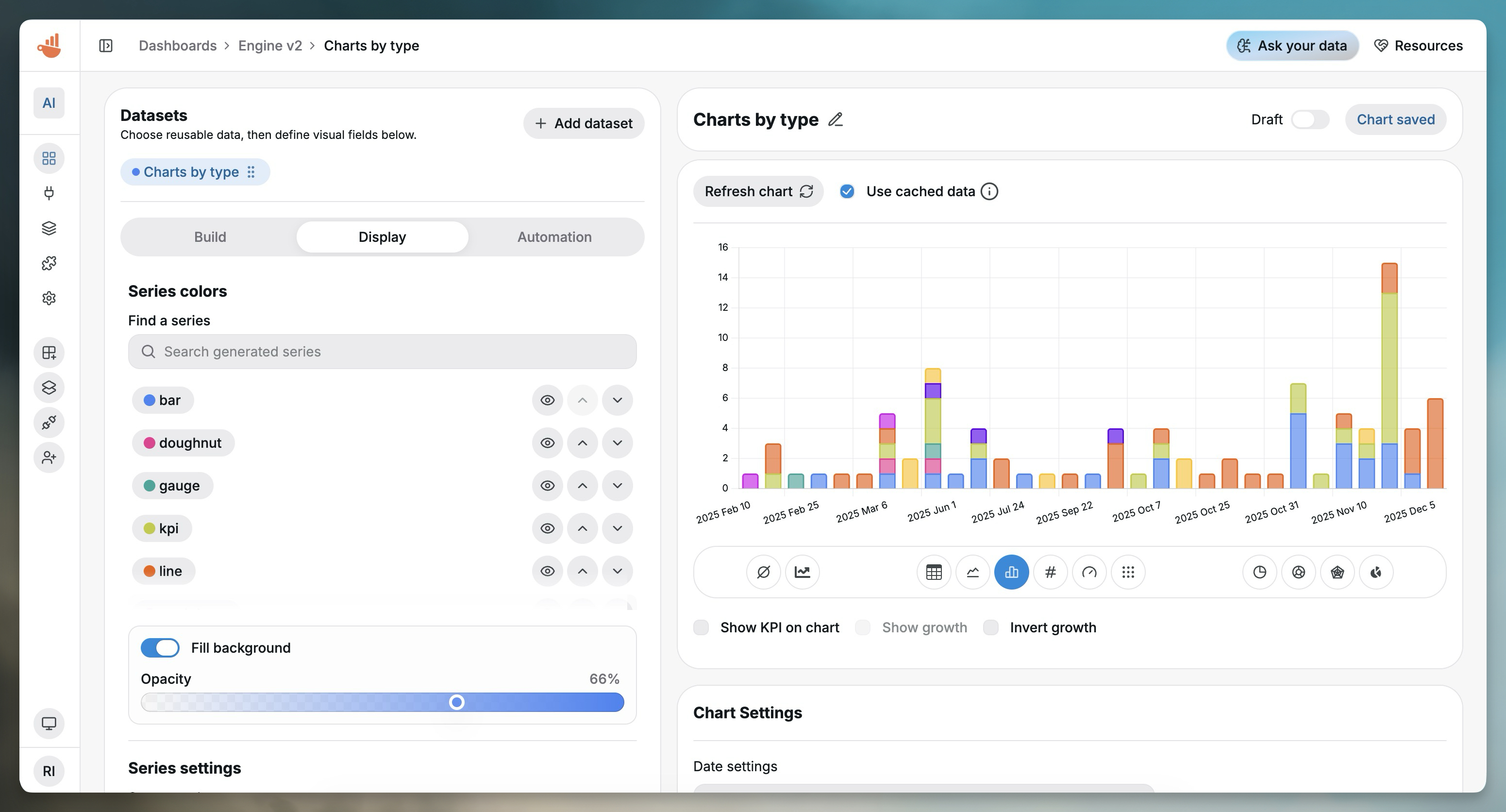
- Series colors and visibility
The new setup also improves automatic date-field detection, reducing the amount of manual configuration needed for time-based charts.
Automatic migration for existing charts
Existing charts are automatically migrated to the new visualization format. There is no manual conversion step, so current dashboards can use the new engine without rebuilding their charts.
Better dashboard filters
Dashboard filters now share a more consistent design and support custom ordering.
Date-range filters also apply to every chart by default. When a filter should only affect specific charts, that selection is still available under advanced settings.
More useful doughnut charts
Doughnut charts can now show the total value in the center of the chart. Segment labels can also display either percentages or values, depending on what makes the data easier to read.
Improvements and performance
This release adds tooltip support for formulas that return text and gives generated series stable color, visibility, and ordering controls.
High-density bar and line charts have also been optimized. When a chart exceeds safe rendering limits, Chartbrew now pauses it to keep the dashboard responsive and shows guidance for reducing the number of displayed series.
Other changes include:
- Updated HeroUI and other client and server dependencies.
- Expanded visualization, migration, filtering, and performance test coverage.
Summary
Chartbrew v5.3.0 is focused on making chart configuration more expressive without making it harder to use.
The new semantic visualization engine and Break down by field make multi-series charts faster to build, while stable series settings keep them consistent as data changes. Smarter filters, improved doughnut charts, and safer high-density rendering should also make dashboards easier to configure and more responsive day to day.
You can read the full v5.3.0 release notes on GitHub.
