Chartbrew as a Chartio alternative
As Chartio is joining Atlassian, they will shut down their service on the 1st of March. I think there will be some businesses looking at Chartbrew as an alternative, so this blog post will go through some of the main feature sets and how you can replicate your Chartio dashboards in Chartbrew.
Data integrations
The first thing to note is that Chartbrew supports slightly different data sources than Chartio. Currently, Chartbrew supports:
- MySQL
- PostgreSQL
- Google Analytics
- Firestore
- MongoDB
- REST APIs
Some of the other integrations that are not available in Chartbrew can still be accessible through the REST API option. This integration allows users to connect to any service that makes the API accessible. Some examples here are Stripe, Customer.io, Shopify, WooCommerce, Mailgun, etc.
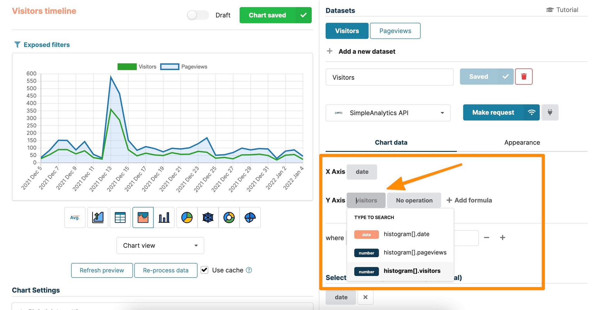
How datasets work in Chartbrew
When creating a new chart in Chartbrew, you have the option to add as many datasets as you want to the chart. For example, you could have two datasets connecting to different data sources and display the data in the same table or chart.
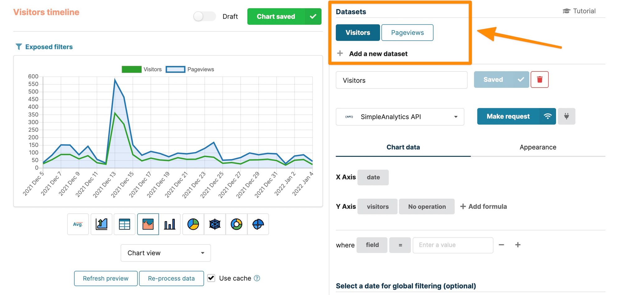
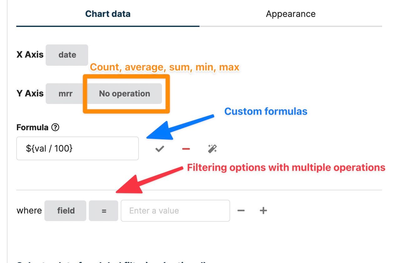
The equivalents of "Measures" and "Dimensions" from Chartio are the "X-Axis" and "Y-Axis", or "Segment" and "Data" in Chartbrew. Instead of a drag&drop experience, Chartbrew has a search-and-select type of UI, mainly because Chartbrew can deal with deeply nested objects as well. You can see below how you would select a field in the interface.
How to request data in Chartbrew
Requesting data from your data sources can be done in different ways and it all depends on the integration type. This section will show a small sample for each integration, but I will include links to more thorough tutorials to see a more complete example.
MySQL & PostgreSQL
In Chartbrew, you can request data from MySQL and PostgreSQL using the native SQL syntax. Chartbrew does not have a visual SQL builder yet. It is possible to save the queries for later use and they can be replicated across different datasets and charts.
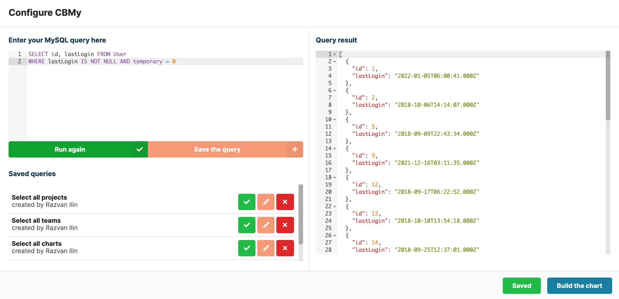
The left side is where the queries can be written and managed. The right side shows the result in a JSON format. To see a more detailed example of how to create a chart from a query, have a look at this Supabase.io tutorial.
Google Analytics
The Google Analytics integration uses a no-code interface to choose from which property and view to pull data. Then you can select from the entire list of available metrics and dimensions available in your Google Analytics account.
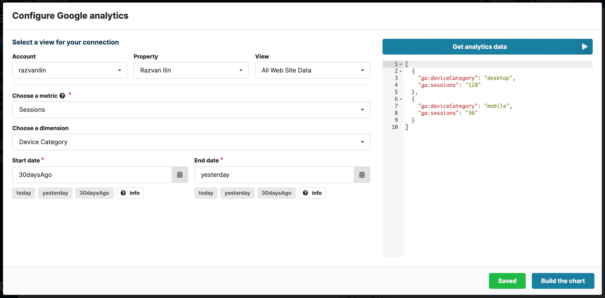
For more details on the Google Analytics integration and how to create charts from the data, you can check the full tutorial here.
Firestore
The Firestore integration is hard to find in other BI software. Chartbrew went above and beyond to support as many querying features as possible. Chartbrew can also cache the data once the first request is made to avoid extra data read costs on the Firebase side.
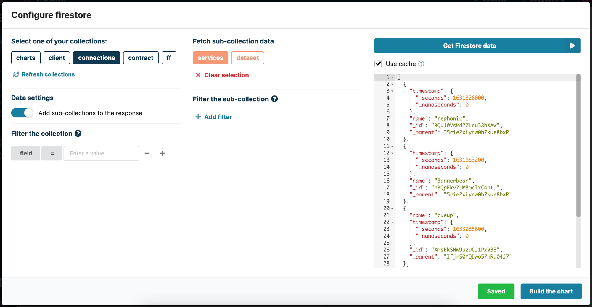
For a more detailed tutorial on creating a dashboard from Firestore data, check the full tutorial here.
MongoDB
Similar to MySQL and PostgreSQL, the MongoDB integration works with native queries. Queries can be saved for later use as well.
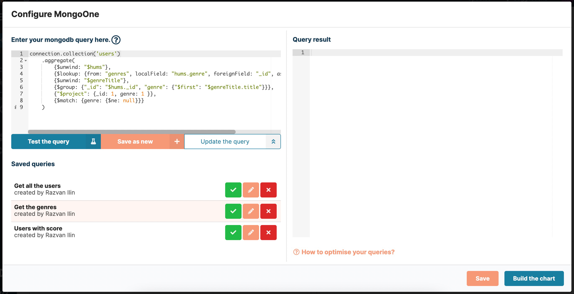
Check out the full MongoDB tutorial on how to query data and create charts.
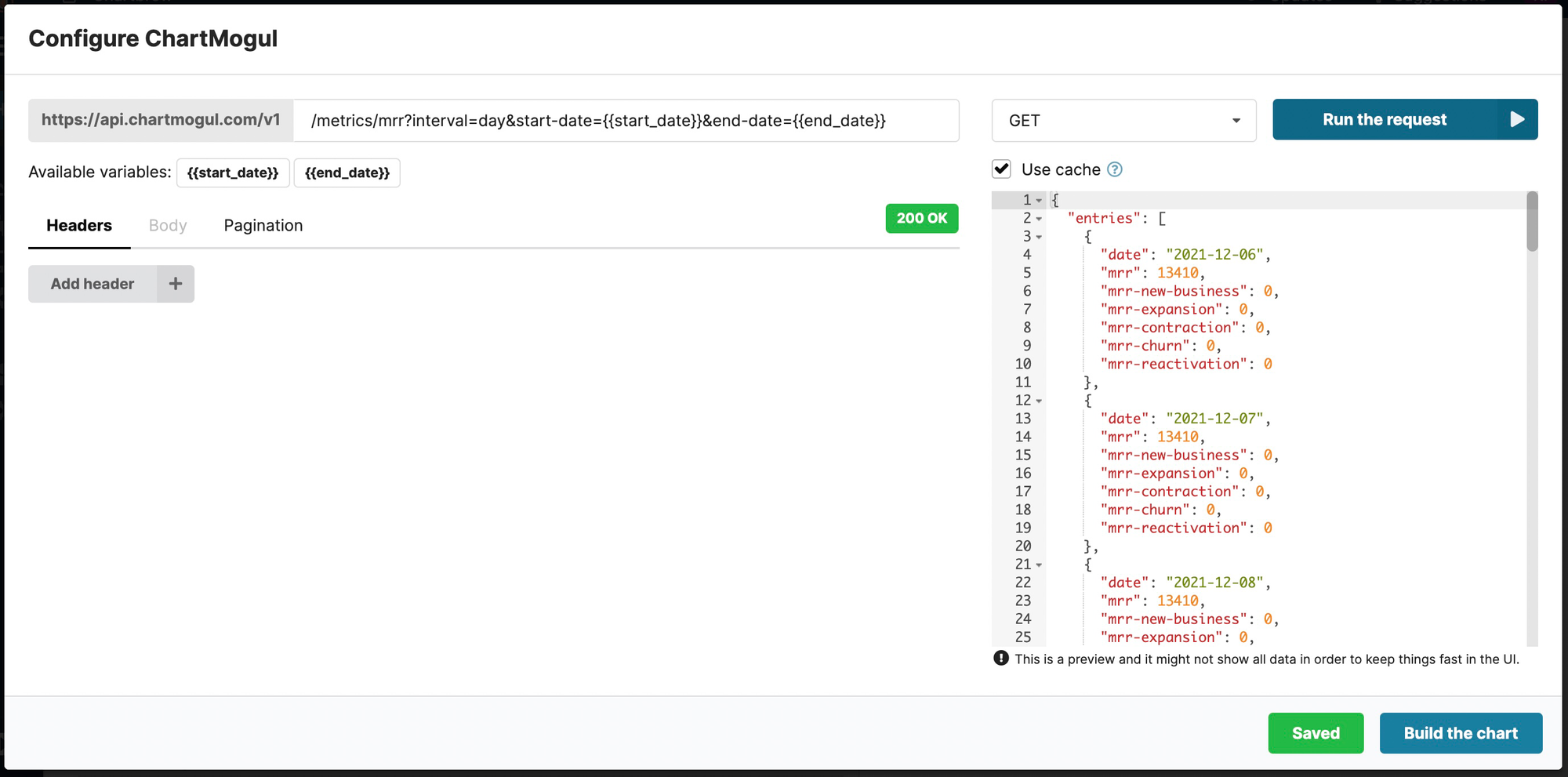
REST APIs
The level of customizability for API requests makes Chartbrew the ideal candidate for creating dashboards from API data. With this integration, you have access to the following API features:
- Basic and Bearer Token authentication
- Custom routes for any API host
- GET, POST, PUT, DELETE, OPTIONS request methods
- Custom headers
- Custom body
- 5 pagination types so Chartbrew can automatically paginate your requests
- Custom variables
Check the following tutorials for more in-depth examples of API usage.
- How to visualize Airtable data with Chartbrew
- How to create a Stripe dashboard in Chartbrew
- How to visualize Simple Analytics data with Chartbrew
- How to visualize Strapi data with Chartbrew
Data filtering and formatting
The data that is fetched from the sources can be further filtered and different kinds of formulas and operations can be done on top of it. This is a high-level view of the possible operations:
- Dimension operations: Count, Average, Sum, Min, Max
- Custom formulas that can be applied to the Dimension field (can append or prepend strings as well)
- Filters applied to any of the fields available in the data that was fetched from the source
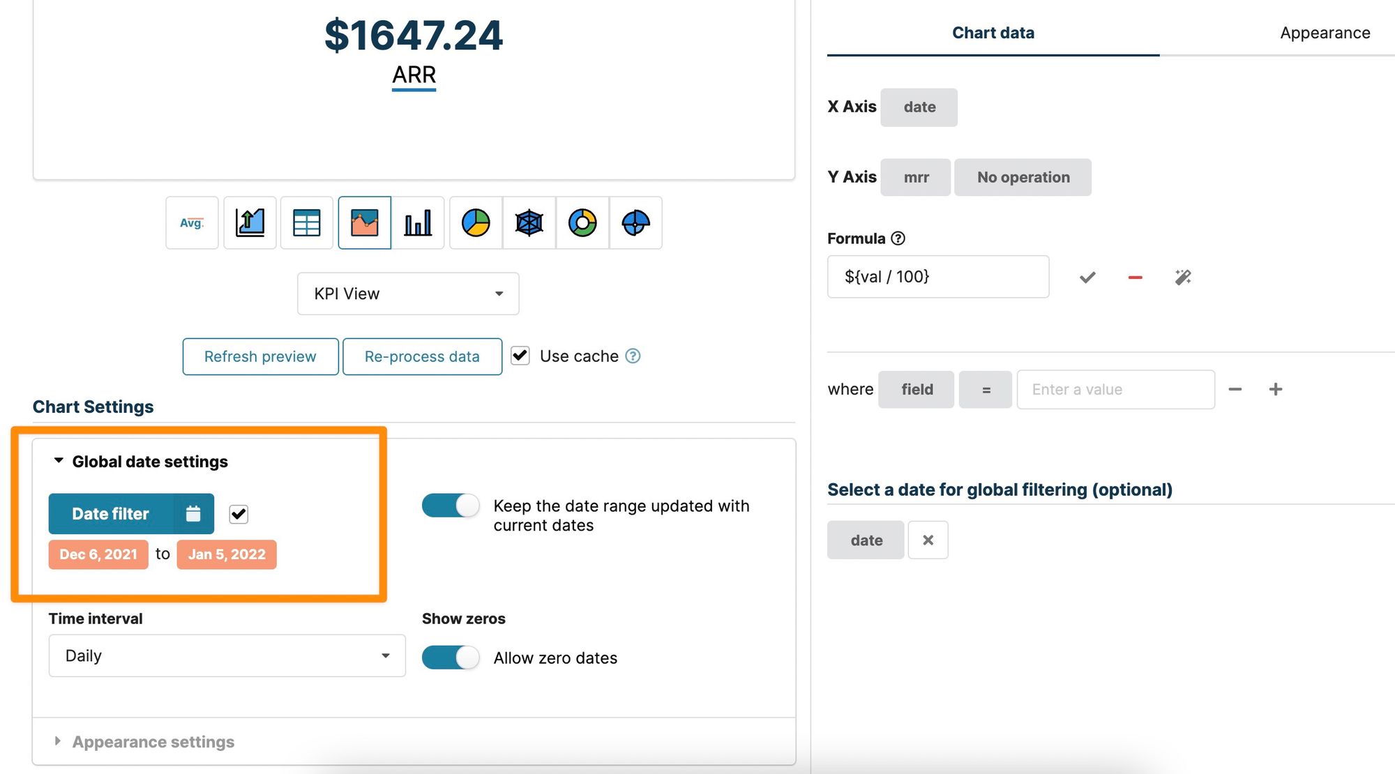
- Global date range filtering (can filter all the datasets with the same date range)
These filtering types are all applied in the chart editor, meaning they are preserved for everyone that views the charts. The dataset filters can also be exposed to visitors so that everyone can filter based on the filters you make available. Exposed filters are changing data only for the current viewer.
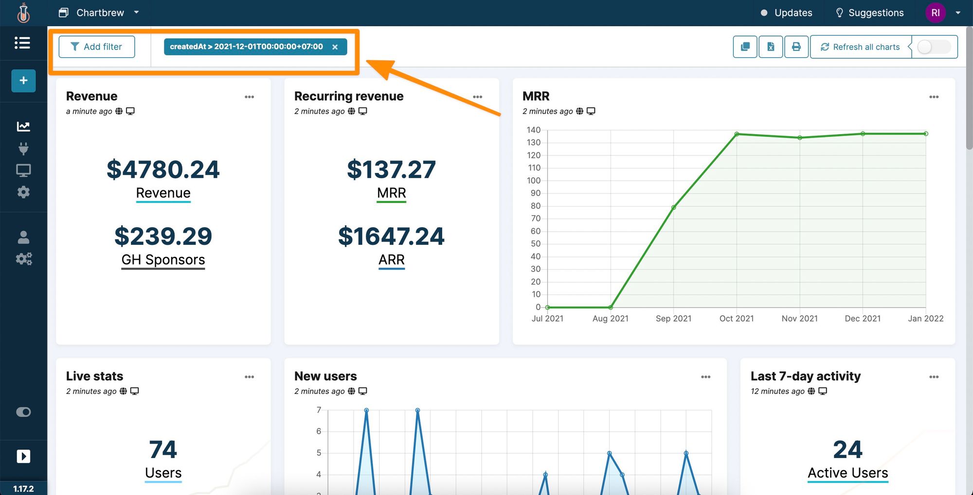
Entire dashboards can be filtered as well. If charts share the same fields, Chartbrew will recognize them and will be able to filter the data from the dashboard view. You can see the screenshot below for an example:
Chartbrew keeps your data updated
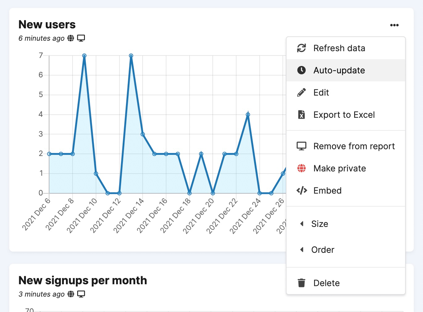
A dashboard needs to show up-to-date data and the main use case for Chartbrew is for the platform itself to take care of that. To enable an updated schedule it is just a matter of adjusting this in the chart settings.
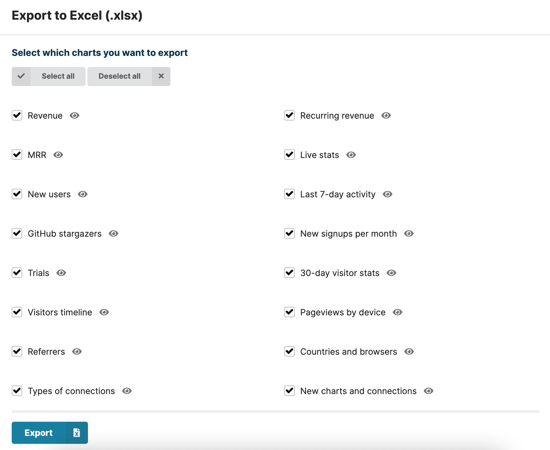
Exporting data out of Chartbrew
Chart and dashboard data can be exported to spreadsheets. This can be done for individual charts or for the entire dashboard, which will create a workbook with multiple sheets.
You can check different use cases for the export feature in this blog post:
 Razvan Ilin
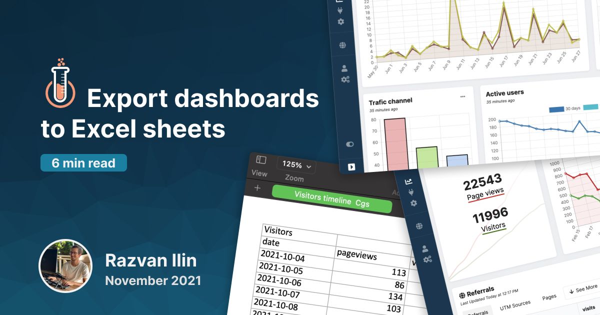
Bring your team to Chartbrew with granular permissions
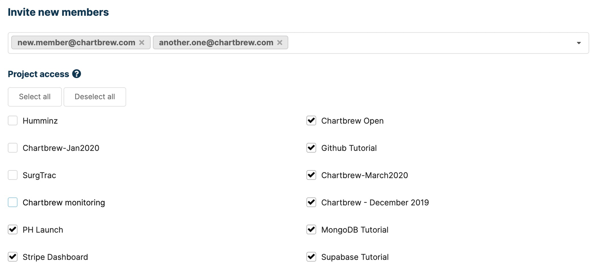
Like Chartio, Chartbrew lets you bring your team on board and team members can have granular access to the dashboards. Roles in Chartbrew are split into two sections. The main roles dictate what actions can be performed by the team member and these are viewer, editor, admin, and owner. What makes Chartbrew great for working with a larger team or even with clients, is that you can assign these roles on individual dashboards.
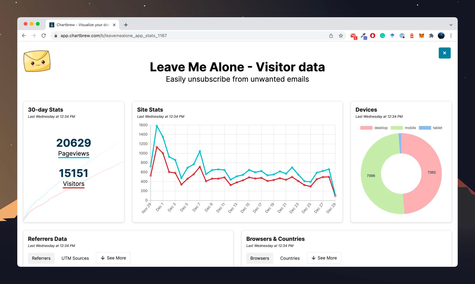
Sharing your dashboards by creating reports
Each dashboard in Chartbrew has a report view that can be customized with a logo, colors, title, description, custom CSS, URL, and public/private access. To get a better idea of how the reports work, have a look at this more in-depth blog post.
Razvan Ilin
Sharing and embedding charts
Instead of sharing and embedding a full report, you can also do the same with individual charts. For example, you can add charts to your dashboard outside Chartbrew or add charts to your blog posts. Check the chart below to see how it works:
Create templates from your dashboards
The templates are a powerful feature in Chartbrew. With templates, you can re-create entire dashboards with just a few clicks. This is super useful when you want to see the metrics of multiple projects or if you are working with multiple clients and want to quickly spin up dashboards for them. Check how the templates work in the blog post below:
Razvan Ilin
Chartbrew is 100% open source
Unlike Chartio, Chartbrew is 100% open source. This means you can self-host it for free on your server and you will get all the features that the platform has to offer. There are instructions on how to set it up and deploy it and this process gets easier and easier. The most common way now is to deploy the Docker image that's made available to everybody.
Check out the documentation at: https://docs.chartbrew.com/
You can find the repository here: https://github.com/chartbrew/chartbrew
Conclusion
Chartbrew can be the perfect alternative to Chartio if you are looking for a simple visualization platform for multiple projects and clients. With Chartbrew you can quickly spin up multiple dashboards, and thanks to the granular permissions and easy sharing features, you can keep your stakeholder always up-to-date.
If you are looking to dig deeper into your data, the more advanced data drilling features that Chartio has might be missing from Chartbrew. Also, due to the datasets being managed differently, it might be a bit of a learning curve to re-create complex charts in Chartbrew.
Regardless, Chartbrew offers a 30-day free trial that you can use to see how it works for your use case. You can sign up for an account any time you want. If you have any questions you can also reach me on Twitter @razvanilin or email me at [email protected].
