How to visualize Simple Analytics data with Chartbrew
Simple Analytics is an easy-to-use analytics tool for your websites that adheres to strict privacy rules. On top of this, it comes with a nice-looking design, email reports, a great Tweet viewer to see who's talking about your website, and much more. Awesome!
The part we're going to focus on here is its API, which you guessed, is also super easy to use. In this tutorial, we are going to go through how to connect to the API, and then we are going to create a chart and a table view to display the data inside Chartbrew. For this tutorial, we are going to use the public data from the simpleanalytics.com site itself, but you can use your own website if you wish.
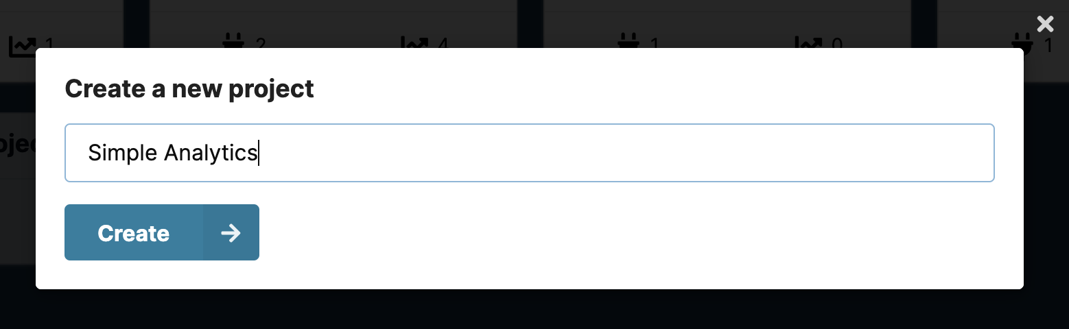
Grab your favorite brew, create a new project in Chartbrew, and let's get started!
Connect to the Simple Analytics API
We are going to follow the Stats API documentation to fetch the data we need for the charts. The documentation gives us the main URL that we can use to fetch the data:
https://simpleanalytics.com/simpleanalytics.com.json?version=5&fields=histogram
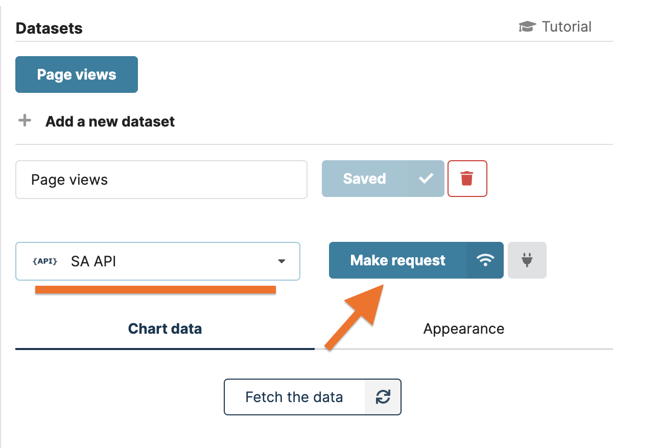
Head over to the connections menu in your new project in Chartbrew and create a new API connection. Fill in the details like in the screenshot below.
- Name: SA API (can be anything)
- Hostname: https://simpleanalytics.com
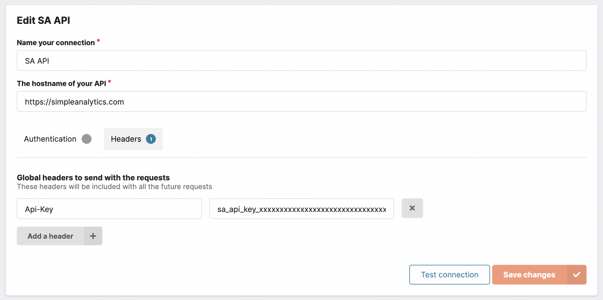
Note that for the hostname we only need to use https://simpleanalytics.com and you'll see why later. You can ignore the Header part if your data is public. In case you are using your own website and its data is private in Simple Analytics, you will have to add an authentication header. Follow the documentation to generate an API key if you don't already have one and then add a header to the Chartbrew connection like above.
Now that we have a connection, it's time to brew some charts!
Create a time-series chart
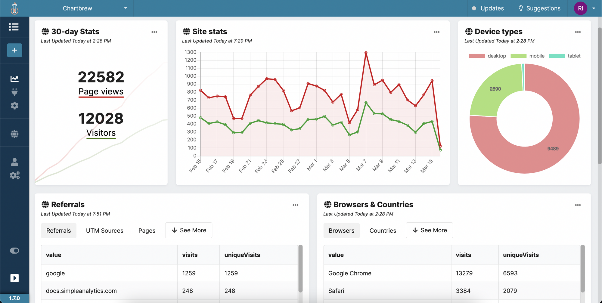
Next, we are going to create a time-series chart showing the number of visitors and page views for the website. Head over to the dashboard of the new project and add a new chart called "Site stats" and then create a dataset called "Page views".
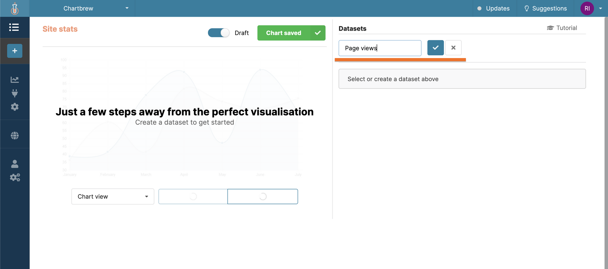
Once we have the first dataset, we can connect it to the Simple Analytics connection that we created earlier.
In the next window, we can configure the API call we're making to the Simple Analytics connection. Copy the following in the route field and then press on "Make the request":
/simpleanalytics.com.json?version=5&fields=histogram
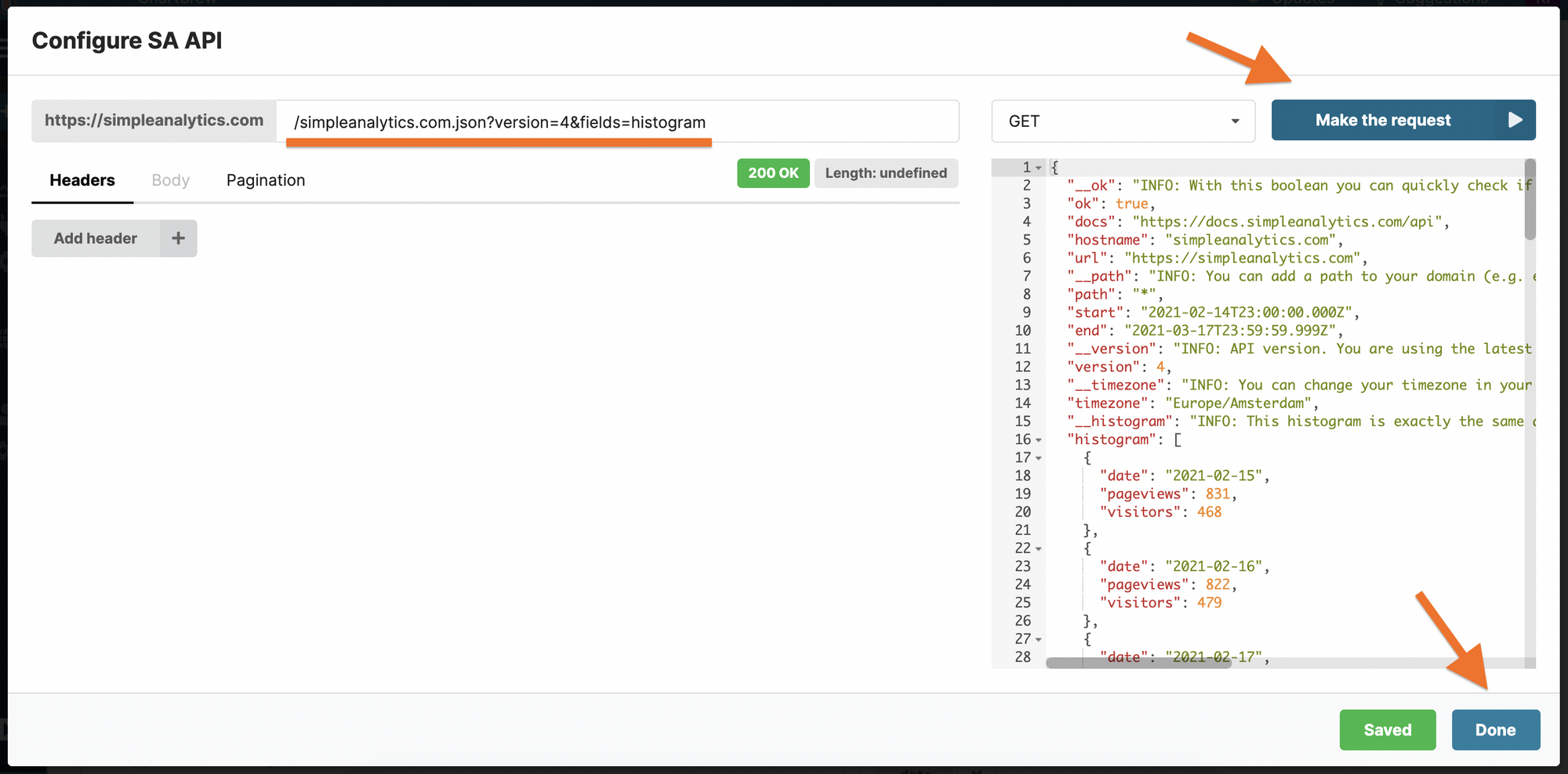
The data we get gives us a histogram array that contains the page views and visitors. The first dataset we created is for the Page Views so let's display this on the chart.
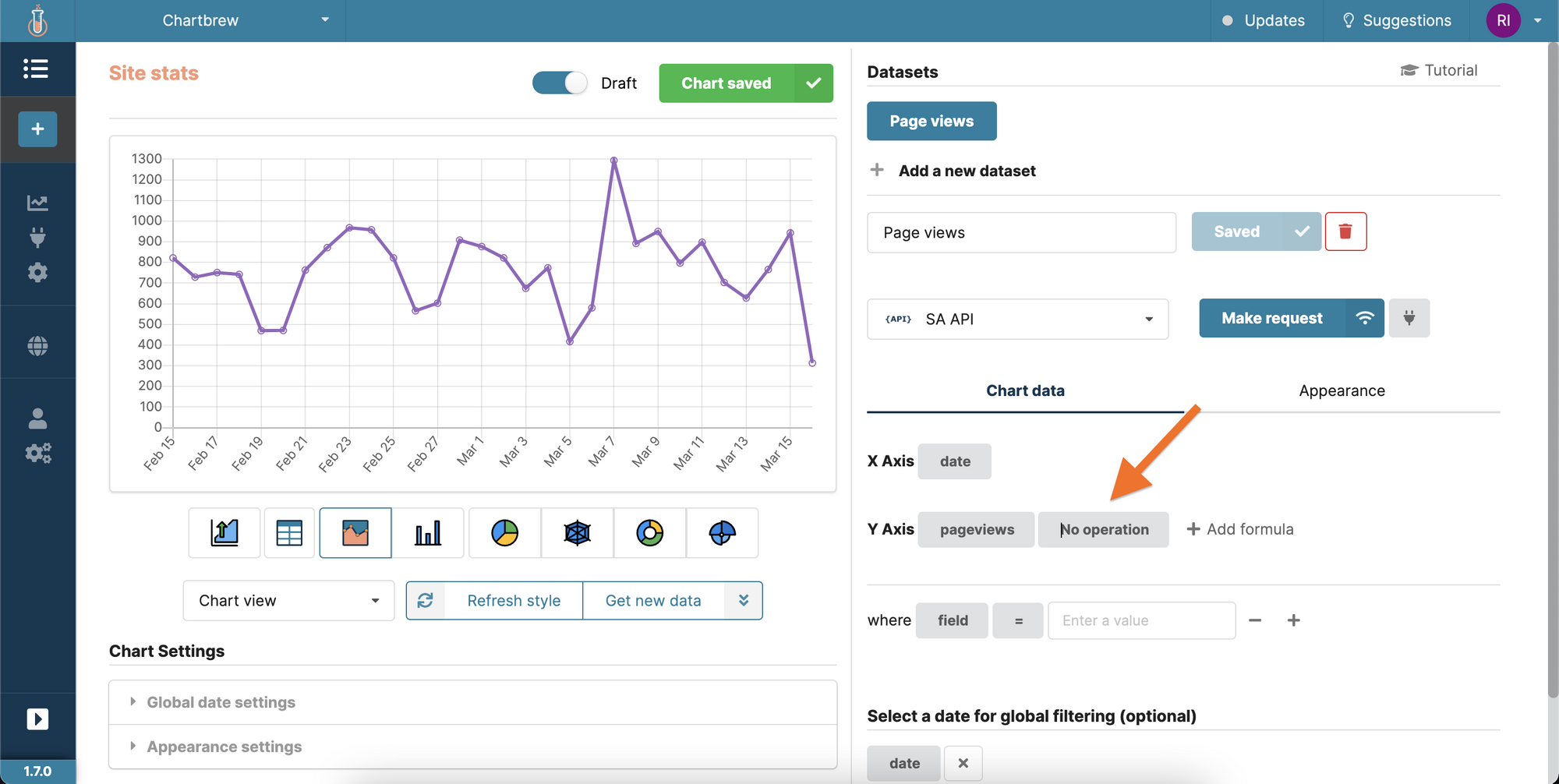
When you press "Done", you will see a straight line on the chart. This is because Chartbrew tries to do a count operation by default. Change the operation on the Y-Axis with "No operation" and the chart will show all the page views like in the API response.
To display the number of visitors we need to create a new dataset. Click on "Add a new dataset" and name it Visitors. We need to make the same API call we did previously, but instead of selecting pageviews as the Y-Axis, we select the visitors.
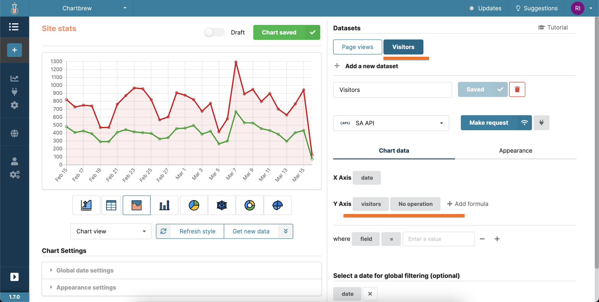
Here we go, a time-series chart that shows the page views and visitors. You can further customize the colors in the Appearance tab if you wish.
Creating a table to show the referrals
Chartbrew can also show data in table views and this is useful for things like referrals, UTM sources, browsers, and more. You'll see more examples as we progress through the tutorial.
For starters, let's focus on getting the referrers. Create a new chart as we did previously and name this one Referrals and then a dataset with the same name. You should have something like this:
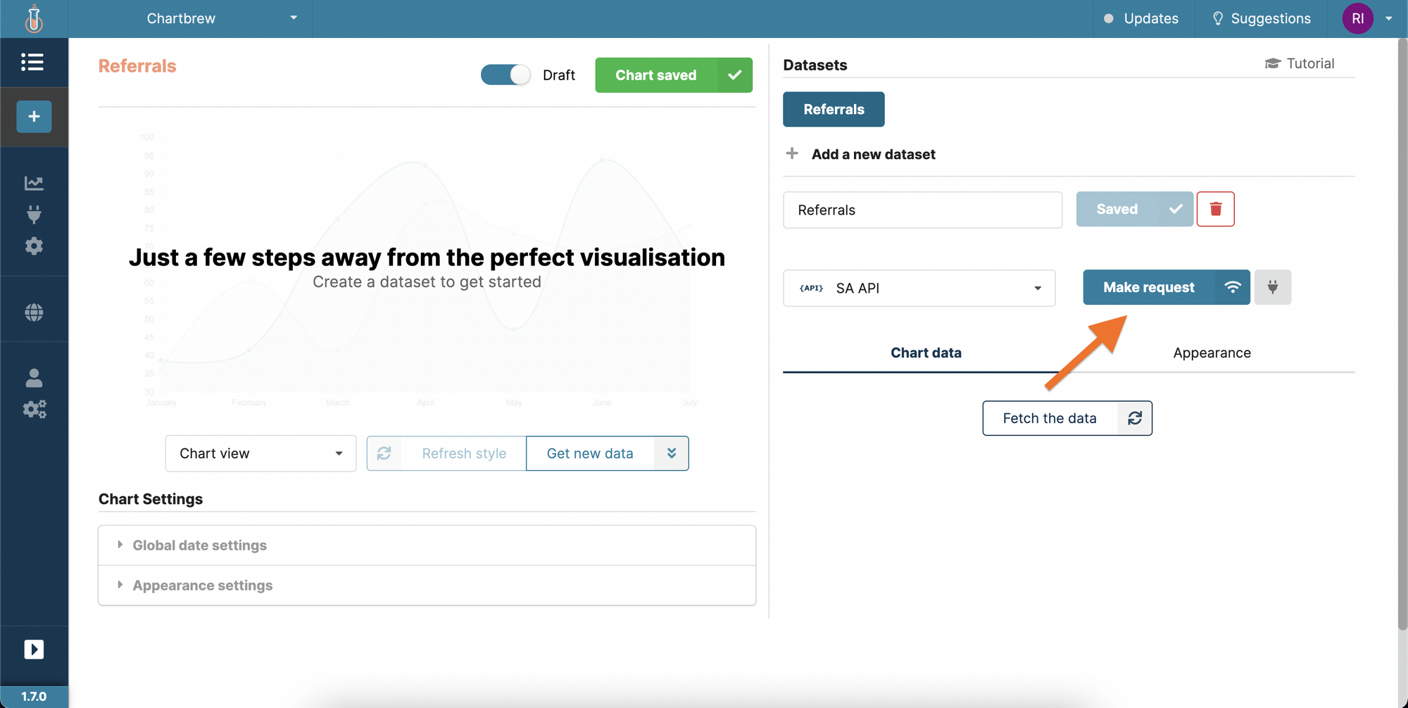
Click on "Make request" and add the following route in the field:
/simpleanalytics.com.json?version=5&fields=referrers
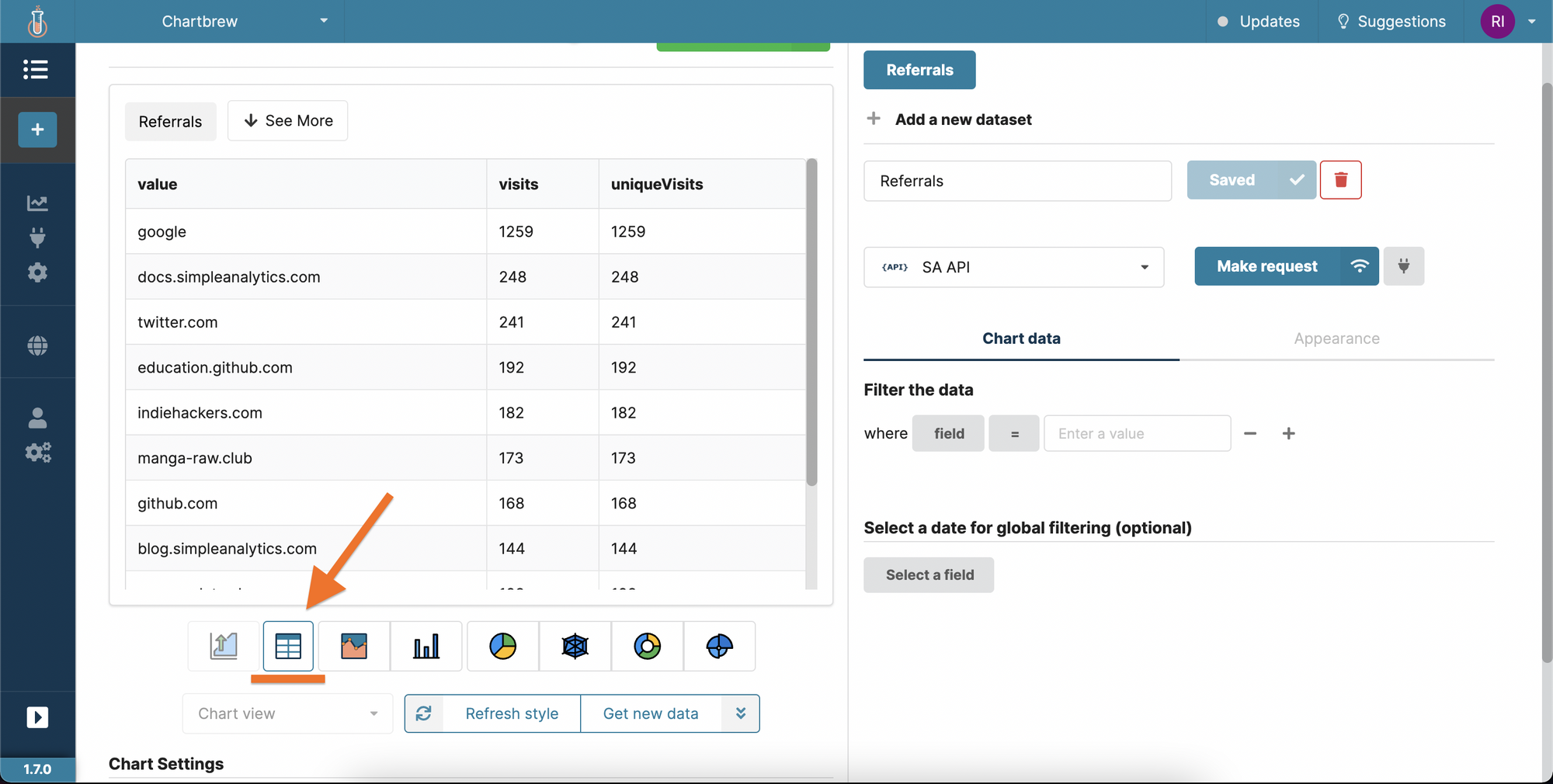
Proceed to send the request to the API and then click on the "table view" button as shown in the screenshot below. The table should load quickly after and we'll get another type of view.
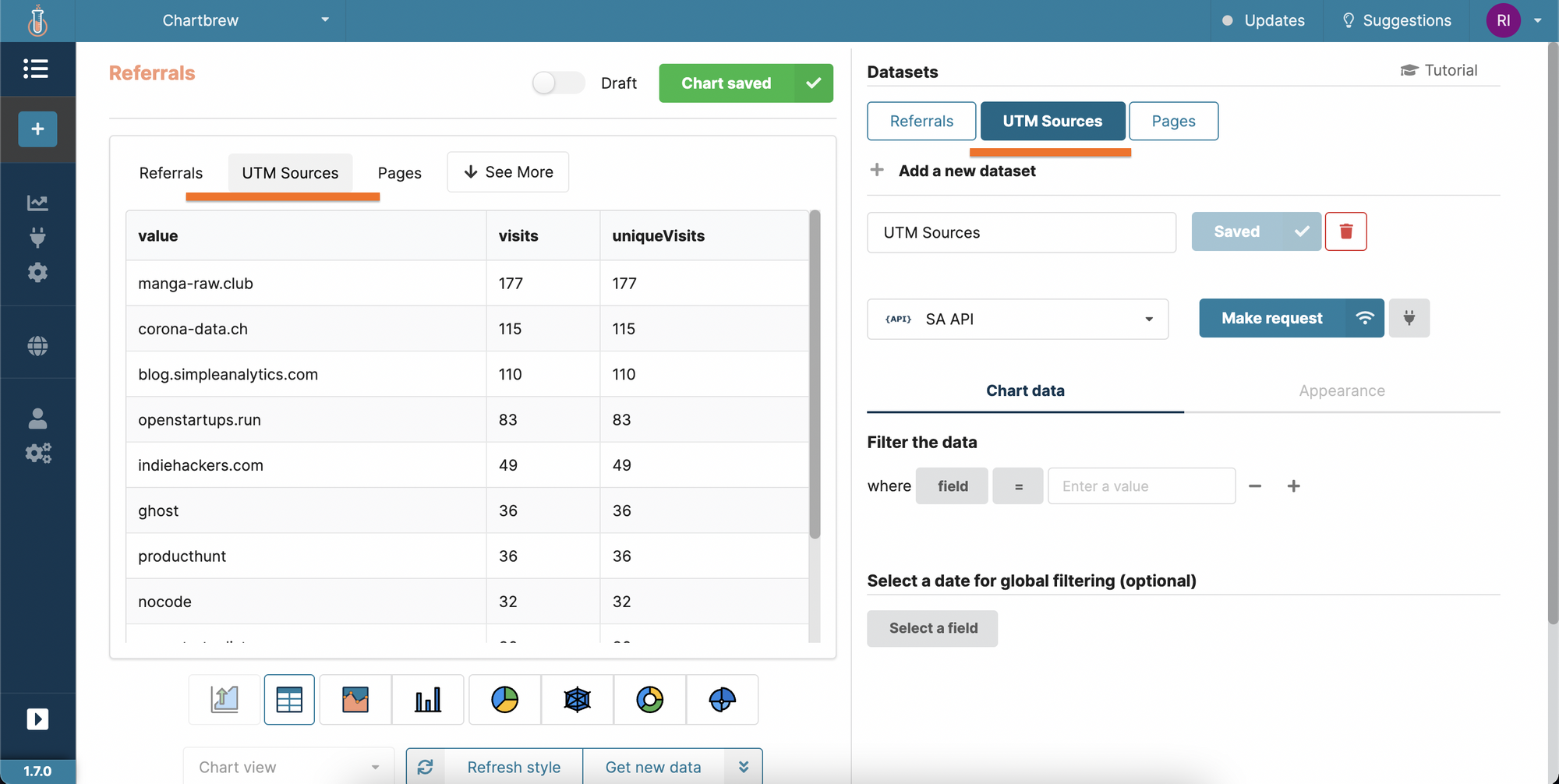
Like with the time-series chart above, we can add multiple datasets to the table view as well. For example, we can get useful insights from the UTM sources, so let's create a new dataset and call it UTM sources.
Repeat all the steps above, but change the route to the following:
/simpleanalytics.com.json?version=5&fields=utm_sources
Sharing, embedding, and auto-updating
There are extra things you can do with the charts after you created them in Chartbrew. Head over to the dashboard and click on the individual chart menu to see all the options:
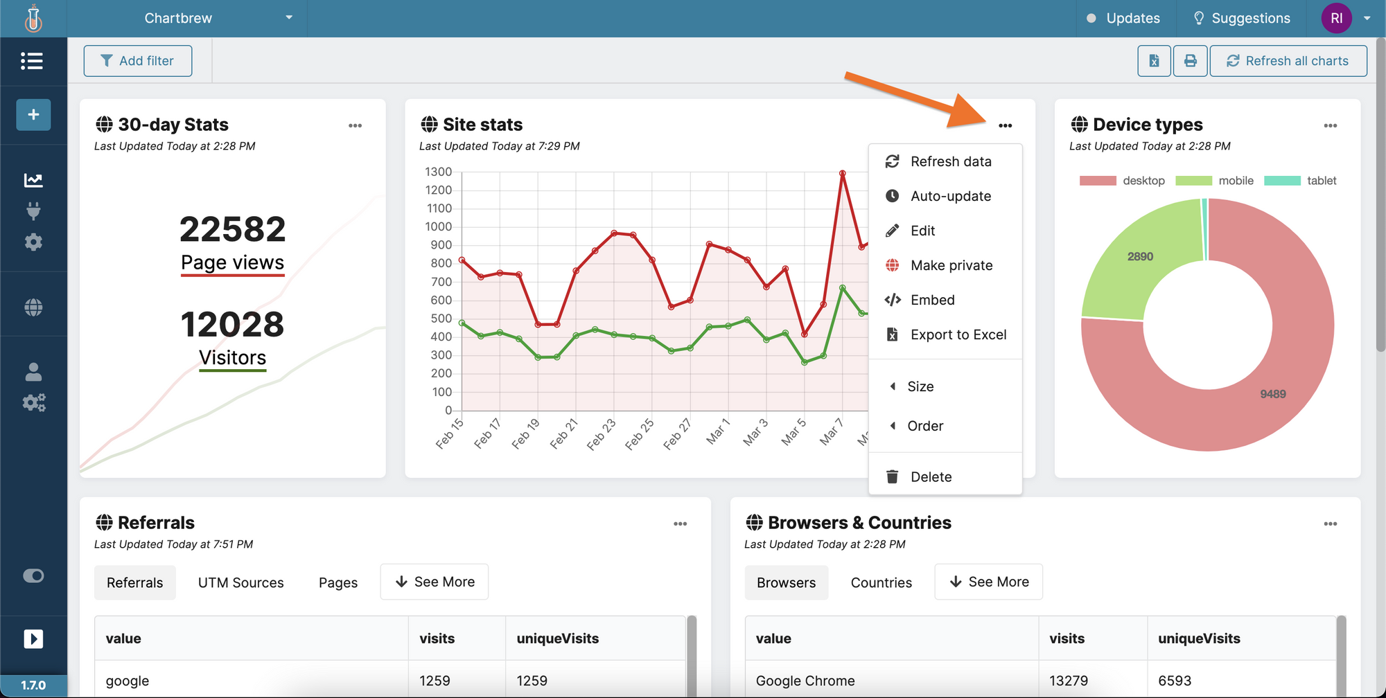
For example, you can embed charts on other websites. Here's a demo that you can interact with:
That's it for this tutorial! You can go ahead and create more charts using Simple Analytics's API documentation. Check which fields you can query for and put the data in other charts.
I created more charts and you can see them in the public dashboard here.
Next steps
Chartbrew becomes more powerful when you mix data from different data sources. On top of website analytics data that comes from Simple Analytics, you can have financial data, marketing campaign data, or even data from your own custom APIs and databases.
- Connect Stripe's API to the dashboard and query for your finance data (see tutorial)
- Connect any PostgreSQL, MySQL, or MongoDB database and see how your content evolves
