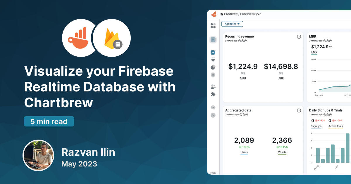
Visualize your Firebase Realtime Database with Chartbrew
Chartbrew officially supports native connections to Firebase's Realtime Database, and this tutorial will show you how you can create real-time reports and visualization dashboards from your data.
Set up your dashboard
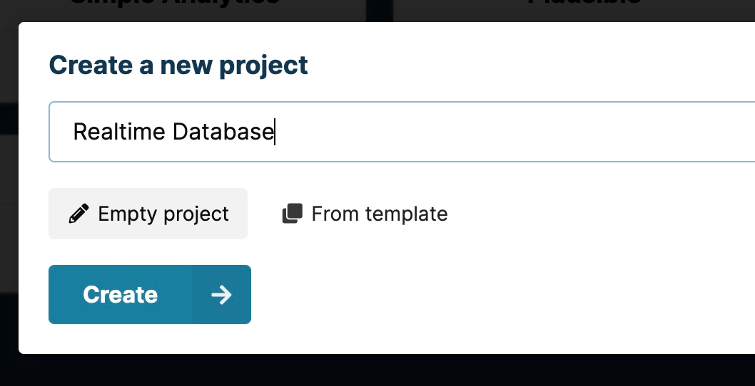
If you do not already have a Chartbrew account, you can sign up for one and start your free 14-day trial here. Once your account is ready, you can create a new project. We can name it "Realtime Database" for now.
You will be redirected to the "Connections" page where you have the option to create a connection to your Realtime Database. Select the option from the list to get to the connection form.
The connection needs the following:
- A name of your choosing so you can identify it later on when connecting charts
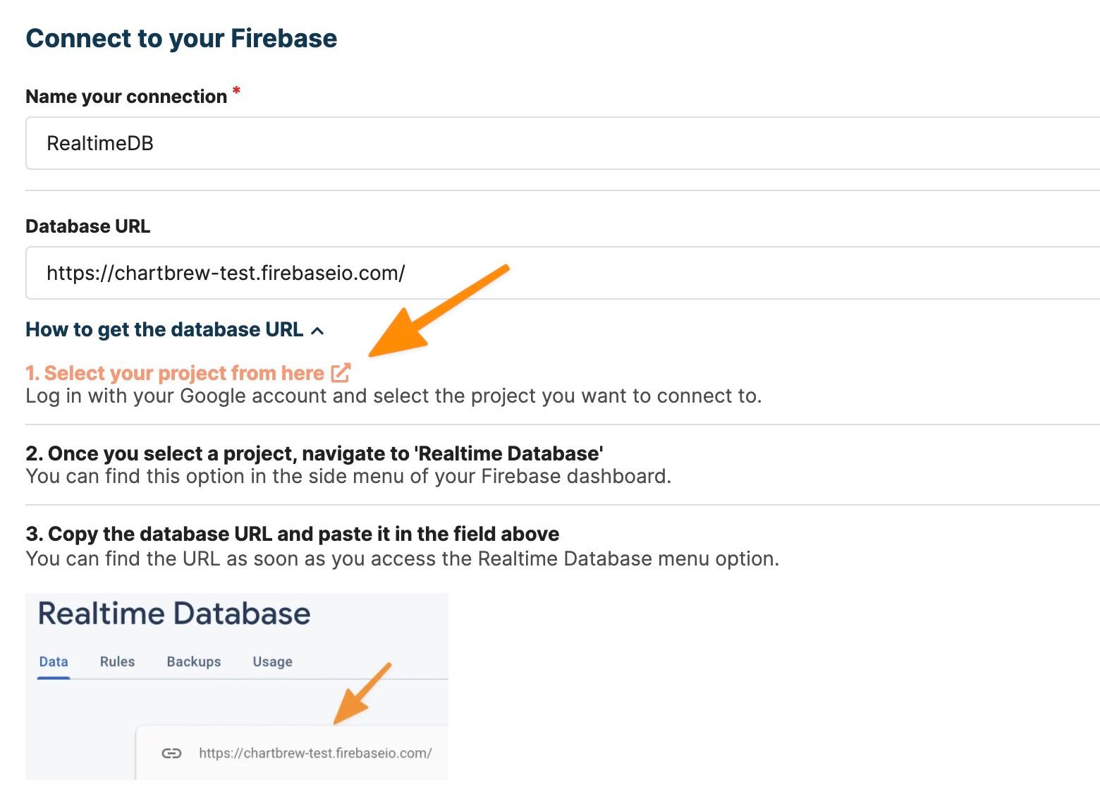
- The database URL which you can find in your Firebase dashboard
- And lastly, the service account to authenticate the connection
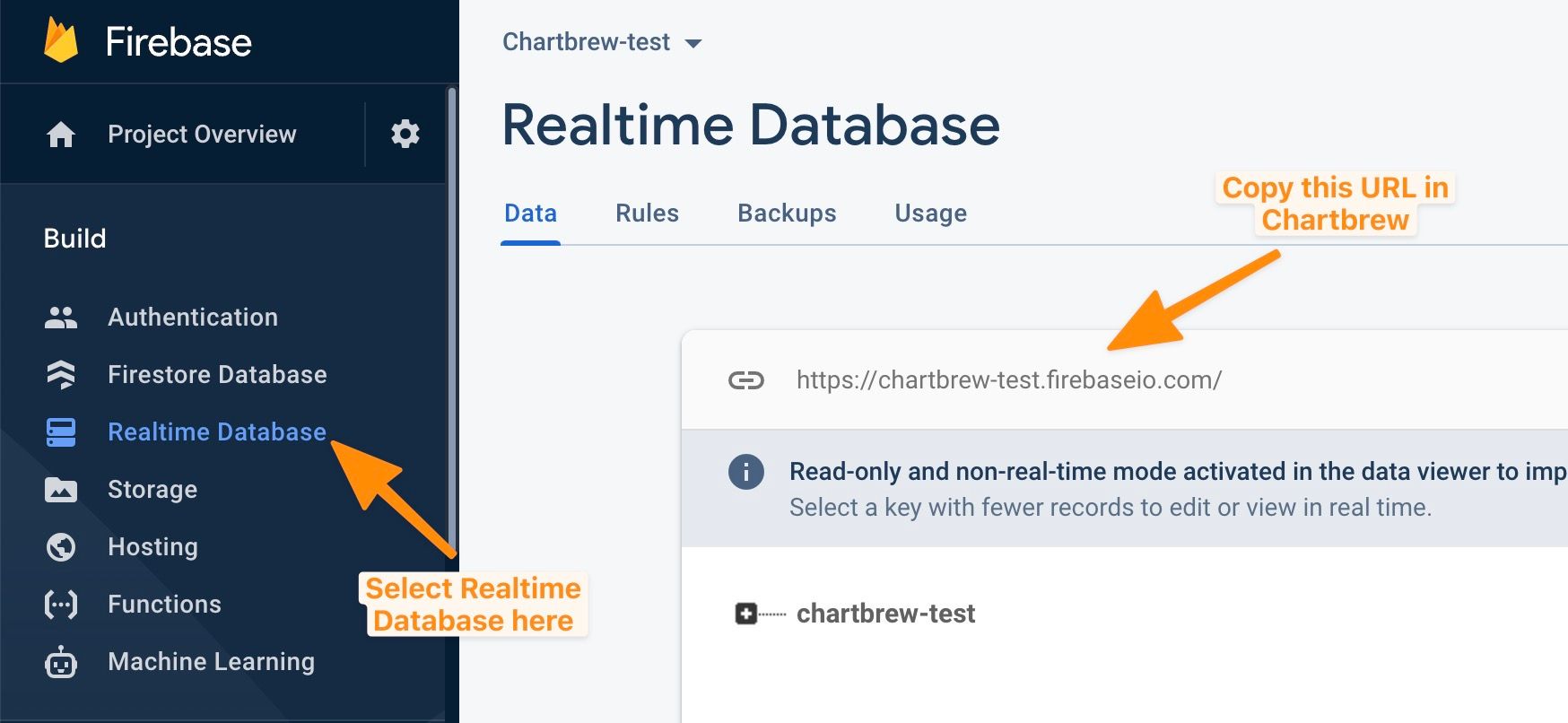
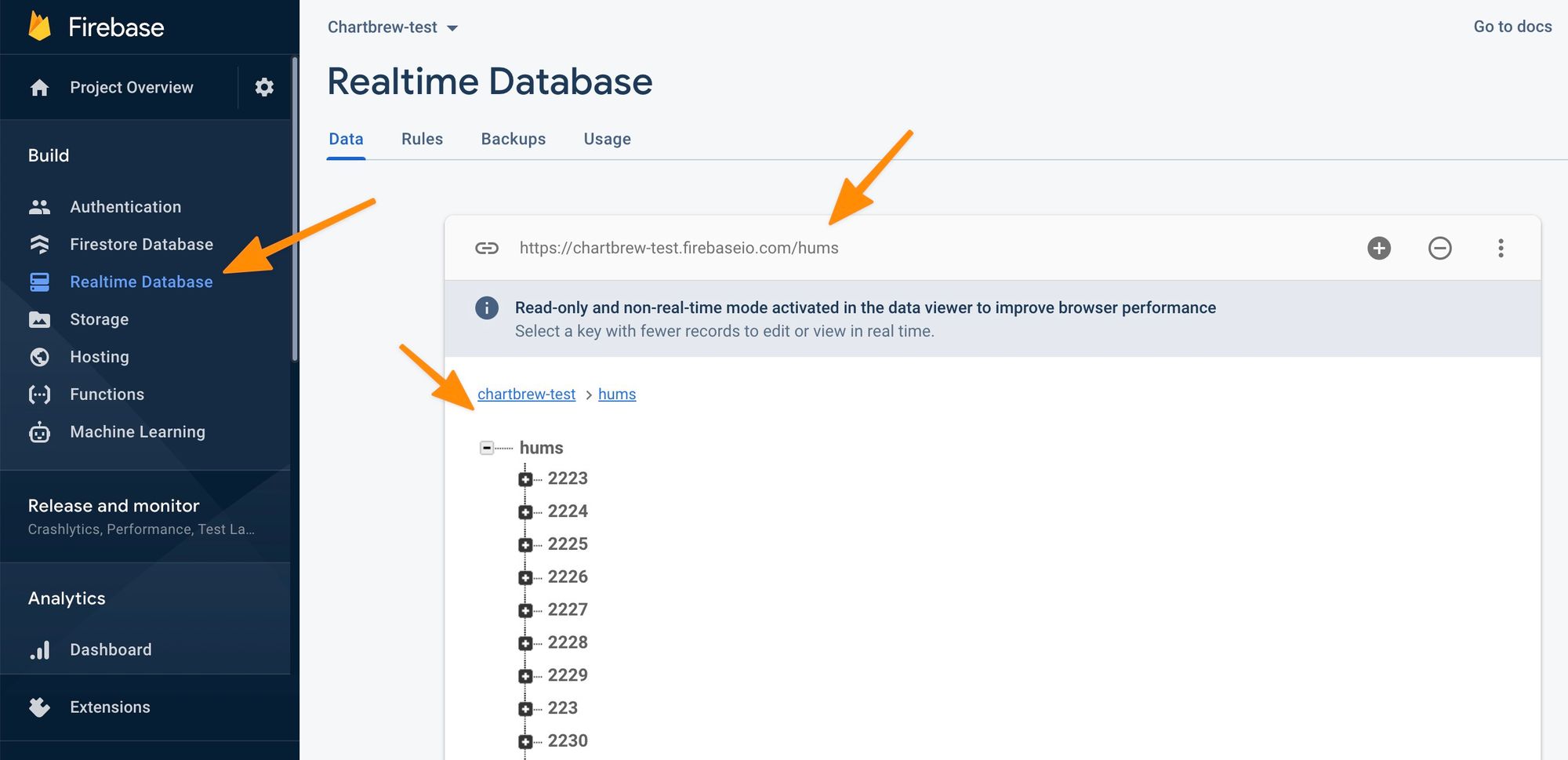
You can get the database URL by going to your Firebase dashboard and selecting "Realtime Database" from the side menu. See the screenshot below:
Copy the URL in the connection form in Chartbrew, then follow the instructions on how to get the service account used for authentication.
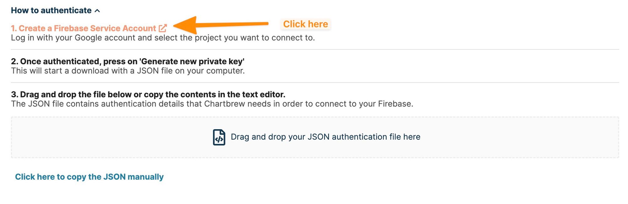
When you click on the link provided on the form, you will be redirected to Firebase. Select the project you want to authenticate to and follow the instructions below on how to download the credentials file.
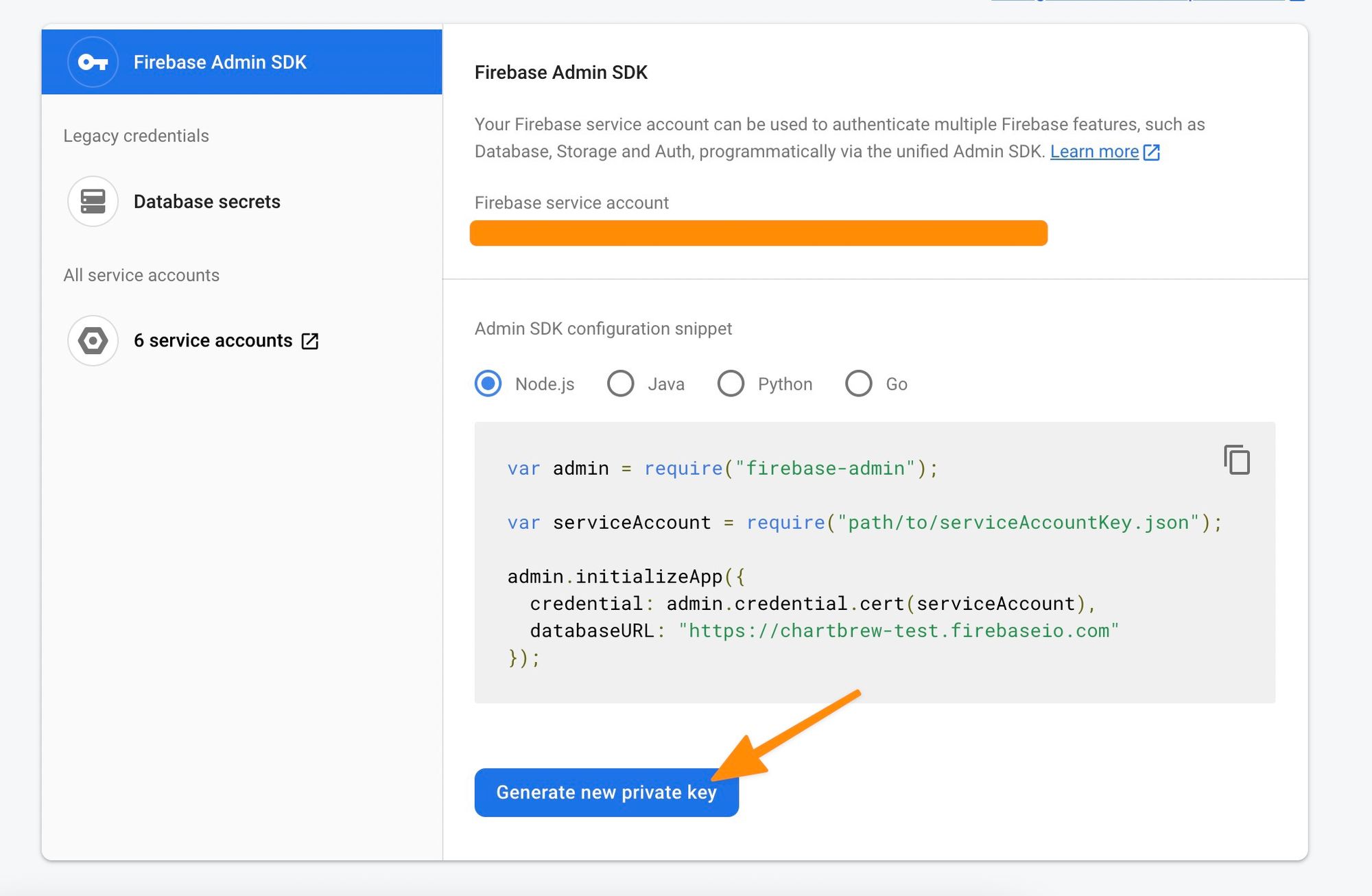
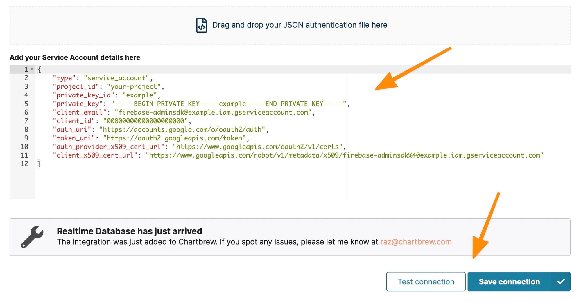
When clicking on the "Generate new private key" button, you will get a file that you can drag & drop in the Chartbrew form to authenticate the connection. You will see all the authentication details in the UI when you drop the file there. Next, test the connection to check if everything is working, then save it for the next steps.
Create a chart from the Realtime Database data
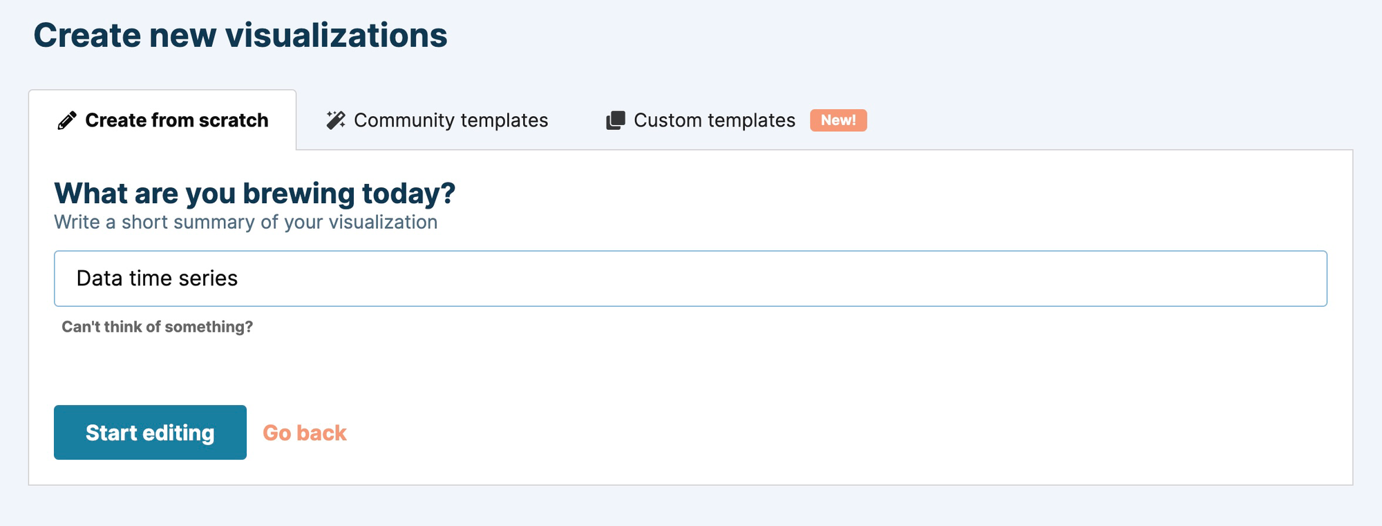
You will be prompted to create a new visualization. Alternatively, click on the "Create a chart +" button in the side menu. Type an appropriate name and let's start editing the chart.
The first thing to do on the chart editor page is to create a new dataset and connect it to the Realtime Database integration we created earlier. Click on "Add a new dataset", type a name, and then select RealtimeDB from the connections list.
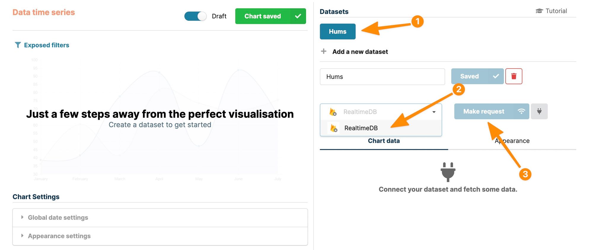
Once a connection is selected, you can "Make a request" for data. Click on the button to see the request options. You can choose the path, order, and limit the data you get from the Realtime Database.
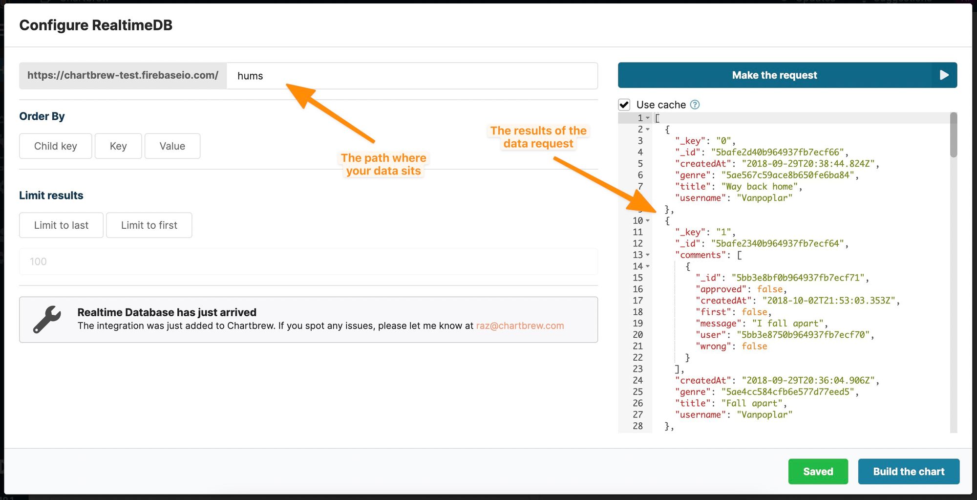
If you are unsure about the path to your data, you can double-check this in the Firebase dashboard as shown in the screenshot below. Note how the path matches the one entered in the Chartbrew request form.
You can use the "Child key" order type for quick ordering and then select one of your fields to order by. You can also limit the results limit what the chart displays. For example, the screenshot below shows data ordered alphabetically by username and results limited to the first 100 items.
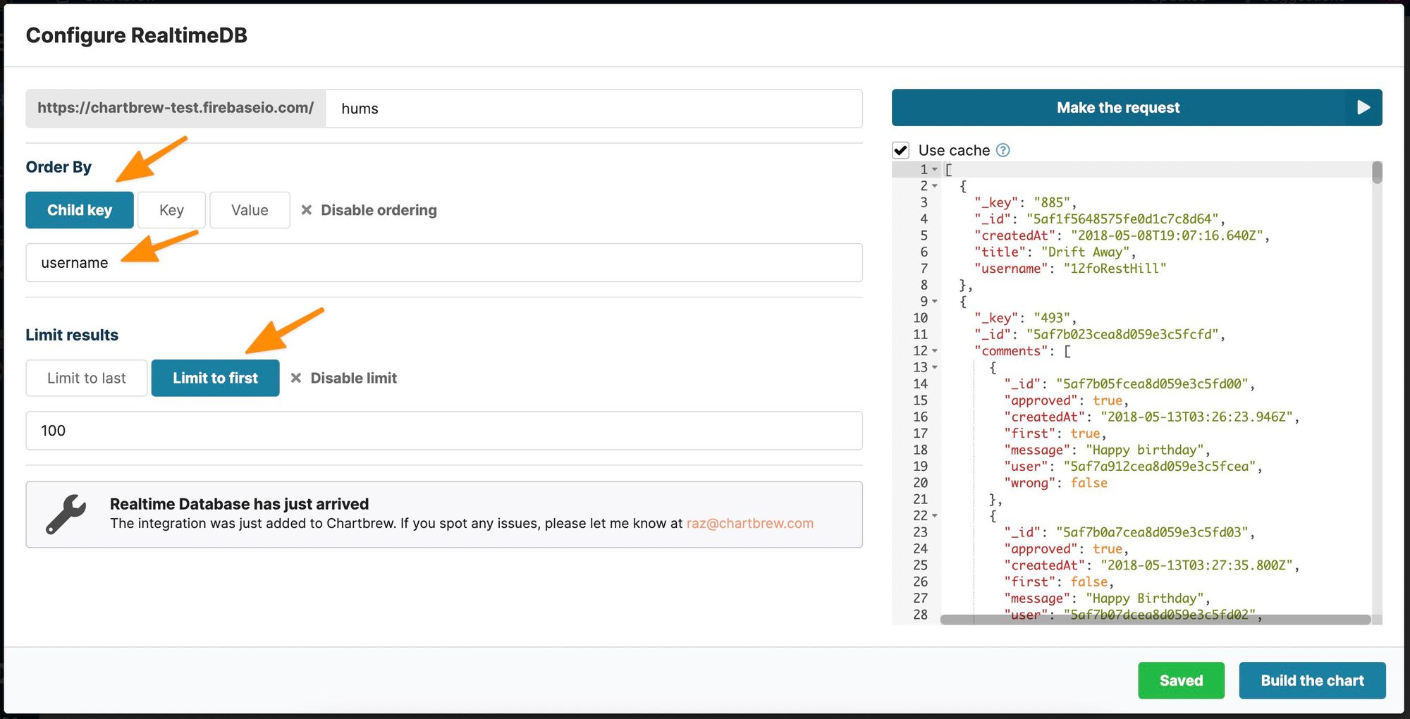
If you want to order by key or value, your data needs to be indexed accordingly. You can check the Firebase documentation on how to do this here: https://firebase.google.com/docs/database/security/indexing-data
Once you have some data to work with, click on the "Build the chart" button to see the chart that was just built. Chartbrew tries to guess an initial visualization based on your data, so if it is not what you are looking for, you can further tweak the chart in the editor.
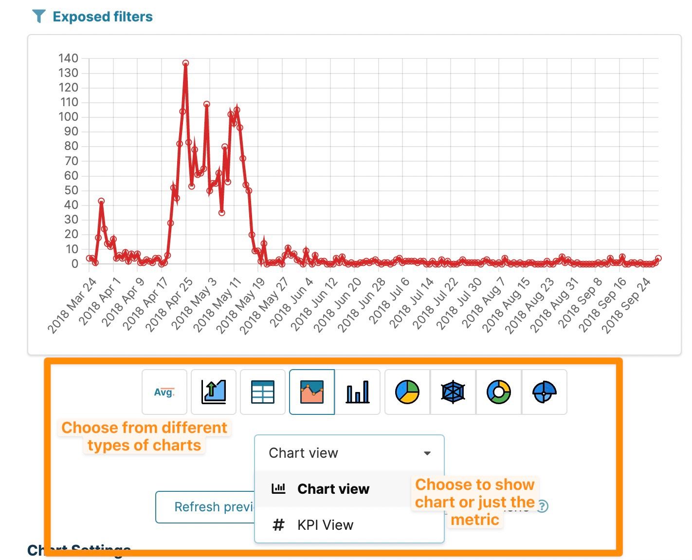
Editing the Realtime Database chart
The main thing you might want to change is what chart type you want to be displayed. You can choose from multiple options like line or bar and other types of charts. For displaying just a number (e.g. total number of users), you can select the KPI view as shown in the screenshot.
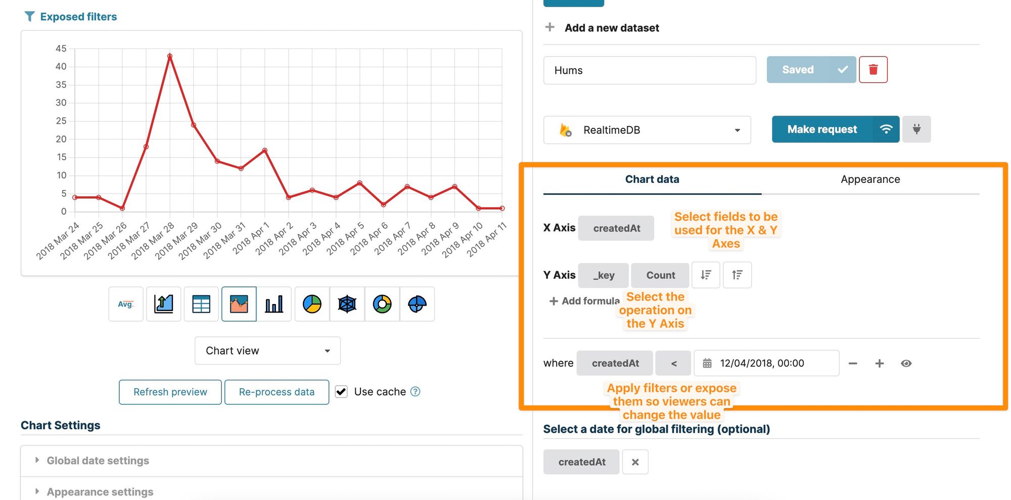
Another common setting is to adjust what your chart should display on the X & Y Axes. Chartbrew supports multiple operations on the Y-Axis such as count, sum, avg, min, max. The data can be ordered and filtered on top of the settings set in the request earlier.
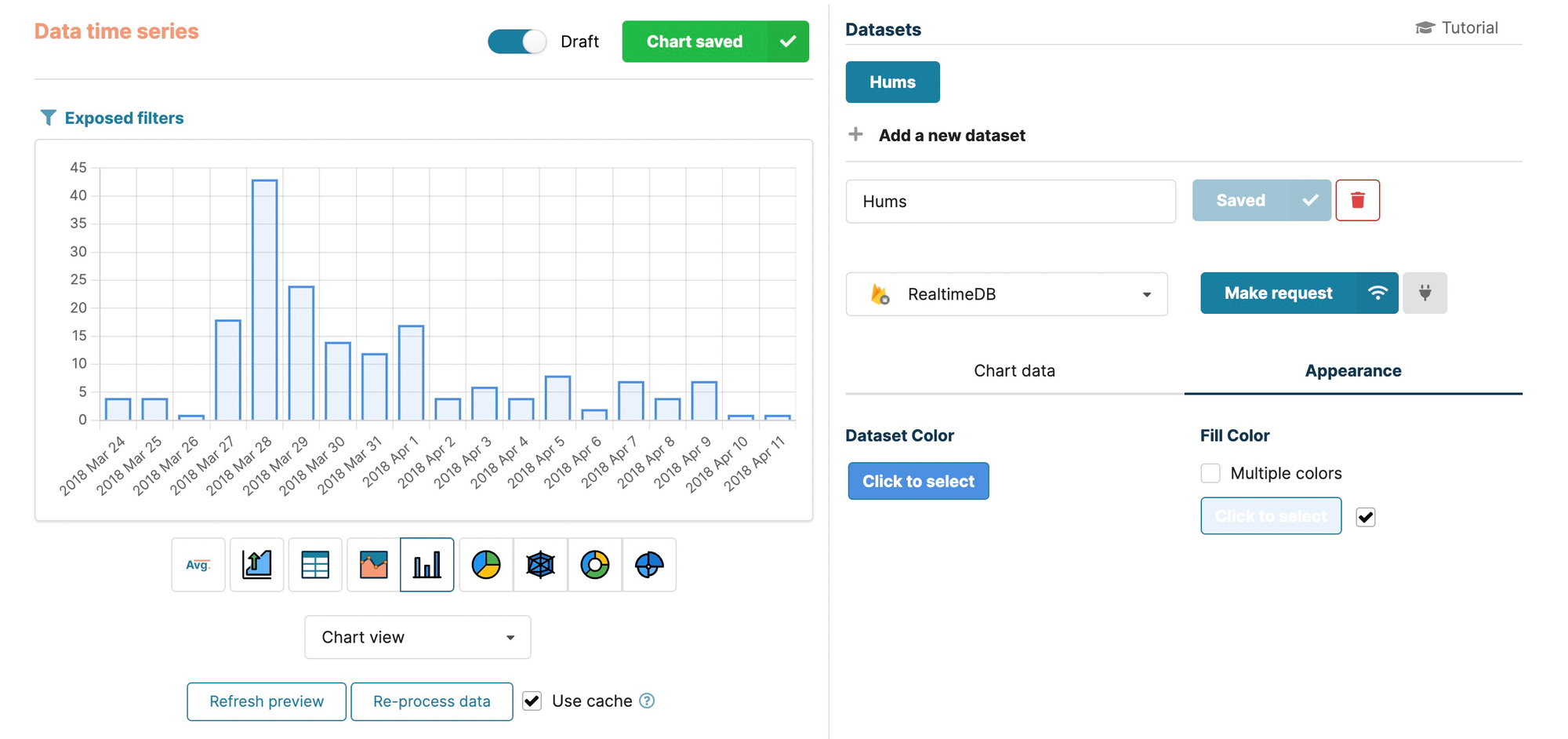
One last setting this tutorial covers is changing the colors on the chart. These can be changed from the Appearance tab. Each dataset can be configured to have a different outline and fill colors.
For extra settings and filtering options, feel free to always enable the tutorial in the upper right corner of the editor, or check the data settings section in the tutorial below:
 Razvan Ilin
Keeping the data updated and sharing your charts
The beauty of Chartbrew is that it can keep your charts up-to-date with the latest data from your sources. Once you head back to the dashboard screen, you will see the chart displayed in a clearer format. Click on the settings menu in the corner of the chart to reveal all the available actions.
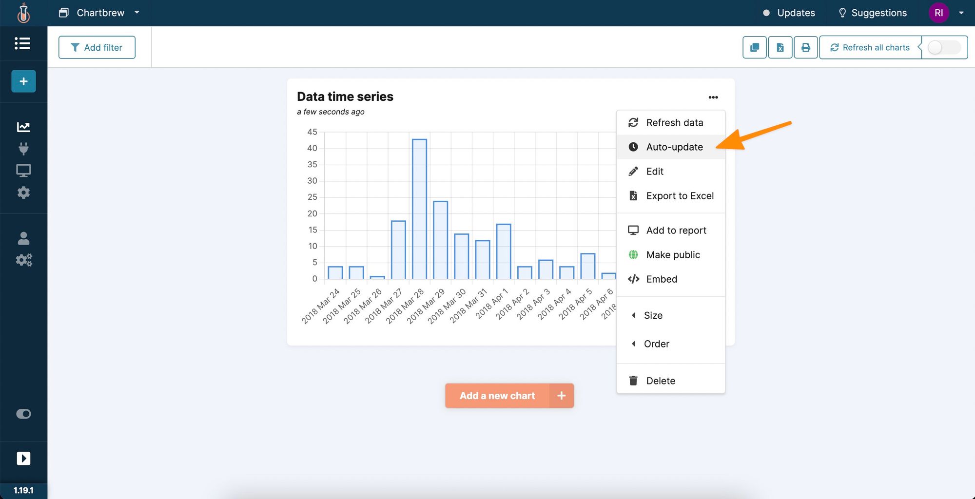
By clicking on the "Auto-update" option, you will be able to select a schedule for when the chart should automatically update with the latest data.
You can also share this chart with anyone by clicking on the "Embed" options. You can copy a direct link to the chart or embed it on any website. For example, check below to see the exact chart that was built above, embedded in this blog post:
Next steps
In this tutorial, we went through authenticating a connection with the Firebase Realtime Database and creating the first chart using the data. There are more things you can do with this data in Chartbrew. You can try the following:
- Create a report and share it with your team or clients
- Get more data from your Firebase projects using the Firestore integration
- Replicate entire dashboards for multiple projects by using dashboard templates
