Visualize and report on Customer.io data with Chartbrew
In this tutorial, we are going to connect to Customer.io and create a few charts using Chartbrew's chart builder. Let's start by creating a new project and selecting the new Customer.io integration.
Update 23rd of June: The "campaign metrics" feature has been released. Check out the video below for a quick feature preview.
Connecting to Customer.io
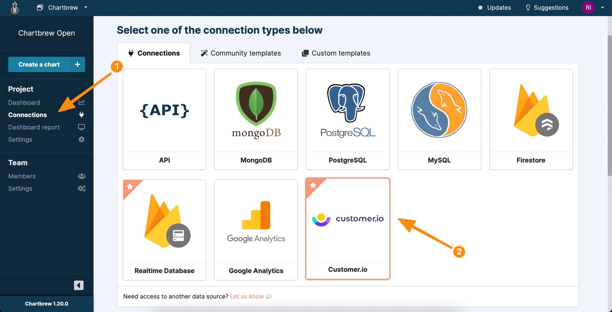
From the "Connections" page, add a new connection, and select the "Customer.io" option from the list.
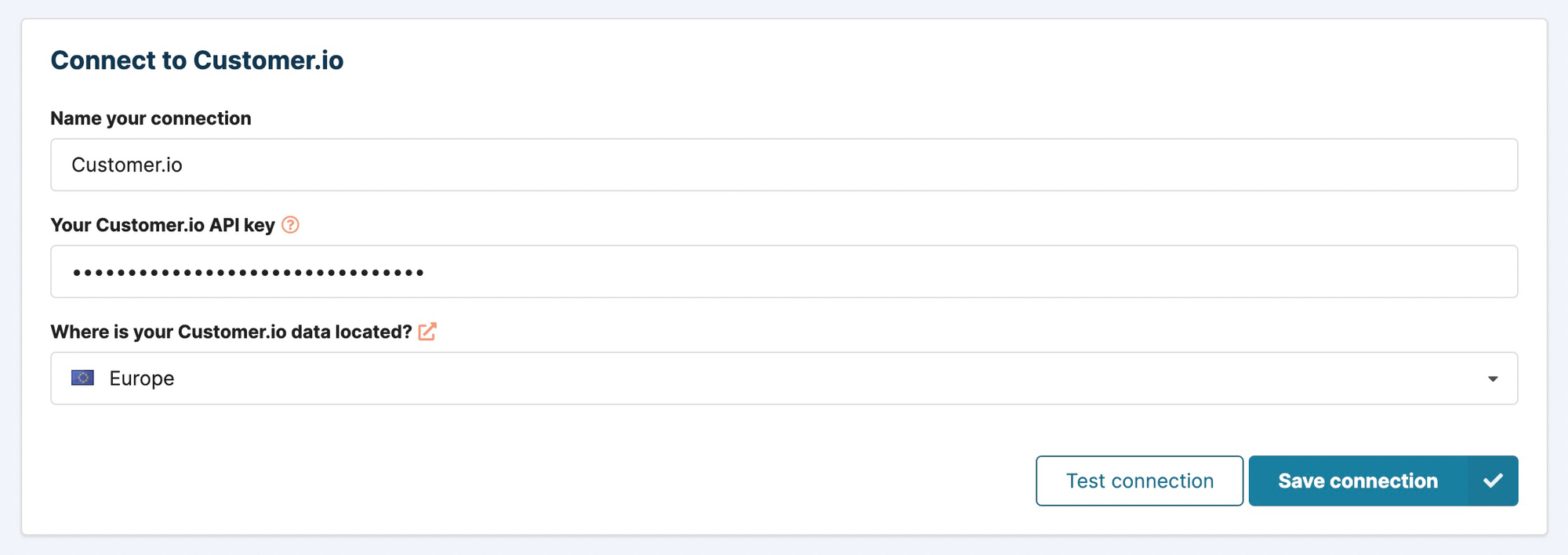
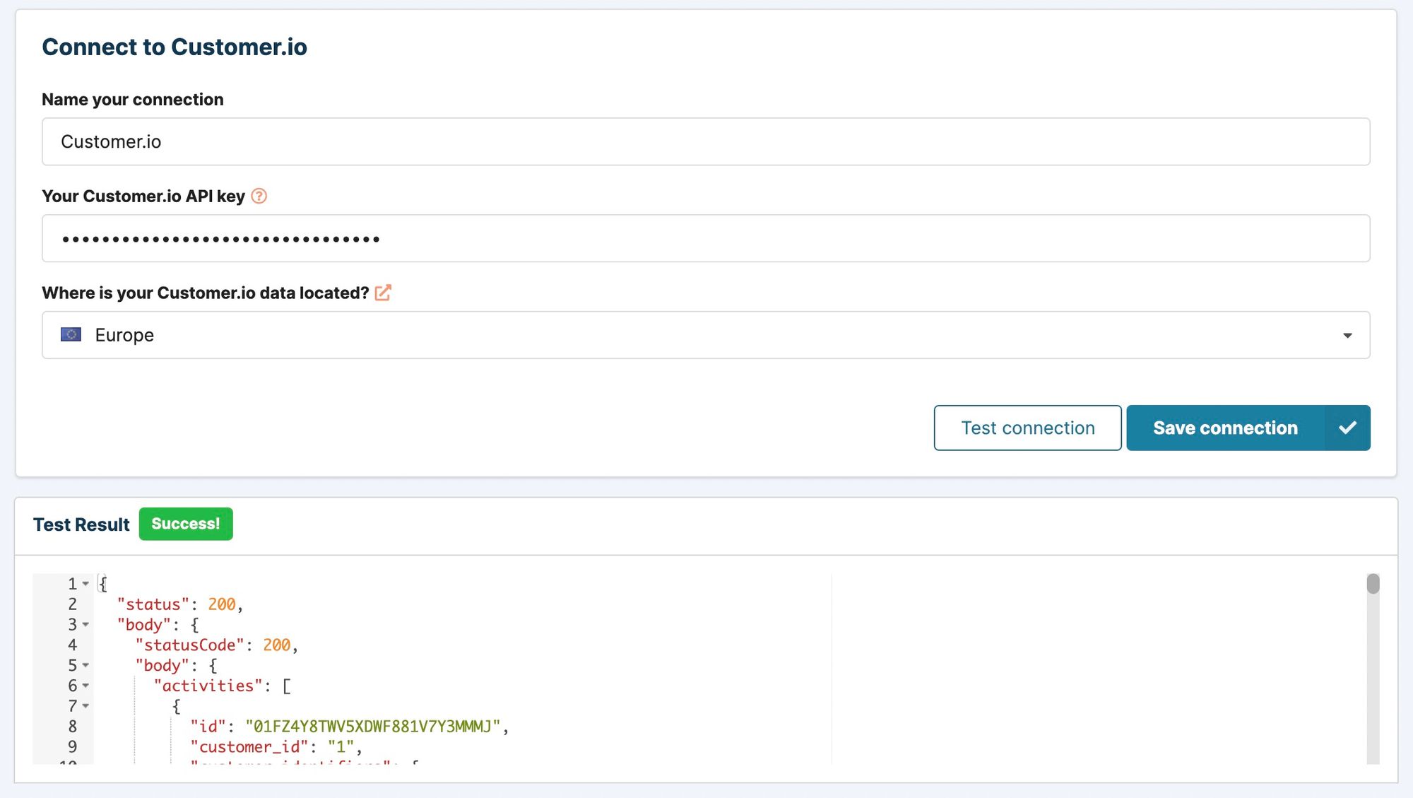
Next, the connection needs a few details to be able to authenticate with your Customer.io account. Enter a name for your connection so you can recognize it later, the API key used for authentication, and the region where your Customer.io data is stored in. We are going to look into how to generate an API key and how to find the region where your data is stored.
Create a Customer.io API key
The API key is used for authenticating the data requests Chartbrew will send to your Customer.io account. To create a key, head over to your account settings, click on "API Credentials", and then select the "App API keys" tab. Alternatively, click here to head there directly.
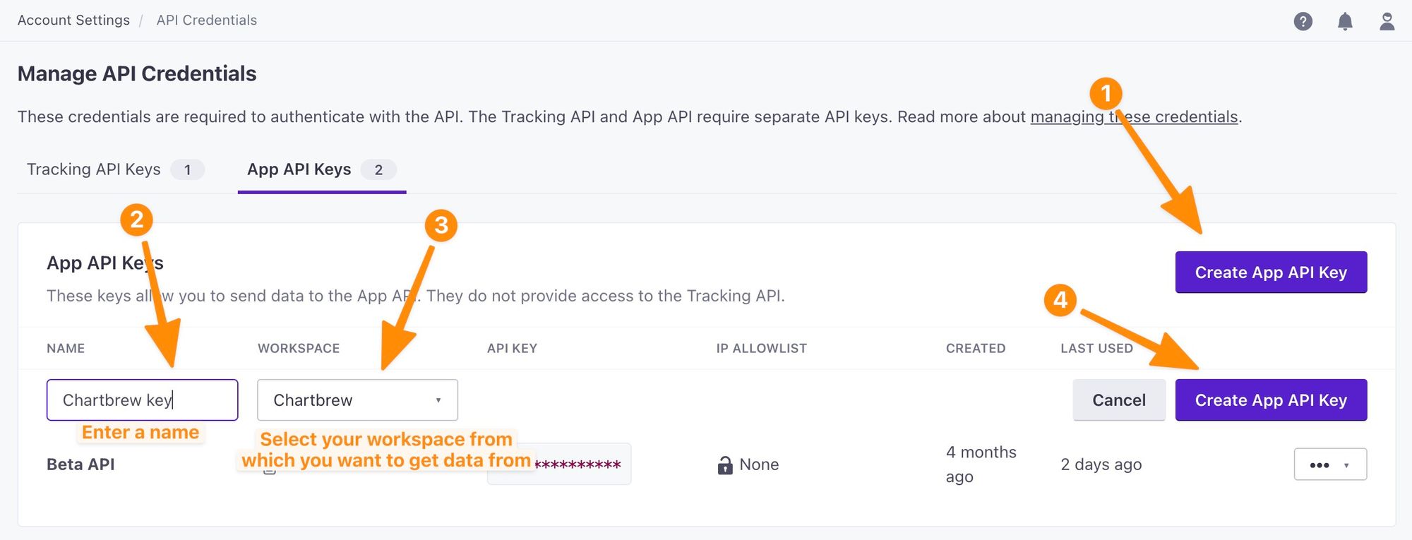
When you click on the create button, you will be shown the API key once, so make sure you copy this in the Chartbrew form.
Find the region where your Customer.io data is stored
Customer.io gives you the option to choose where your data is stored when you create your account. This can either be the US or Europe. If you do not remember the region you chose for your account, you can see this again in the Privacy Settings of your account. Click here to go to the page directly.
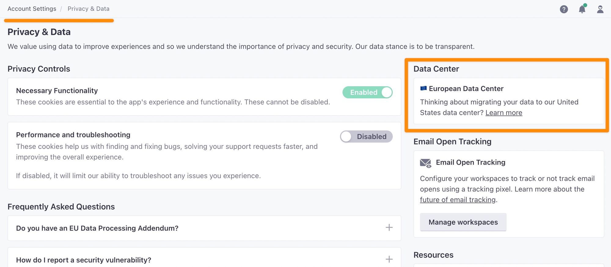
In the example above, the data is stored in the European data center. This means "Europe" should be selected in the Chartbrew form.
Once the form is complete, click on the "Test connection" button to see if Chartbrew can connect to your Customer.io account. If everything works, you should see a sample list of activities that happened recently in your Customer.io workspace. Click on the "Save connection" button to be able to use it for creating charts.
If unsuccessful check again the following items:
- The API key is created in the "App API keys" menu and not in the "Tracking API keys".
- You already have some IPs in the "IP allow list", but not Chartbrew's IP. If you're using chartbrew.com, you can add 89.39.106.86 to the list, or if you are self-hosting Chartbrew, add the IP from where the server app is running.
- Double-check if the region you selected is correct.
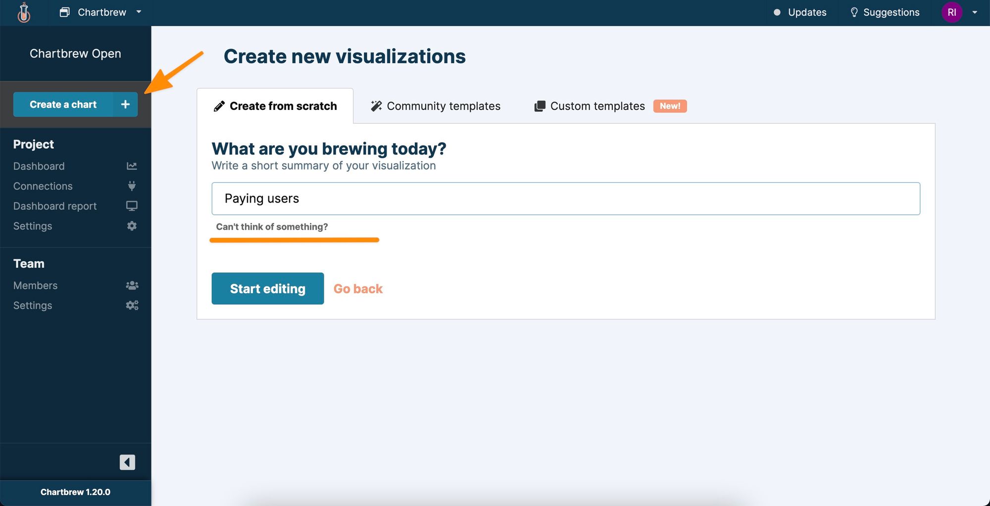
Creating the first Customer.io chart
To start with, let's first count the users that are part of one or more segments in Customer.io. Click on the "Create a chart" button and name it according to what type of users you want to show.

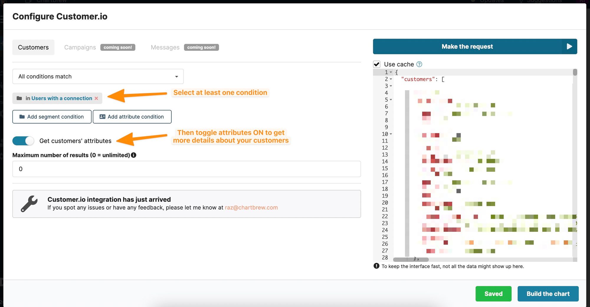
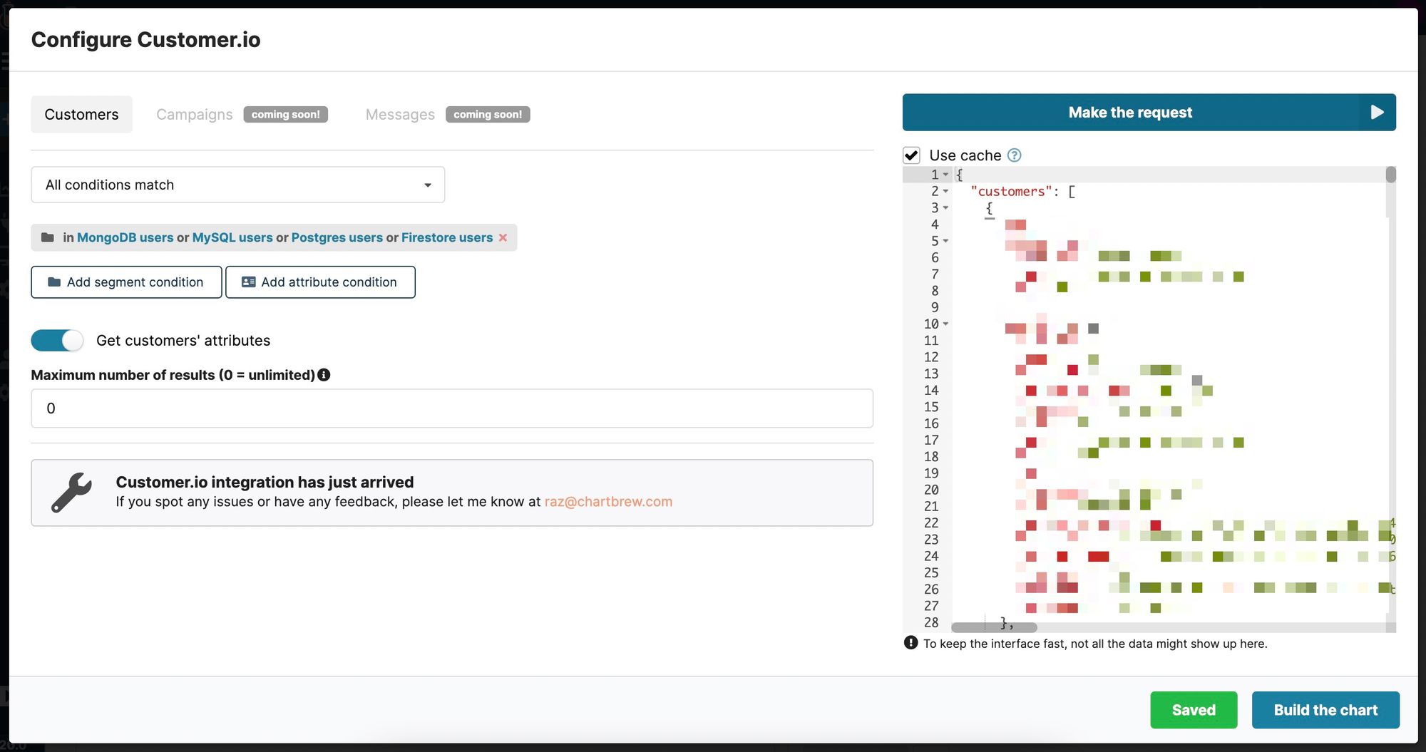
After clicking on the "Make request" button, Chartbrew will show a window where the data request can be configured to get the data you are looking for. In the current example, we will show all the customers in the "Paying customers" segment.
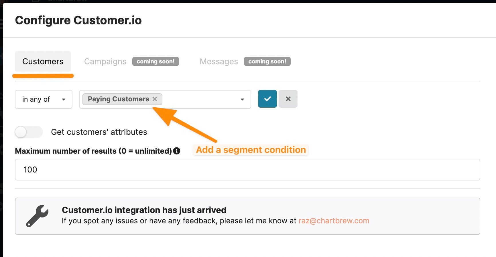
Click on the "Customers" tab and then add a new segment condition. Chartbrew will show you all the segments available in your Customer.io workspace. Select one of your choices, then adjust the maximum number of results you wish to get. Once the condition is saved, we can request the data from Customer.io by clicking on the "Make the request" button.
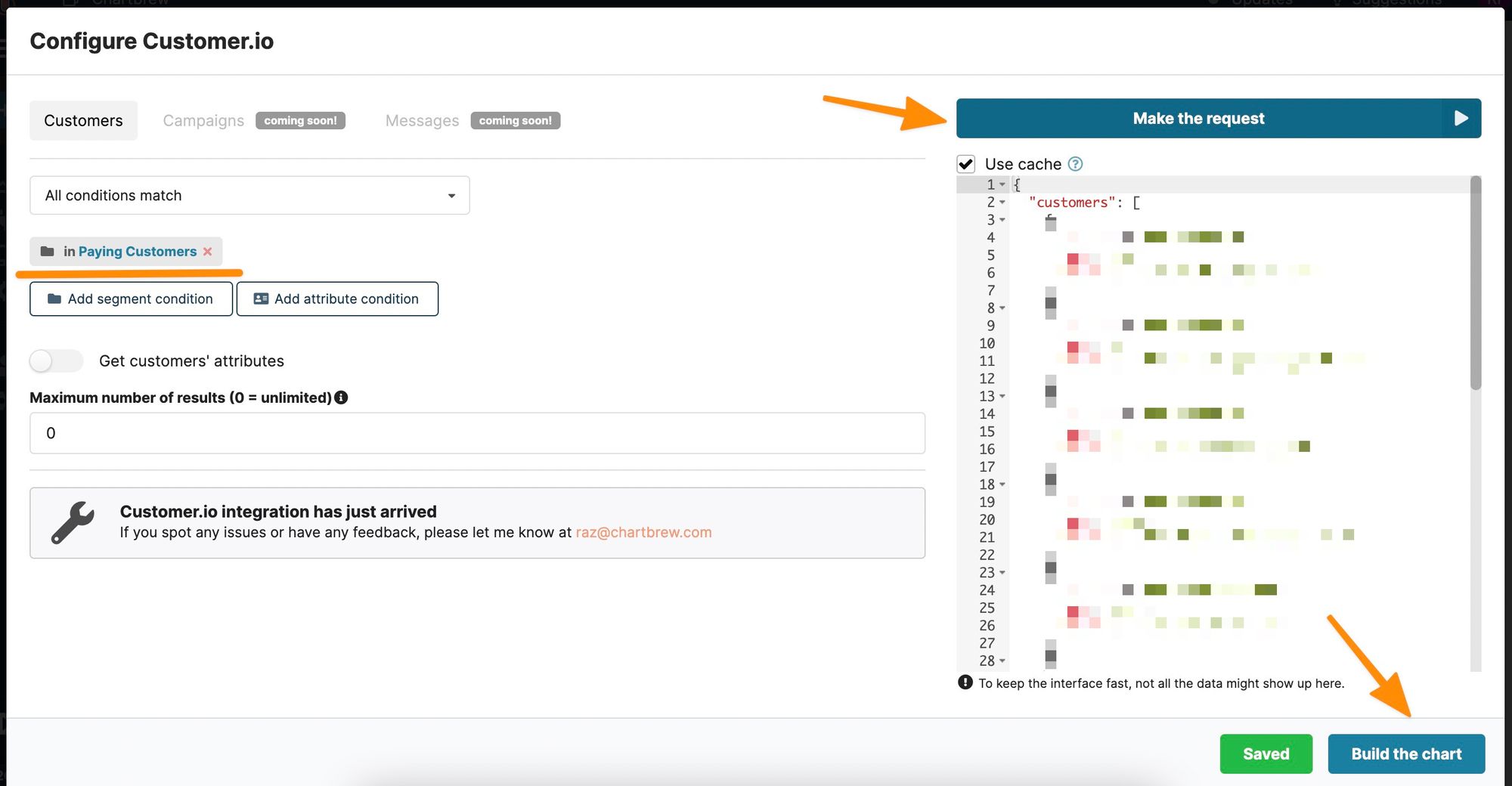
If the request is successful, we get the data on the right side of the page in JSON format. Let's proceed by clicking on the "Build the chart" button to continue with the chart configuration.
To show the total number of customers, we have to tell Chartbrew to accumulate the data and then display it as a KPI to make it more readable.
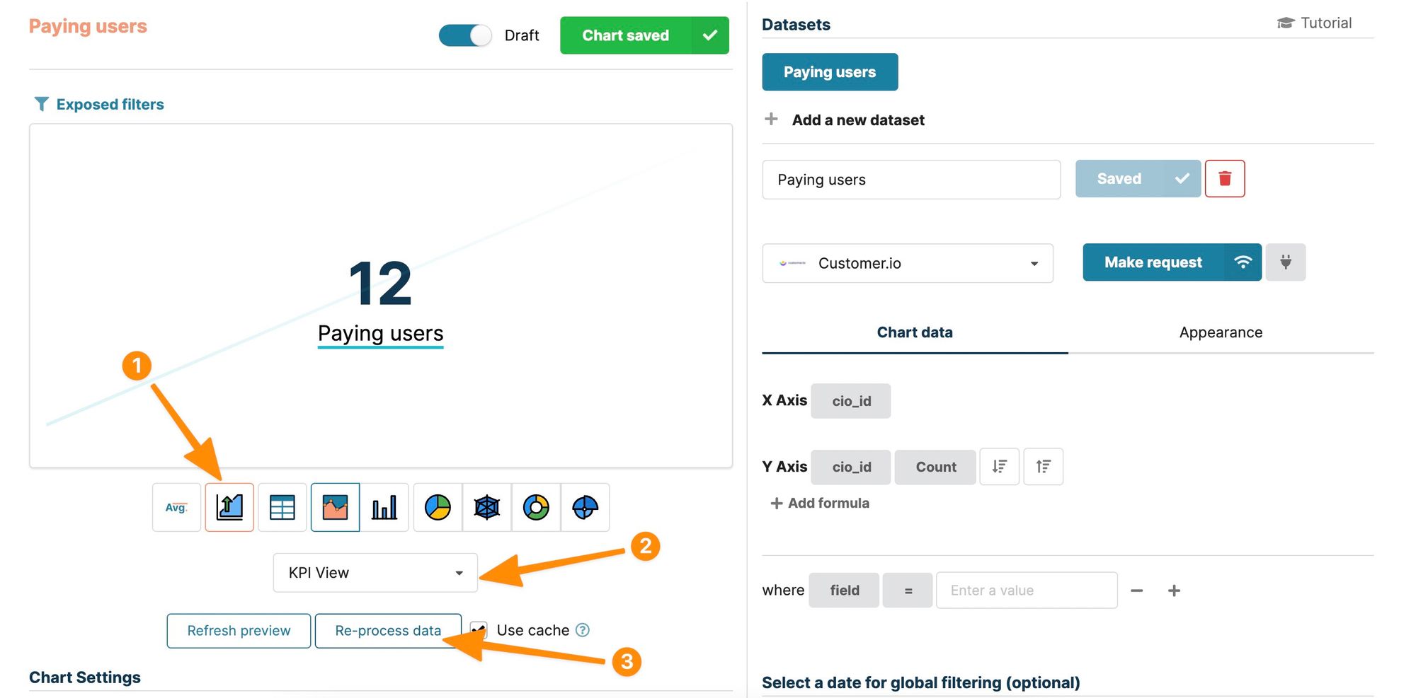
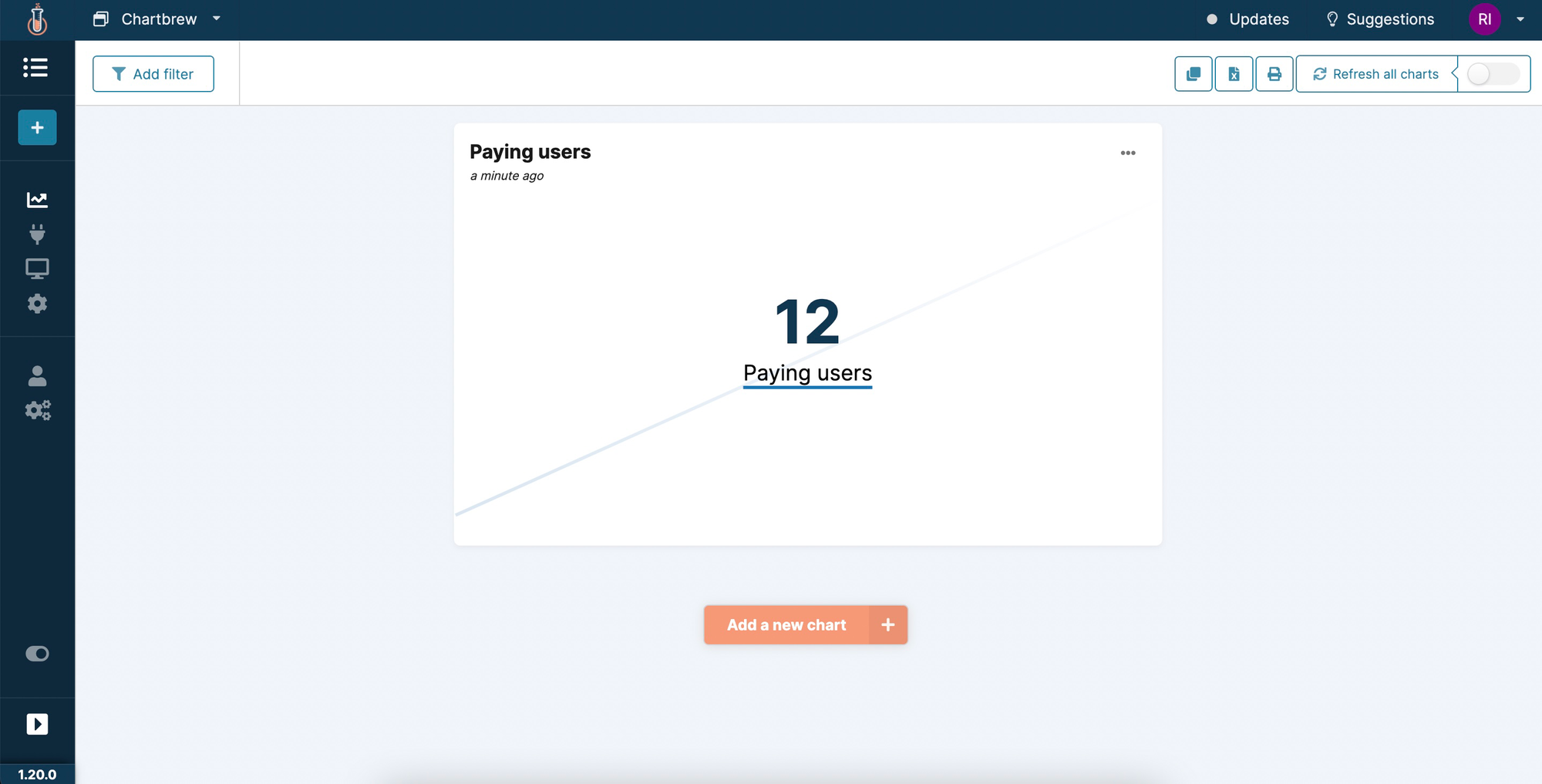
Now that the metric is created, we can head back to the dashboard and see that the first chart is live and shows all the users in the segment we selected.
Create a time series chart from Customer.io data
Time series are useful visualizations to show the evolution of some of the Customer.io segments. Click on the "Add a new chart" button to start configuring our first-time series chart. Repeat the same steps to connect the chart to the Customer.io connection and then click on the "Make request" button.
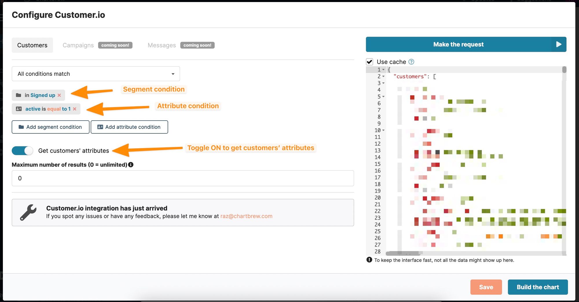
In this example, we added both a segment and an attribute condition. Segment and attribute conditions can be distinguished by the icon in front of the condition. To create a time series chart, we will need more information about the users. For a time series, we will need a date field such as the creation date of the user in Customer.io or something similar.
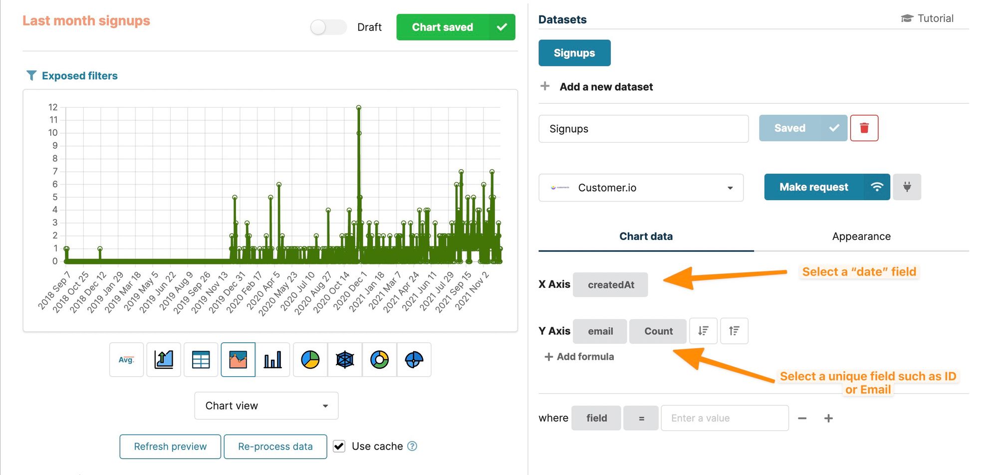
In the chart builder, we will have to select a "date" field for the X-Axis and a field that is unique for every user on the Y-Axis (e.g. email or ID) with the COUNT operation. This shows all the results on a timeline, which by default are shown on a daily time interval. Let's restrict the information a bit more and only show the signups that happened in the last month. To do this, we have to select a "date" field that Chartbrew can use for "date" filtering. In this case, it's the same field as the X-Axis.
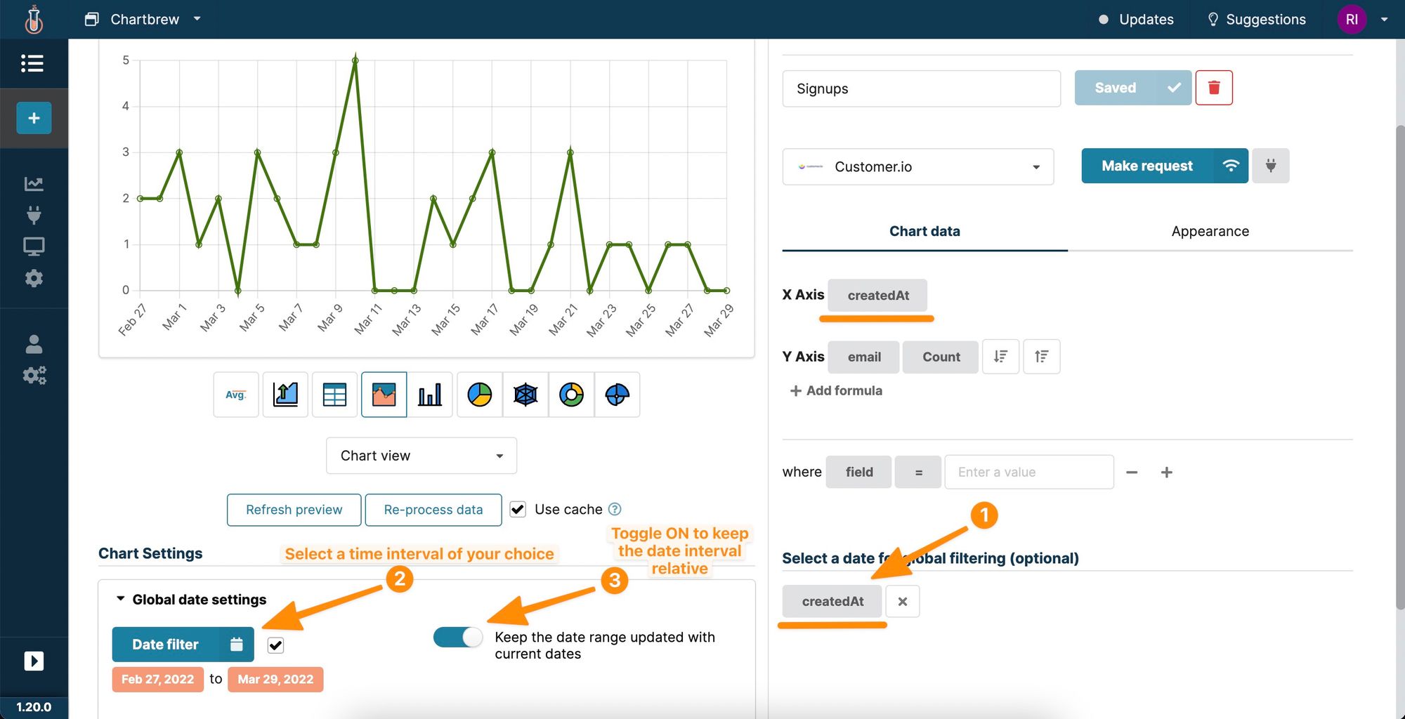
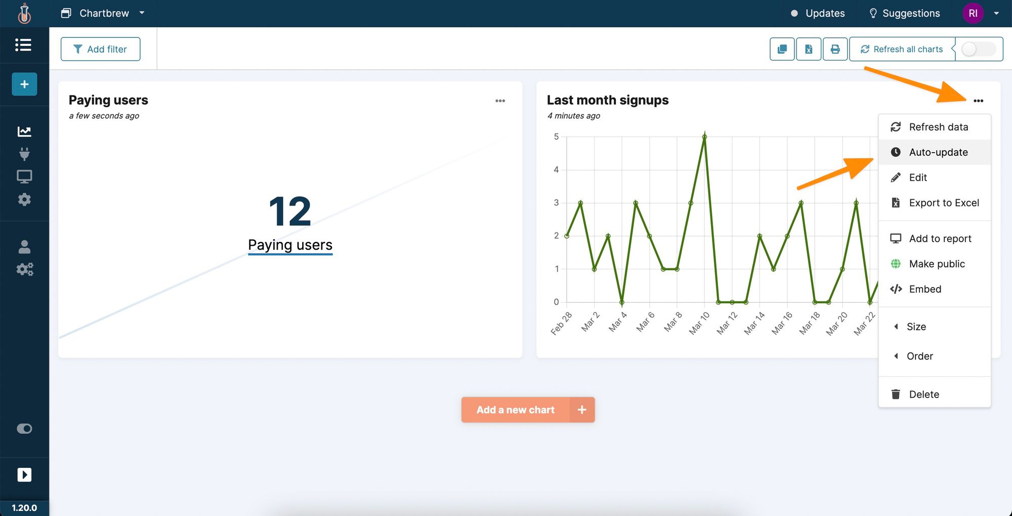
The chart will now show only the users that are created between the selected date interval. In the example above, the chart will always show the users created in the last 30 days. To make sure the data is always up-to-date, Chartbrew can automatically request new data from Customer.io and update the chart in the background.
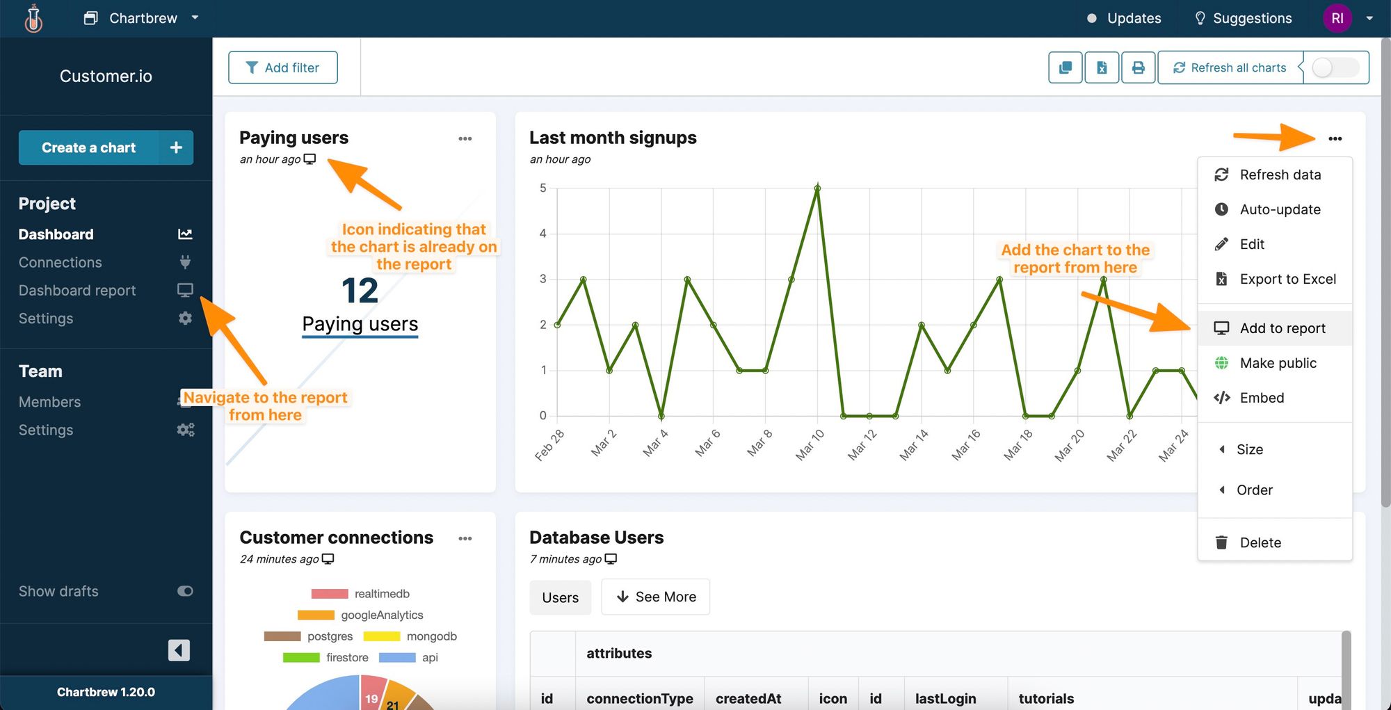
From the dashboard page, we can go to each chart's settings menu to select an auto-update schedule, among other options.
More than keeping the charts up-to-date automatically, Chartbrew offers many other options such as exporting the data, adding charts to client reports, embedding, and sharing the charts with others or on 3rd party sites.
Classify customers based on attributes
In the next example, we are going to create a doughnut chart showing the different types of customers available on Customer.io. The classification will be made using one of the attributes available in the sample data, more specifically, the type of connection customers use with Chartbrew.
Let's create a new chart and configure the data request to get the customers from the desired segments or with any attribute conditions.
Once we get some data, we can start configuring the chart. In this example, we are going to classify the customers based on the "connectionType" field.
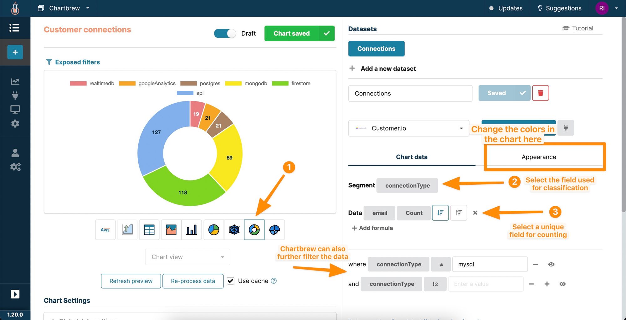
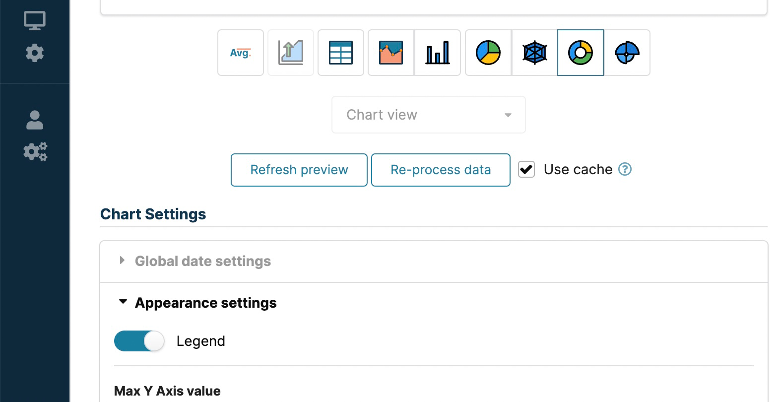
If you want to show the legend on the chart, you can enable this option from the appearance settings.
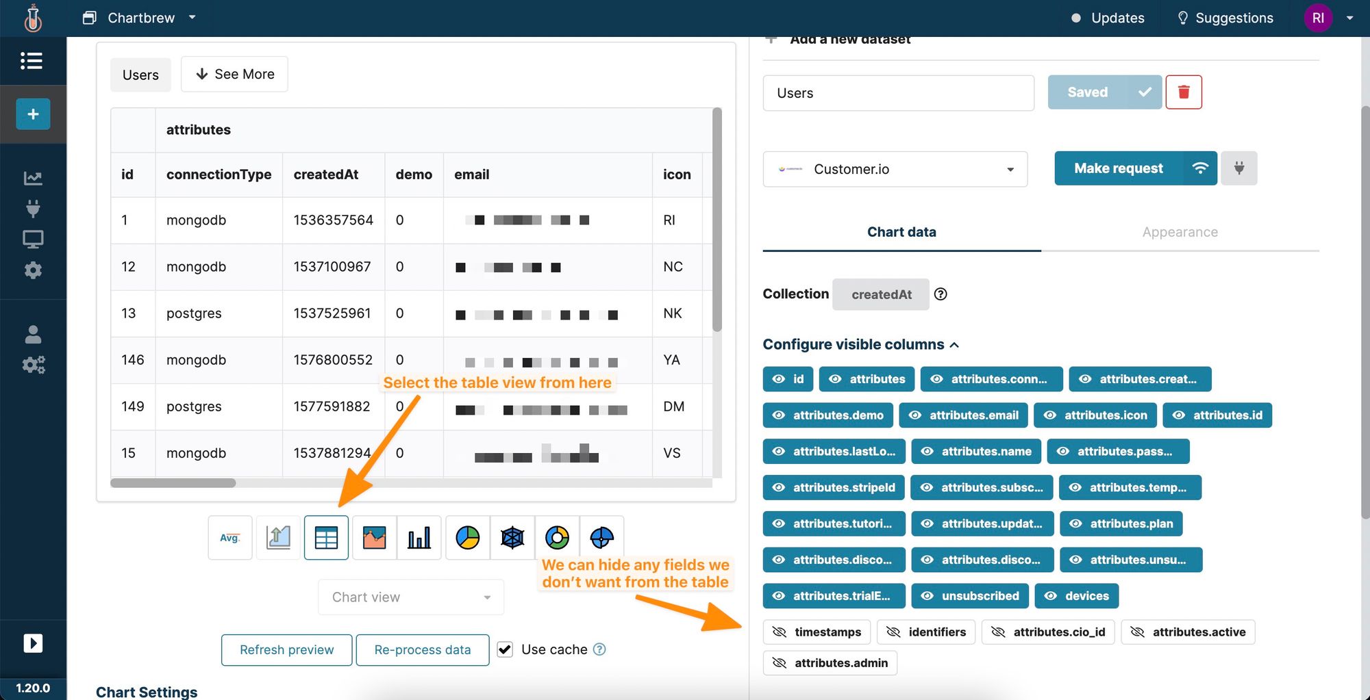
Showing Customer.io data in tables
One last example we are going to cover in this tutorial is showing Customer.io data in a table format. Tables are great for quickly getting a glimpse into customers' attributes. Create a new chart like before and select your desired conditions.
In this example, we are going to show all users that use database connections with Chartbrew. The condition will select all users from 4 different Customer.io segments.
The table view does not require too much configuration. Chartbrew can hide fields from the table, and add further filters for the data, and the table allows sorting by columns as well.
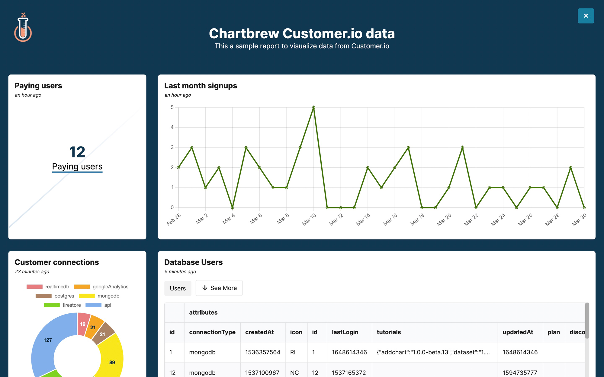
Create a client report from Customer.io charts
Client reports in Chartbrew are useful because they can easily be shared with others and customized to match each company's brand. Let's add all the charts we created to the client report and quickly customize it to make it ready for sharing.
You can learn how to further customize the reports in the tutorial below:
 Razvan Ilin
Next steps
In this tutorial, we covered how to connect to Customer.io to get data, then how to create different visualization types using the Chartbrew chart editor. To get more value and learn how other bits of Chartbrew work, try the following next steps:
- Combine your Customer.io data with visitor stats from Google Analytics, Simple Analytics, or Plausible
- Create dashboard templates so you can easily replicate charts across different Customer.io workspaces
- Customize the client reports matching the company's brand
