Spider Chart
A spider chart, also known as a radar chart or star chart, is a powerful visualization tool that displays multivariate data in a two-dimensional graph. Each variable is represented by an axis radiating from the center, creating a web-like pattern that makes it easy to compare multiple variables across different categories. Spider charts are particularly effective for showing performance metrics, skill assessments, and comparative analysis across multiple dimensions.
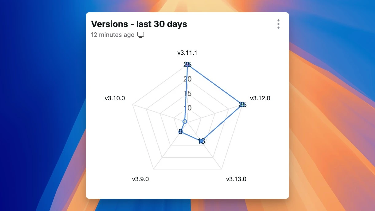
A spider chart in Chartbrew
Understanding Spider Charts
Spider charts excel at visualizing complex multi-dimensional data by displaying multiple variables simultaneously. They effectively demonstrate relationships between different metrics, show patterns across multiple dimensions, represent comparative data clearly, illustrate strengths and weaknesses, and provide intuitive visual comparisons across categories.
Core Components
Visual Elements
The visual structure of spider charts comprises several key elements that work together to create an effective visualization. Axes form the fundamental structure, representing different variables through radial arrangement, with consistent scaling and clear labeling. The grid lines create a web-like pattern that helps in reading values, while the area formed by connecting data points provides a clear visual representation of the overall profile. The center serves as the reference point for all measurements, typically representing the minimum or zero value.
Data Structure
The underlying data structure of spider charts is built on multivariate relationships and value attribution. Each axis represents a different variable or metric, with values typically normalized to a common scale. The data points are connected to form a polygon, creating a shape that represents the overall profile of the data being visualized.
Implementation Best Practices
Design Considerations
Effective spider chart design requires careful attention to various aspects of visual presentation and interaction. The layout should establish a clear hierarchy with balanced distribution of axes and effective use of space, while ensuring readability. Color usage must support category distinction while maintaining visual harmony and accessibility. Interactive features should include hover effects for detailed information, clear data point highlighting, and the ability to toggle between different data series.
Data Organization
Proper data organization forms the foundation of effective spider charts. The structure should maintain consistent scaling across all axes, with logical ordering of variables and clear relationships between metrics. Value handling requires careful attention to normalization, appropriate scale selection, and thoughtful consideration of missing values.
Advanced Features
Enhanced Visualization
Modern spider chart implementations incorporate sophisticated visualization features that enhance user understanding and interaction. Animation capabilities include smooth transitions between states, engaging data updates, and fluid series comparisons. Interactive elements encompass intuitive hover behavior, detailed tooltips, clear selection states, and comprehensive legend controls.
Analysis Tools
Advanced analysis capabilities transform spider charts into powerful analytical tools. These include pattern recognition for identifying trends, comparison features for evaluating different profiles, and filtering options for focused analysis.
Industry Applications
Business Analytics
In business contexts, spider charts effectively visualize various organizational aspects. They excel at representing:
- Employee skill assessments
- Product feature comparisons
- Performance metrics across departments
- Competitor analysis
- Market positioning
Data Analysis
Data analysis applications leverage spider charts for understanding complex data structures. Common uses include:
- Customer satisfaction metrics
- Quality control measurements
- Risk assessment profiles
- Resource allocation analysis
- Project management tracking
How to Create a Spider Chart
Creating an effective spider chart involves several key steps:
-
Data Preparation
- Identify the variables to compare
- Normalize the data to a common scale
- Organize categories logically
-
Design Setup
- Choose appropriate colors and styles
- Set up the radial axes
- Configure the grid system
-
Implementation
- Plot the data points
- Connect points to form the shape
- Add interactive features
-
Refinement
- Add labels and legends
- Implement tooltips
- Ensure accessibility
Implementation Challenges
Technical Considerations
Implementation of spider charts faces various technical challenges that require careful attention. Performance considerations include handling multiple data series efficiently, ensuring smooth rendering of complex patterns, and maintaining responsive interactive features. Compatibility issues involve ensuring consistent browser support and adapting to different devices.
Design Aspects
Design challenges in spider chart implementation require balancing multiple factors. Visual clarity depends on effective label placement, clear axis distinction, readable value representation, and balanced color usage. User experience considerations include ensuring easy interpretation, providing efficient information access, and designing intuitive interactions.
Future Trends
AI Integration
Artificial intelligence is enhancing spider charts through various innovative applications. These include automated insight generation, sophisticated pattern detection, and dynamic updates based on user behavior and data patterns.
Advanced Features
Emerging capabilities are expanding the possibilities for spider chart visualization. New features include 3D visualization options, real-time data updates, and advanced filtering capabilities.
Conclusion
Spider charts are powerful tools for visualizing multi-dimensional data and comparing multiple variables simultaneously. Their intuitive design and interactive capabilities make them particularly effective for exploring complex relationships and understanding patterns across multiple dimensions.
As technology advances, spider charts continue to evolve with new features and capabilities, while maintaining their core strength in clearly communicating multivariate relationships. Organizations that effectively implement spider charts can provide users with powerful tools for understanding and analyzing complex data structures.
Related Terms
- Radar Chart - For alternative visualization
- Data Visualization - For visualization techniques
- Chart - For chart types
