Gauge Chart
A gauge chart is a visualization that displays single values within a predefined range, often used to show key performance indicators (KPIs) or progress toward goals. This intuitive chart type mimics physical gauges, making it particularly effective for displaying metrics that have target ranges or thresholds.
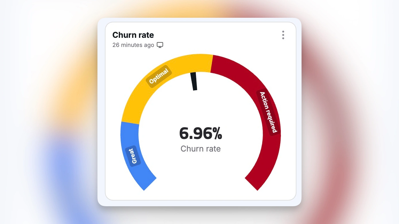
A gauge chart in Chartbrew
Understanding Gauge Charts
Gauge charts serve as powerful tools for visualizing performance metrics and progress indicators. According to Data Visualization Society, gauge charts can improve metric comprehension by up to 25% compared to simple numerical displays. Their familiar design, reminiscent of speedometers and other physical gauges, makes them immediately accessible to diverse audiences.
The impact of gauge charts extends beyond simple metric display. They provide instant visual feedback about performance relative to goals, help identify areas needing attention, and facilitate quick decision-making. Through thoughtful implementation, gauge charts can effectively communicate complex performance data in an easily digestible format.
Core Components
Visual Elements
The fundamental elements of a gauge chart work together to create clear and meaningful visualizations. Essential components include:
- Base structure: Dial or arc forming the chart foundation
- Value indicator: Needle or pointer showing current measurement
- Scale markings: Clear reference points for value interpretation
- Value display: Prominent numerical representation
- Color zones: Visual ranges indicating performance levels
- Labels and units: Clear context for measurement interpretation
These elements combine to create an intuitive and informative visualization that users can quickly understand.
Design Principles
Effective gauge chart design follows established principles that enhance understanding. Clear value ranges provide context for measurements, while intuitive color coding helps users quickly interpret performance zones. Typography choices ensure readability of values and labels, supported by appropriate scale divisions that match the metric's nature. Strong visual hierarchy guides attention to the most important information, while contextual indicators provide additional meaning. When implemented in data dashboards, these principles ensure effective communication of performance metrics.
Implementation Best Practices
Metric Selection
Gauge charts work best with specific types of metrics that benefit from their unique visualization style. The most effective applications include:
- Performance indicators: KPIs and critical metrics
- Progress tracking: Goals and completion rates
- Resource monitoring: Utilization and capacity levels
- Threshold compliance: Standards and limits
- Status indicators: Health and condition metrics
The effectiveness of gauge charts in these scenarios stems from their ability to show both current values and contextual ranges simultaneously.
Visual Design
The visual design significantly impacts a gauge chart's effectiveness. Color schemes must align with data meaning, conveying status and urgency appropriately. Scale intervals should match the metric's natural divisions, while label placement ensures clear readability without cluttering the display. Proportions need careful balancing to maintain visual appeal, supported by sufficient white space and background contrast. When combined with real-time data visualization, these design elements create dynamic and informative displays.
Advanced Features
Interactive Elements
Modern gauge charts leverage interactivity to enhance their utility and user engagement. Hover details provide instant access to precise values and contextual information, while click-through capabilities enable deeper data exploration. Dynamic updates ensure real-time accuracy, complemented by smooth animation effects that make changes easily noticeable. Threshold alerts provide immediate notification of critical changes, and comparative views enable quick performance assessment against benchmarks or historical data.
Customization Options
The flexibility of modern gauge charts is evident in their extensive customization capabilities. Multiple ranges can be defined to represent different performance zones, while custom colors enable clear visual communication of status. Variable scales accommodate different measurement needs, and format options ensure data is presented appropriately for its context. Animation settings can be fine-tuned for optimal user experience, while flexible layouts enable seamless integration into any dashboard design.
Best Practices
Data Presentation
Effective data presentation in gauge charts relies on careful attention to detail and context. Clear value context helps users understand the significance of measurements, while appropriate precision ensures accuracy without overwhelming detail. Unit clarity prevents misinterpretation, and target indication provides immediate performance context. Trend visibility helps identify patterns over time, while alert thresholds enable quick identification of critical conditions.
Performance Optimization
Optimizing gauge chart performance involves balancing multiple technical considerations. Rendering efficiency ensures smooth visual updates, while appropriate update frequency maintains data accuracy without overwhelming system resources. Memory usage is carefully managed to maintain dashboard responsiveness, and animation smoothness creates a professional user experience. Load time optimization and quick response speed ensure that users can access critical information without delay.
Advanced Applications
Dashboard Integration
The integration of gauge charts into dashboards requires thoughtful consideration of several key factors. Layout placement ensures optimal visibility of critical metrics, while size optimization balances detail with space efficiency. Color harmony maintains visual consistency across the dashboard, and update frequency is coordinated with other components. Interaction design ensures intuitive user experience, while mobile responsiveness enables access across all devices.
Multi-metric Display
Advanced gauge chart implementations often combine multiple metrics to provide comprehensive insights. Nested gauges can show hierarchical relationships, while side-by-side comparisons facilitate direct metric evaluation. Hierarchical displays organize metrics by importance or relationship, and related metrics are grouped for context. Trend indicators show performance over time, while composite scores combine multiple factors into single measurements.
Industry Applications
Business Analytics
In business analytics, gauge charts serve as powerful tools for monitoring key performance indicators. Sales performance metrics provide immediate insight into revenue generation, while budget utilization tracking ensures resource efficiency. Resource capacity monitoring prevents bottlenecks, and project progress tracking enables timely intervention when needed. Quality scores highlight areas needing improvement, while efficiency ratings identify optimization opportunities.
System Monitoring
IT operations teams rely on gauge charts for real-time system monitoring. Server health indicators provide immediate status updates, while network performance metrics ensure optimal connectivity. Storage capacity monitoring prevents data management issues, and CPU utilization tracking helps maintain system performance. Memory usage monitoring enables proactive resource management, while response time tracking ensures service level compliance.
Future Trends
AI Integration
The integration of artificial intelligence is transforming gauge chart capabilities. Predictive indicators enable proactive decision-making, while anomaly detection identifies potential issues before they become critical. Dynamic thresholds adjust automatically based on historical patterns, and pattern recognition enables sophisticated trend analysis. Automated alerts provide intelligent notification of significant changes, while performance forecasting helps anticipate future needs.
Advanced Visualization
The evolution of visualization technology is expanding gauge chart possibilities. 3D rendering creates immersive data experiences, while AR/VR integration enables new ways of interacting with metrics. Voice interaction and gesture control provide natural user interfaces, while real-time analytics enable immediate insight generation. Contextual adaptation ensures that visualizations remain relevant and effective across different use cases and environments.
Conclusion
Gauge charts represent powerful tools for visualizing performance metrics and progress indicators. Success in implementation requires careful attention to design principles, metric selection, and user experience. Through thoughtful application of best practices, organizations can create effective gauge visualizations that drive better understanding and decision-making.
