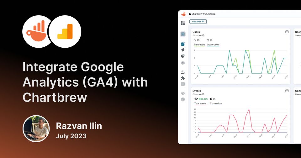
Integrate Google Analytics (GA4) with your Chartbrew dashboards
This tutorial will show how to connect Google Analytics to your Chartbrew dashboards and create visualizations from your GA4 properties. Chartbrew features pre-made charts that can be made in just a few clicks and a more advanced editor to get the most out of the integration.
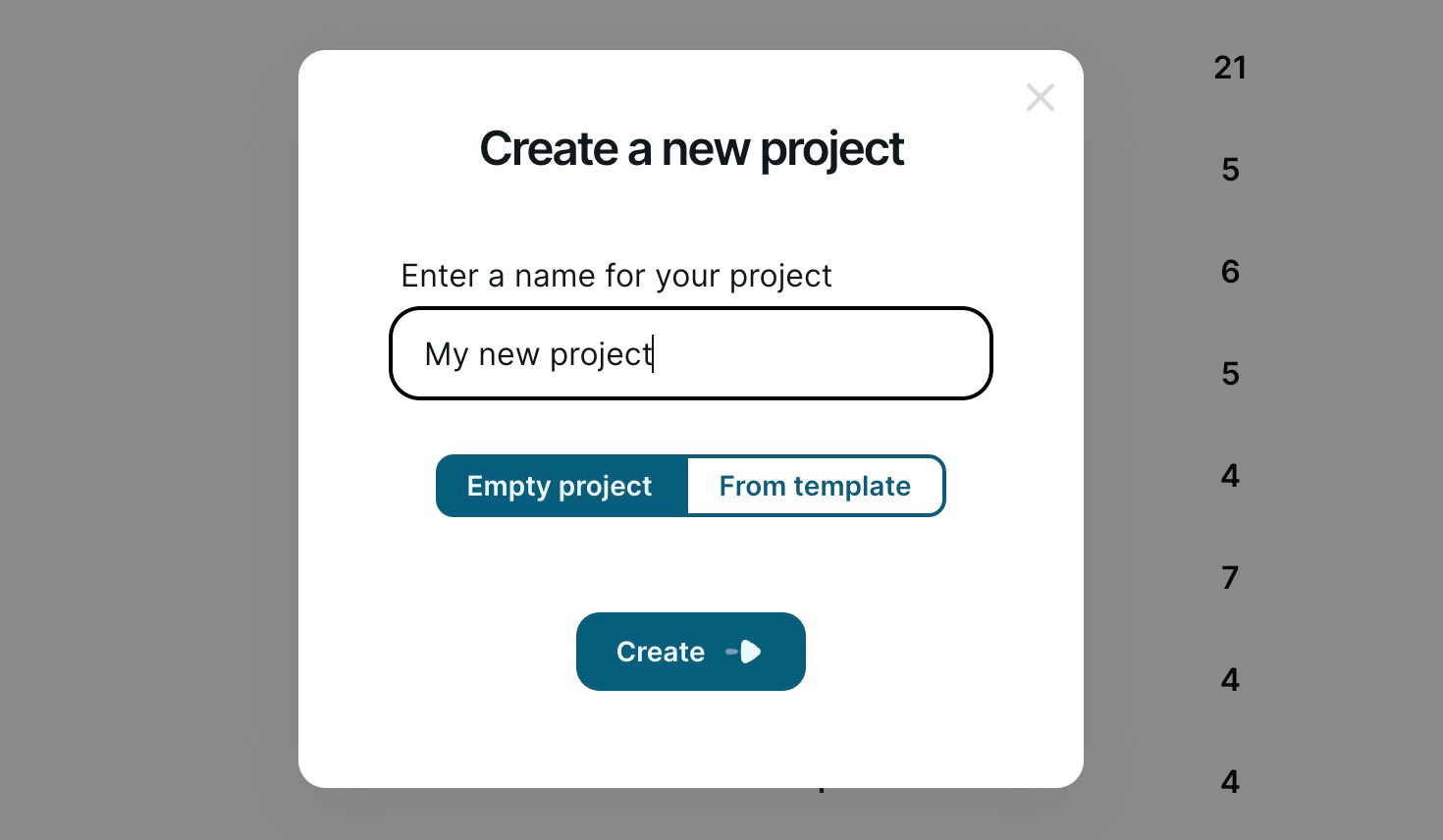
Create a Chartbrew project
If you create your first project in Chartbrew, feel free to follow the onboarding that will guide you in selecting the connection type you want to start with.
If you already have Chartbrew projects and you want to create a new one, you can do so from your main dashboard. Create a new project and let's get started!
Create your first Google Analytics charts
Click on the Connections menu once you enter your Chartbrew project and select the Community Templates tab as shown in the screenshot below:
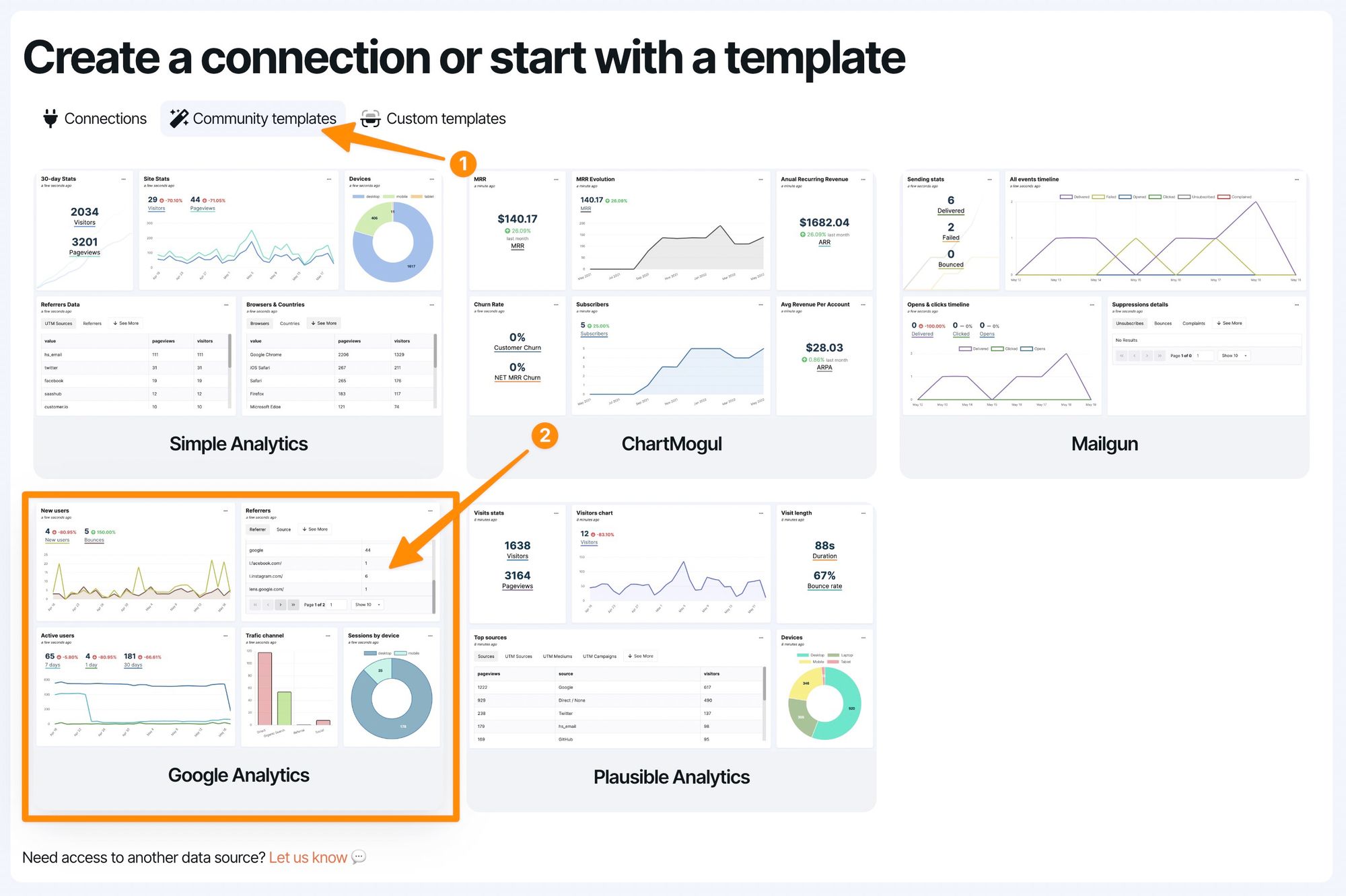
Once you select the Google Analytics option, you can enter any name for it so you can identify it later on. Click on the Authenticate with Google button and proceed with the authentication procedure. Please note that you will have to select the Google account that owns the GA properties you want to connect to.
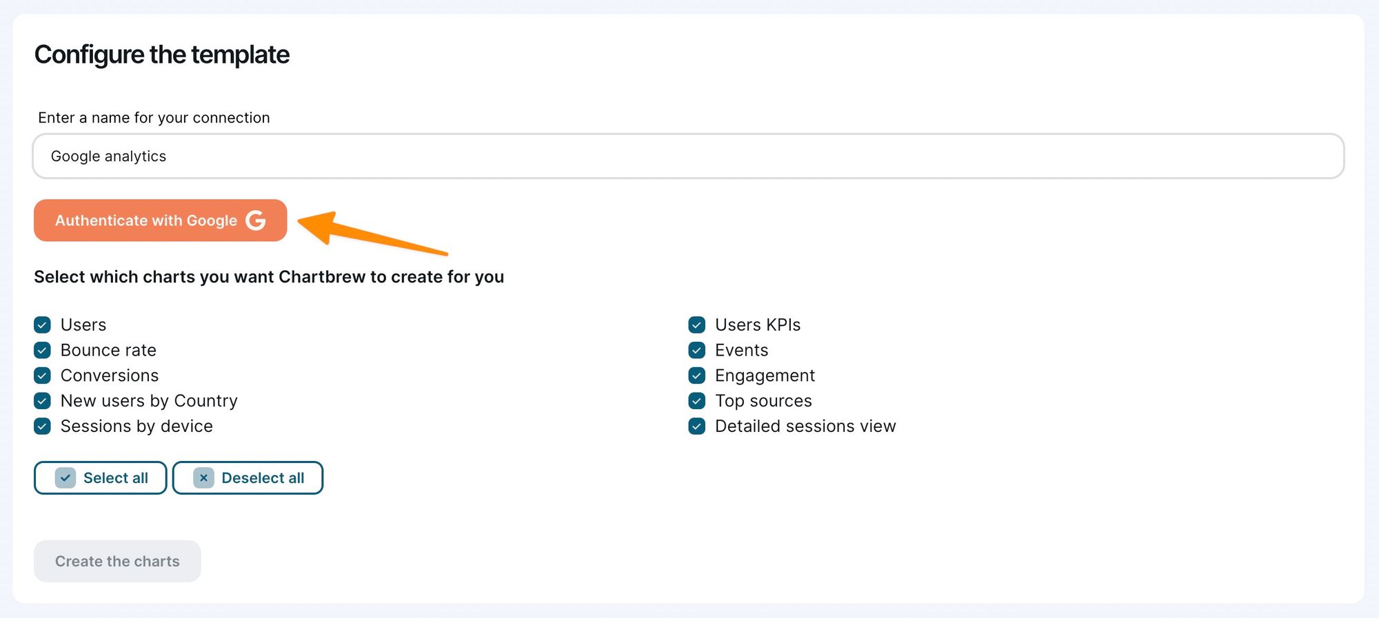
Once you finish the authentication, you will be redirected back to the same screen, but this time you can choose the account and property you want to connect to and the visualizations you want to create.
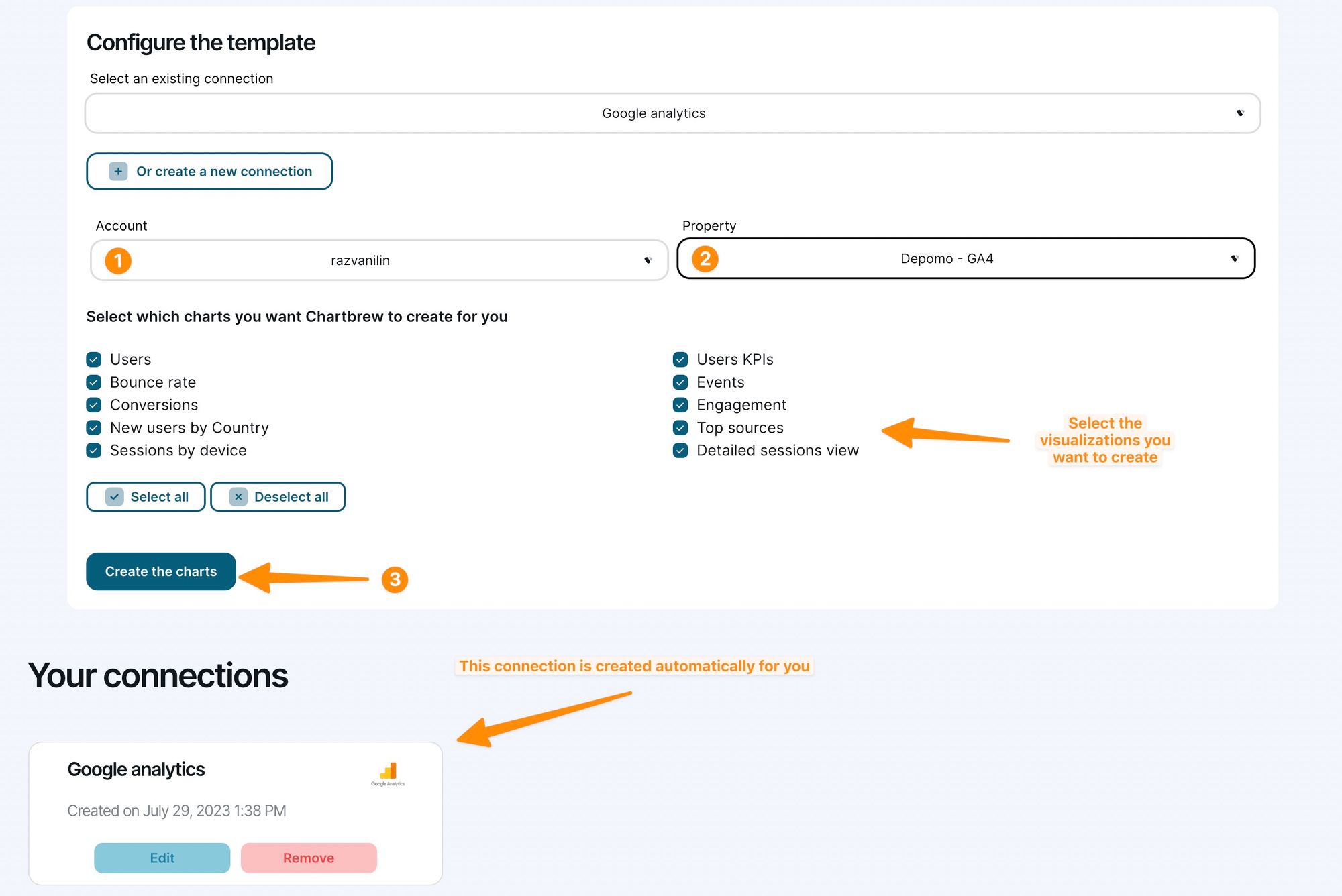
Clicking on the Create button will trigger Chartbrew to automatically create the selected visualizations. The charts might not load properly on the first try since the data might come a bit slower from Google Analytics. Just refresh the page again after a few seconds and the data should be in.
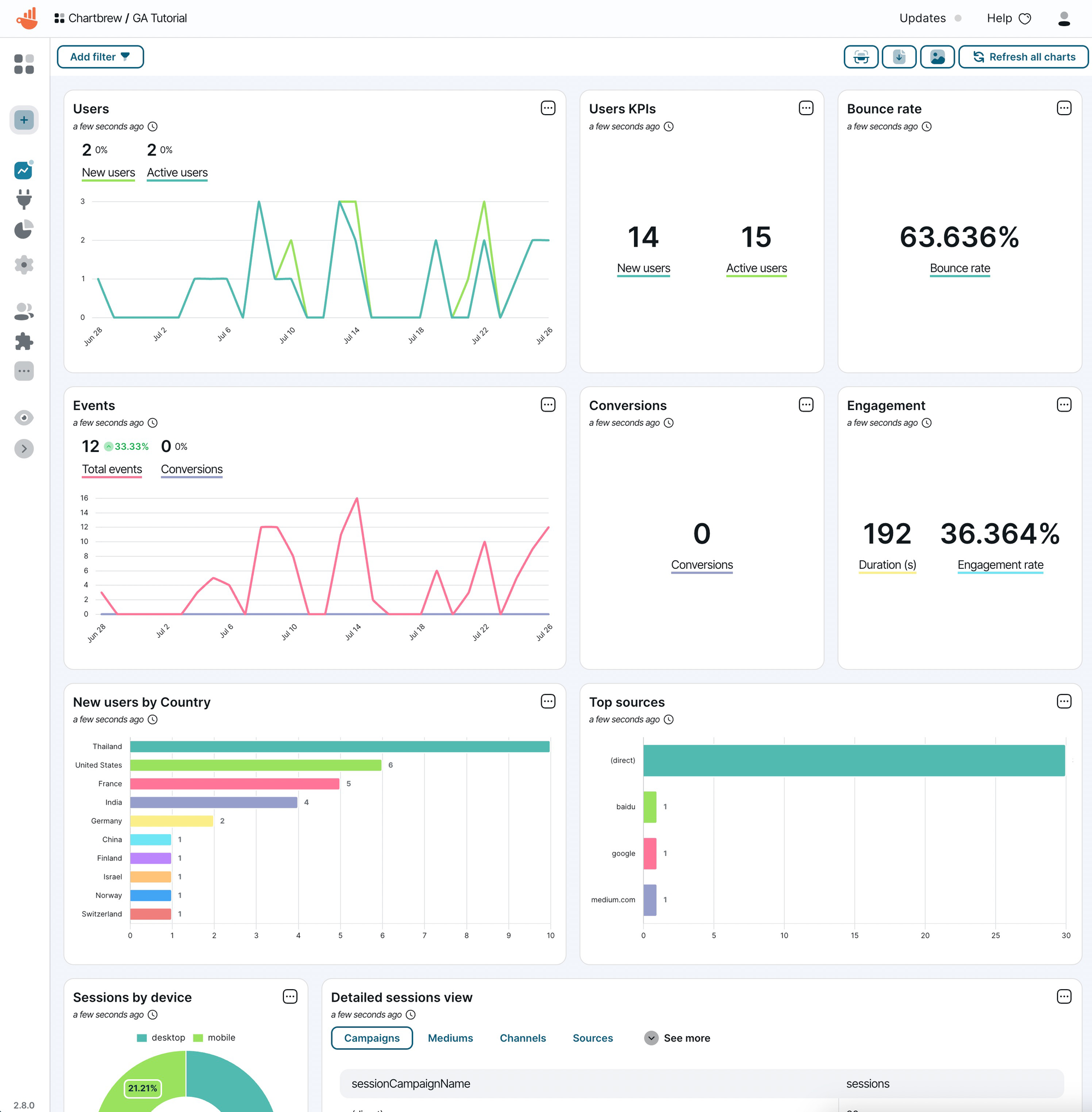
Your new dashboard is all set up with the pre-made charts now. These charts are set to automatically update every day, but you can customize the way they look on the dashboard and how frequently you want them to update.
Create custom charts from Google Analytics
To access the full potential of the Google Analytics integration, Chartbrew features a chart editor that lets you choose the desired metrics and dimensions you want to use for creating visualizations. The best place to look for examples is to check out the charts from the template to see how they are configured. But in this tutorial, we will go step by step on how to create a chart.
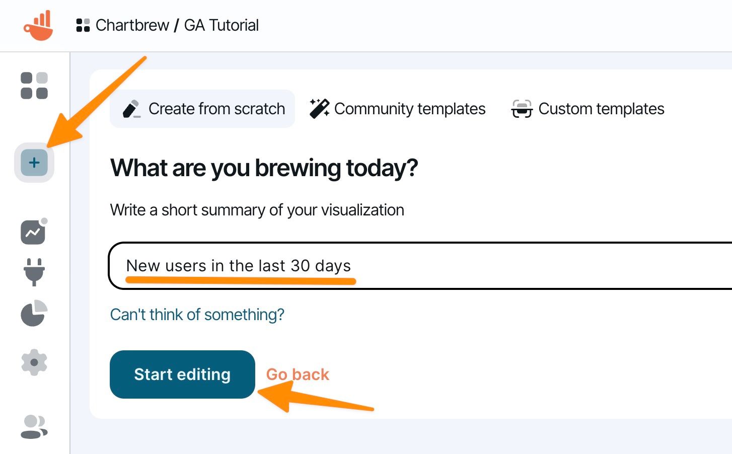
Let's start by creating a new chart in your dashboard. In this example, we will create a time series chart showing the new users in the last 30 days.
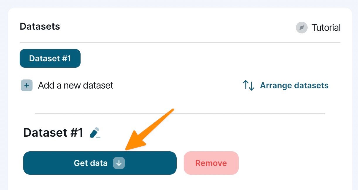
Click on the Add a new dataset button to get started, then press the Get Data button as shown below:
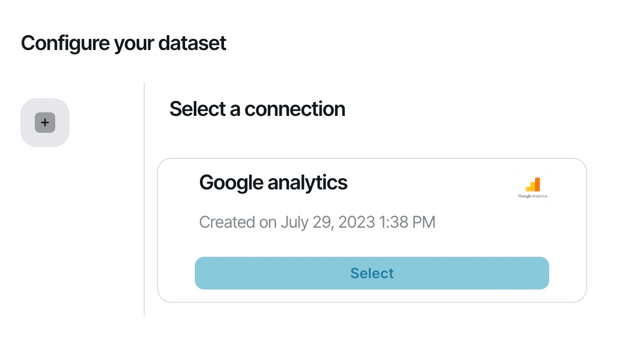
Next, select your Google Analytics connection from the list. If you have multiple connections in your project, make sure you select one that connects to your desired Google Analytics account.
The query builder will appear with quite a few options to choose from. First of all, you will have to select the account, then the property you want to get data from. The metric option will determine what type of data you want to get from your property.
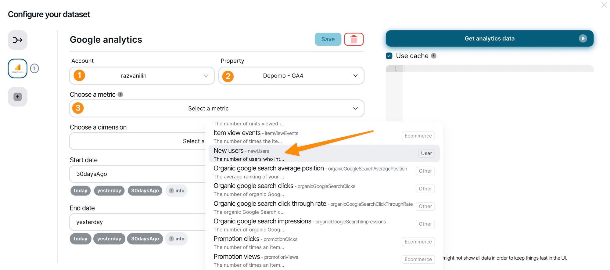
The dimension field will determine how this data is formatted or grouped. If you leave the dimension field empty, GA will return the total metric value for the determined period. The Start date and End date will tell GA for what period it should return data. You can use relative dates as shown in the UI, or exact dates in the YYYY-MM-DD format.
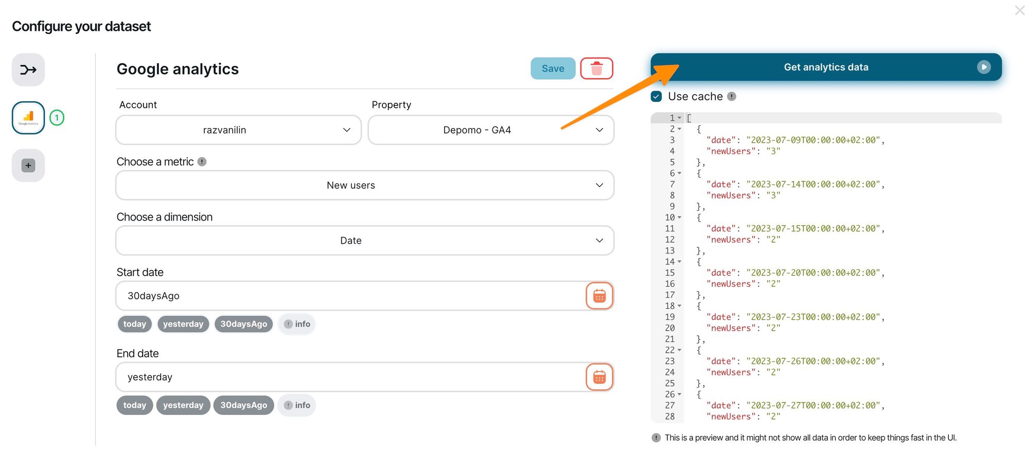
After you are happy with the selection made in the query builder, press the Get analytics data button to get the data from GA. The right window will be populated with sample JSON data for a quick preview (the data is usually truncated here to protect your browser from storing too much data in the memory).
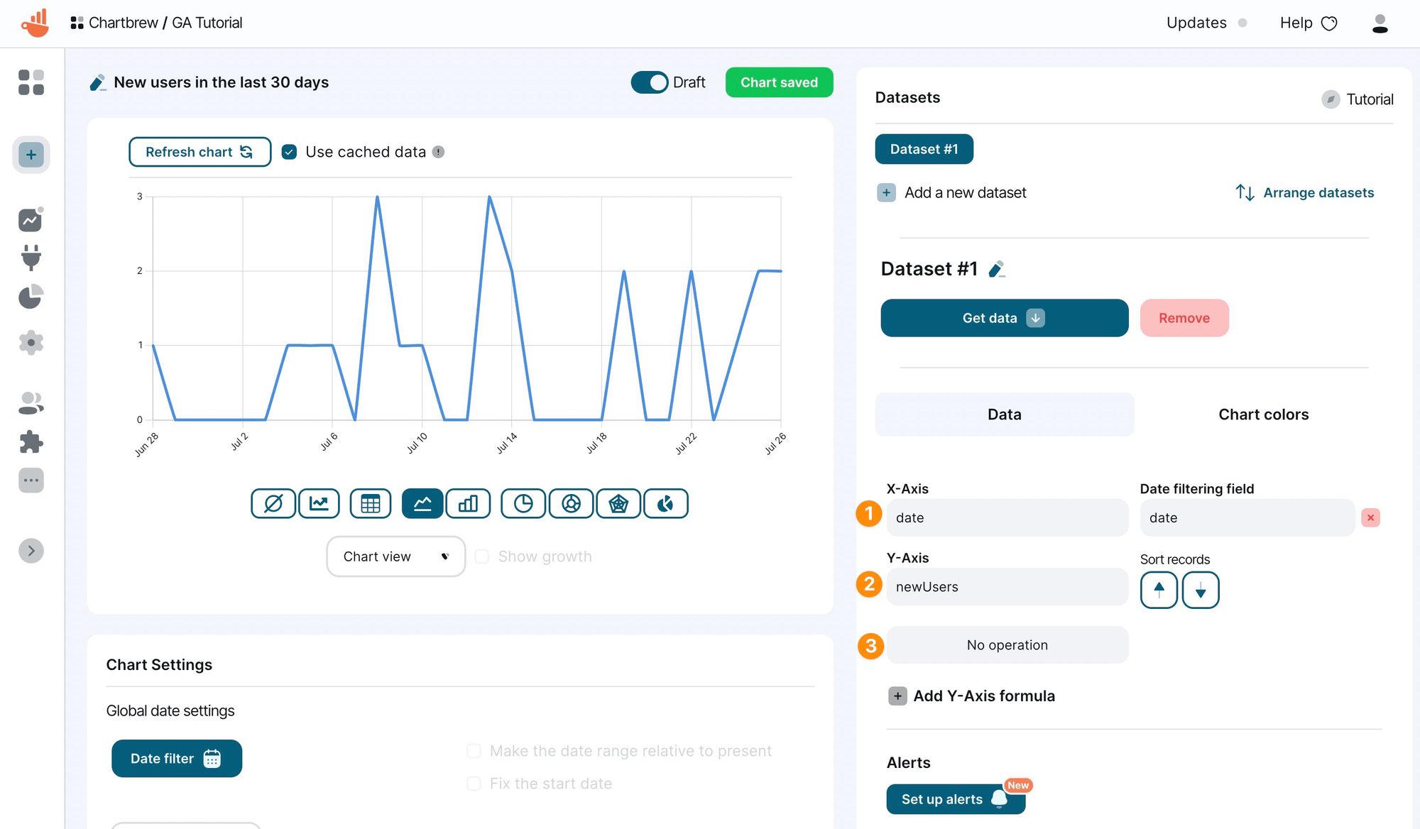
You can then click on the Build the chart button to get back to the editor and you will most likely see a chart is already made for you. Chartbrew will try to select the right fields for you, but you can modify these as you see fit. In the example below, we had to change the count operation to no operation to get the desired result. Now we have a time series chart showing the new users in the last 30 days.
Next steps
This tutorial was focused on how to create charts from the Google Analytics integration, but there are so many other things you can do with Chartbrew. You can get most of the value from the platform when you integrate all your services and create a live dashboard that always updates with fresh data.
- Check what other integrations that you can use with Chartbrew
- Create public reports and share them with others
- Create your templates and easily replicate them in different projects
