How to visualize your MongoDB data with Chartbrew
This tutorial will walk you through the how-to process and show you real examples of charts that you can interact with right here in this blog post. All the charts are generated from a sample database hosted on MongoDB Atlas. Let's get started!
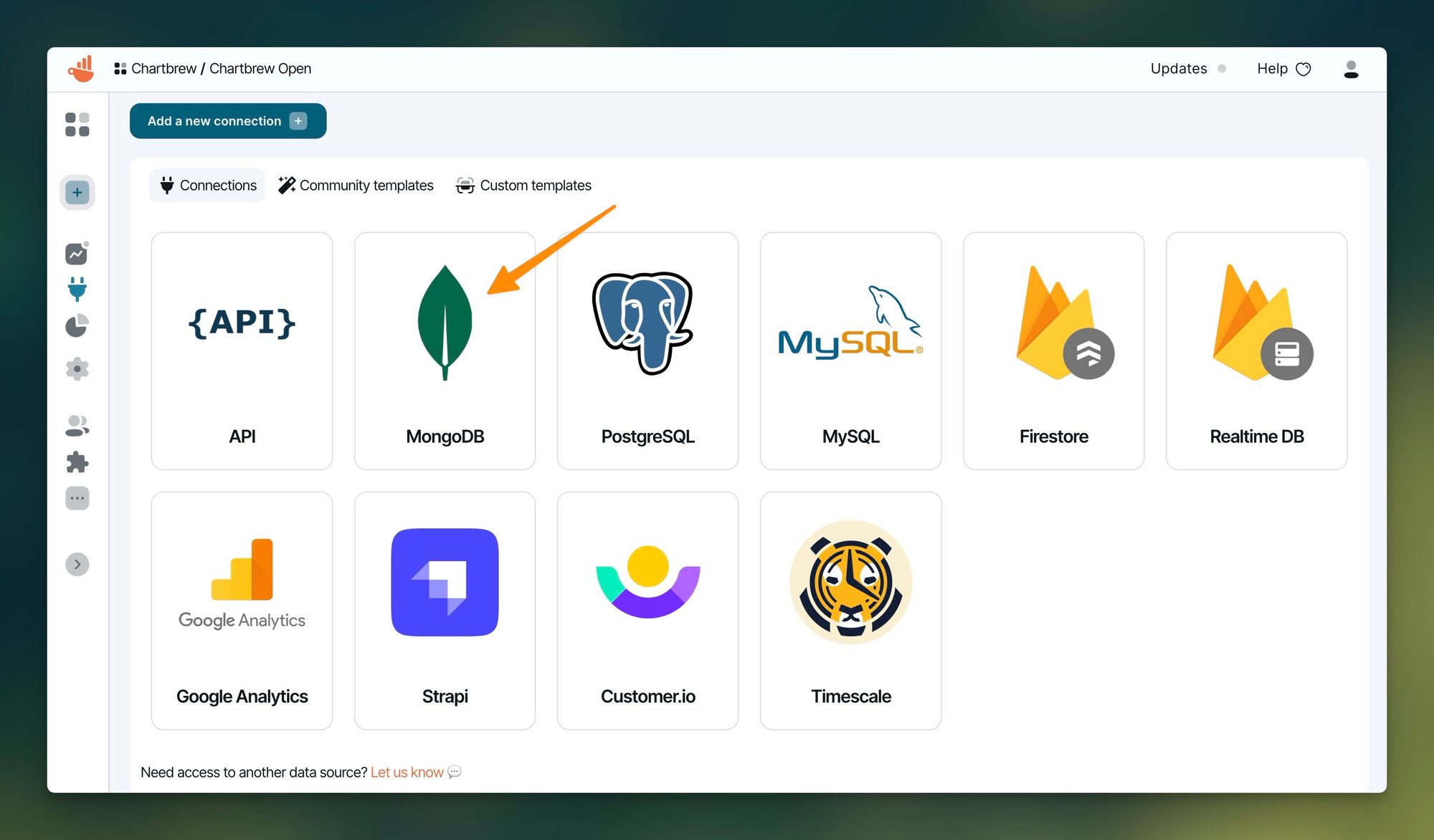
Connecting to your database
Select the MongoDB connection from the list on the connection page:
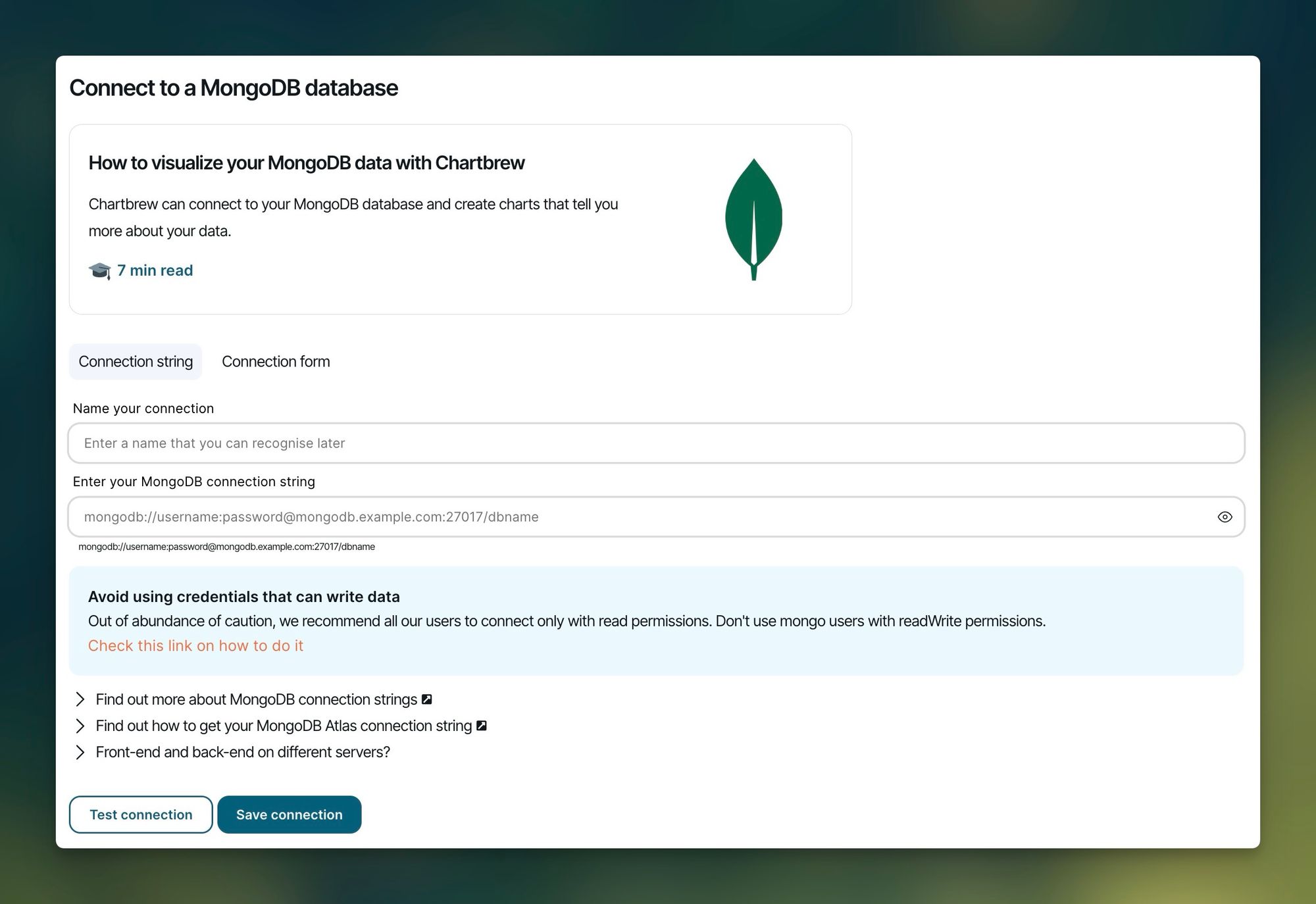
The next step is to enter the connection details for your MongoDB database. It can be different depending on where you host your database, so we are going to look at three different use-cases below:
- VPS (for example, DigitalOcean, Hetzner, Vultr)
- Heroku with ObjectRocket
- MongoDB Atlas
MongoDB hosted on a VPS
You might have a DigitalOcean droplet or your server rack in the closet and you are running your MongoDB database from there. For starters, it is recommended to create a new user with read-only access to your database. Log in to your database using the mongo command and create a new user like below:
use <your_db_name>
db.createUser(
  {
    user: "chartbrewUser",
    pwd: passwordPrompt(),  // or cleartext password
    roles: [{ role: "read", db: "<your_db_name>" }]
  }
)
Official MongoDB resource about creating users
Now that we have the new user, we can determine the connection string that we can use to query for the chart data. The string has the following format:
mongodb://chartbrewUser:<chartbrewUser_password>@mongo.example.com:27017/<your_db_name>Enter this connection string in the Chartbrew form above and proceed to test the connection. If successful, press Save connection and jump to the next step in the tutorial.
You might need to allow remote connections to your database so that Chartbrew can reach it. Please read the article below that explains all the steps you need to know about allowing remote connections. Chartbrew's IP address from which the queries are made is: 89.39.106.86
 Mark Drake
MongoDB with ObjectRocket on Heroku
Using the ObjectRocket dashboard you can create a new user for your database. Ensure this user has read-only access to your database so that there is no risk of modifying the data in any way.
You can open your database dashboard using Heroku's CLI tool:
heroku addons:open ormongoOnce you have your new user or if you want to use an existing one, you can get your connection string with the following command:
heroku config:get ORMONGO_RS_URLThe command above will print a string in your terminal. Copy this and place in the Chartbrew connection form. Also, double-check to see if the user credentials are correct and they are from a read-only user. The final connection string should look similar to the following:
mongodb://chartbrewUser:[email protected]:12345/example_db?ssl=trueMongoDB on Atlas
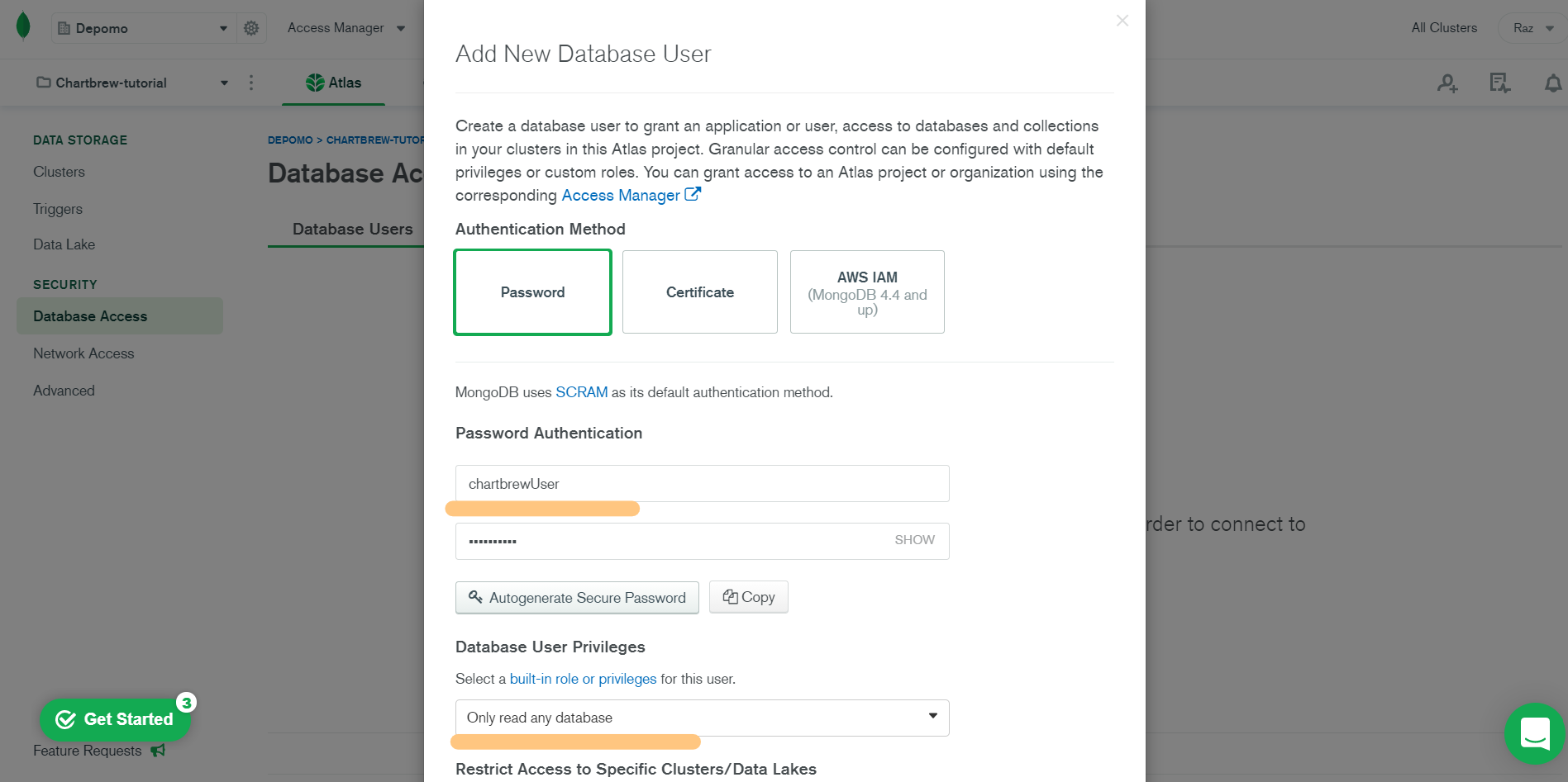
Before we start, let's make sure we have a read-only user for your cluster that we can use with Chartbrew. Head over to your Atlas dashboard and create a new user from the Database Access section:
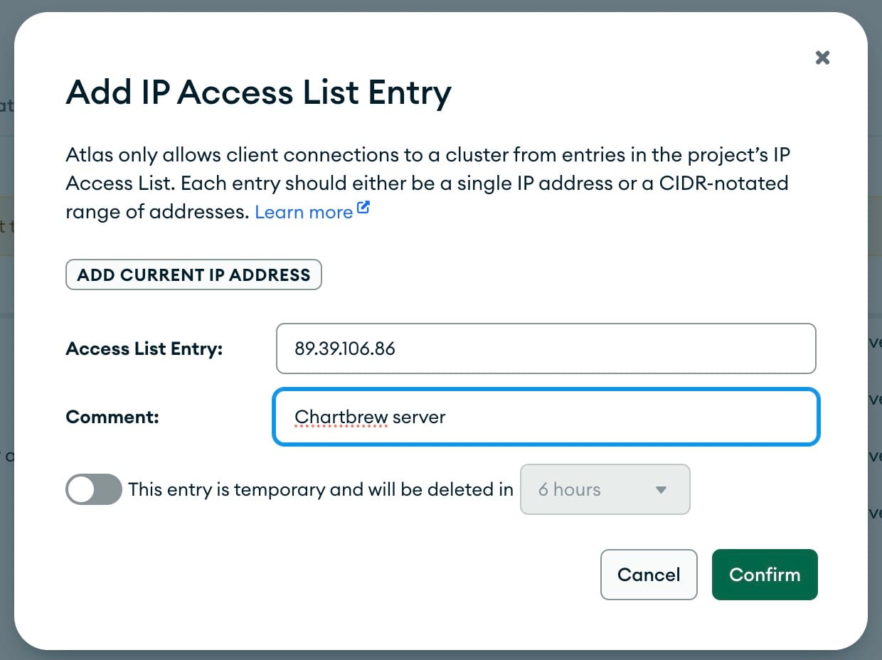
Next up, we want to make sure that Chartbrew can access your MongoDB database. This can be done by whitelisting Chartbrew's IP address from the Network Access section in your Atlas dashboard. The IP address you have to enter there is 89.39.106.86
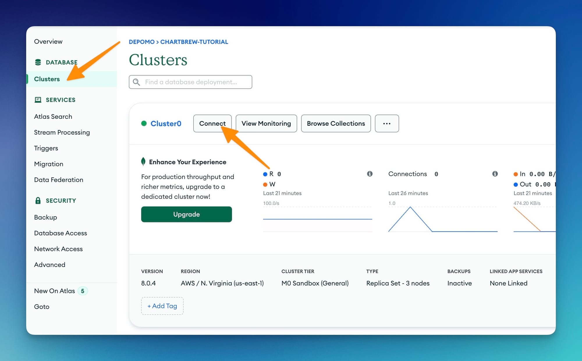
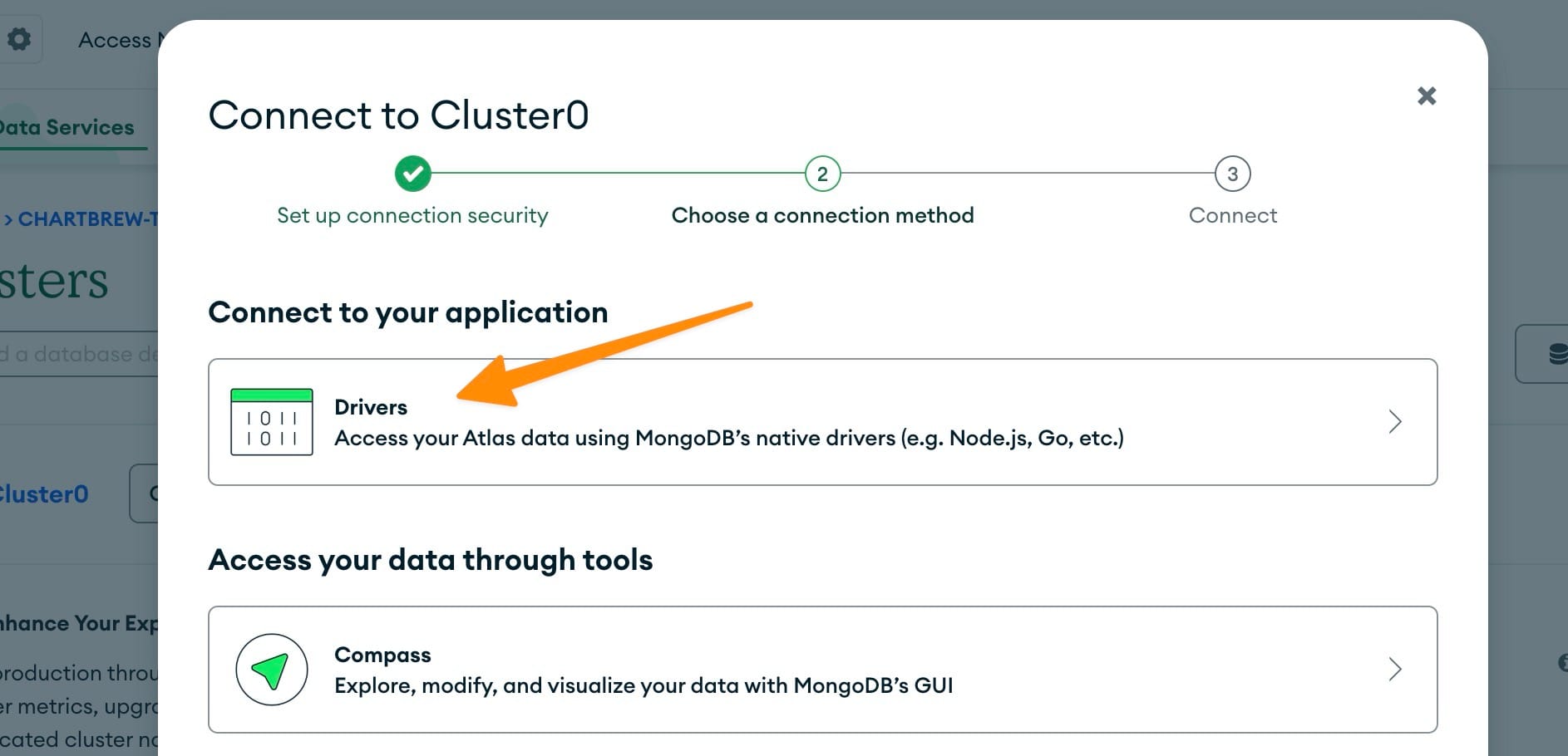
After we have the user and the network configuration in place, we can proceed to get the connection details:
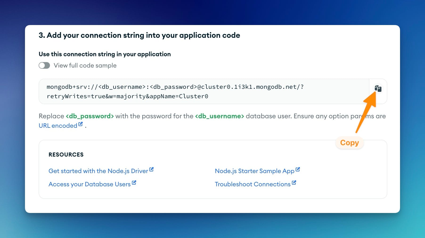
Now that we have the connection string, we need to change it to contain the correct username, password, and database name. Copy this string in Chartbrew's connection form and test the connection.
Testing the MongoDB connection
Once you have your connection string by following one of the methods above, you can test the connection directly in Chartbrew. Replace the username, password, and database name with your own. When done, test your connection to see if it works. Take a look at the screenshot below to see what it looks like when the connection is successful:
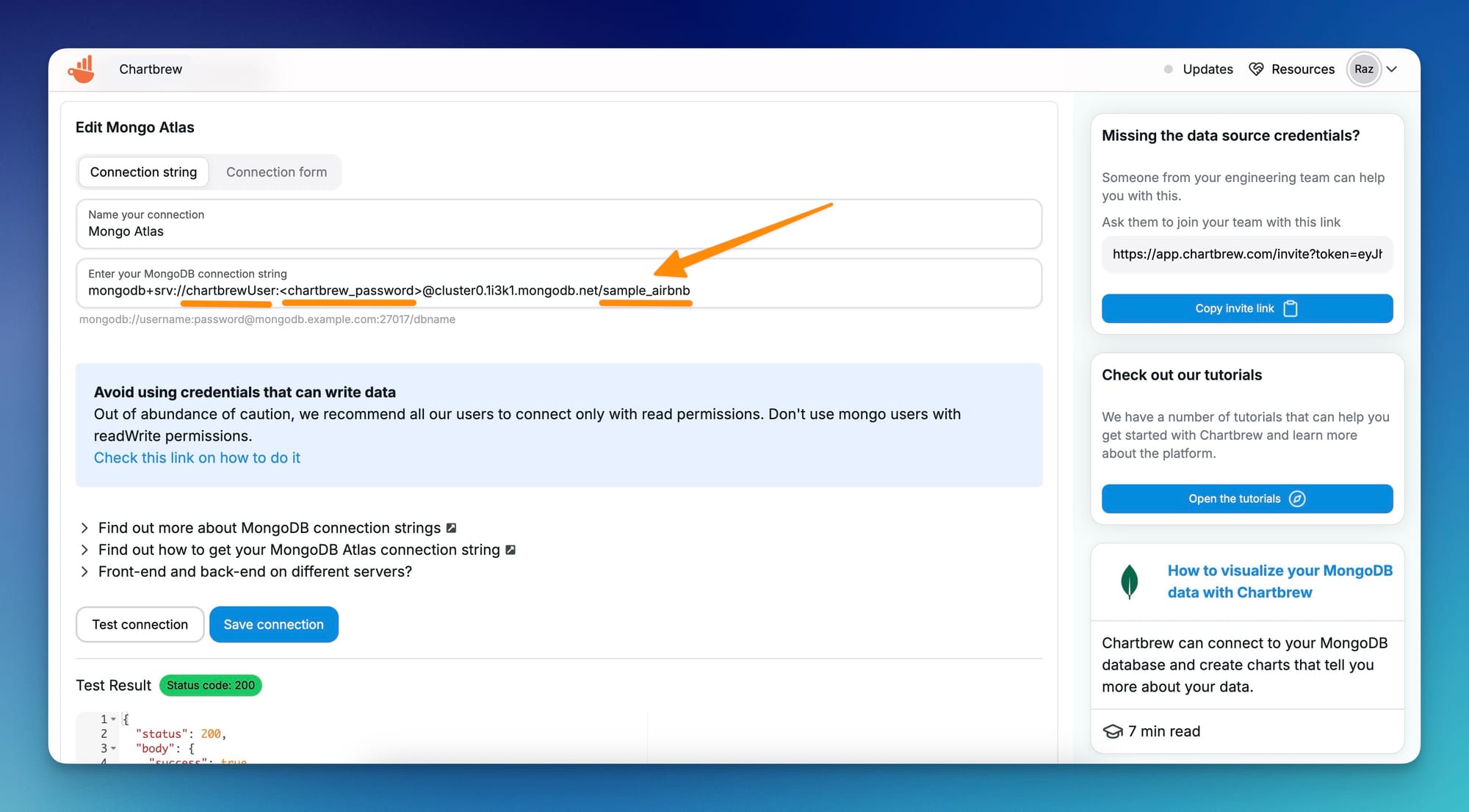
Once the connection is successful, press the Save Connection button, and we can create the first dataset!
Creating your first MongoDB chart
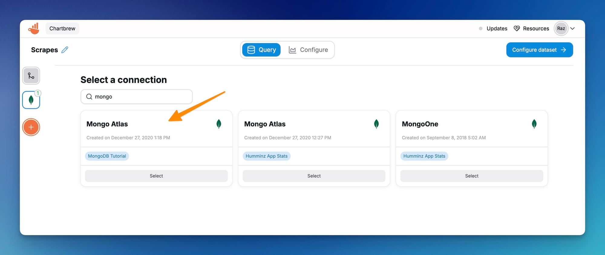
When you save the connection, Chartbrew is going to ask you to create a new dataset. You can choose that option or, alternatively, you can create a new dataset from the Dataset menu on the homepage.
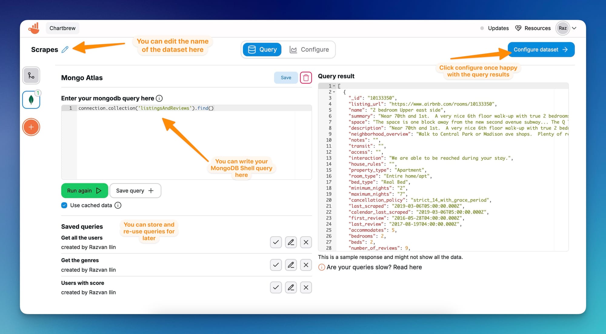
For this tutorial, the data comes from the sample data provided by MongoDB Atlas containing AirBnB dummy data.
A new dataset will require a connection where it pulls data from. Select the new connection we just created.
Once you select the connection, you will be redirected to the query screen. You will have to use MongDB Shell syntax to query data from your connection. You can test queries and preview the results in JSON format on the right side of the page.
On this page, you can also save queries that you can re-use at a later time for another dataset. This is useful if you have more complex queries that you need to tweak slightly for other datasets.
Once happy with the results, click on the Configure dataset button to prepare it for visualization.
When configuring a dataset, the most important parts are the Dimension, Metric, and chart types. In our examples, we are going to count unique IDs grouped by date defined in the last_scraped field.
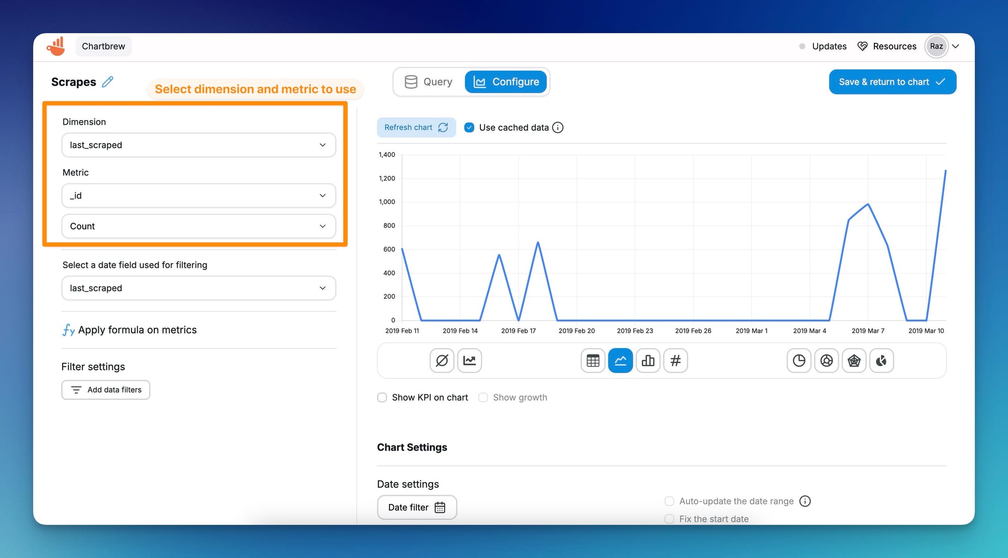
There are even more options to customize colors, set up alerts, and much more once we create a chart in one of our dashboards. If you're happy with the settings, press on the Complete Dataset button and you will be asked if you want to create a chart from your dataset in one of your dashboards. You can also choose to do this later--your dataset will be saved nonetheless.
Creating KPI charts
Key Performance Indicator (KPI) charts are useful when you want to see a quick view of your product or business metrics. You might want to see the total number of users, what's your revenue, or how many people engaged with your newsletter. In Chartbrew, you can create these types of charts.
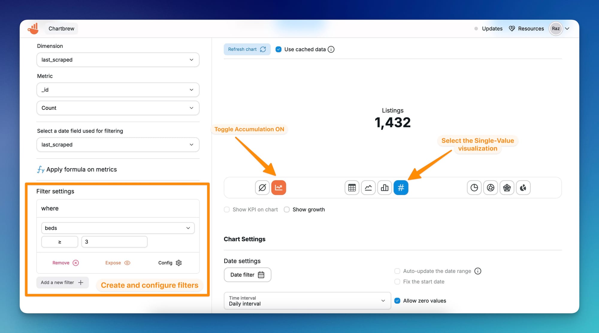
The previous chart was a time series from the sample data showing when data was scraped. For the KPI chart, we are going to show how many of these have at least 3 beds.
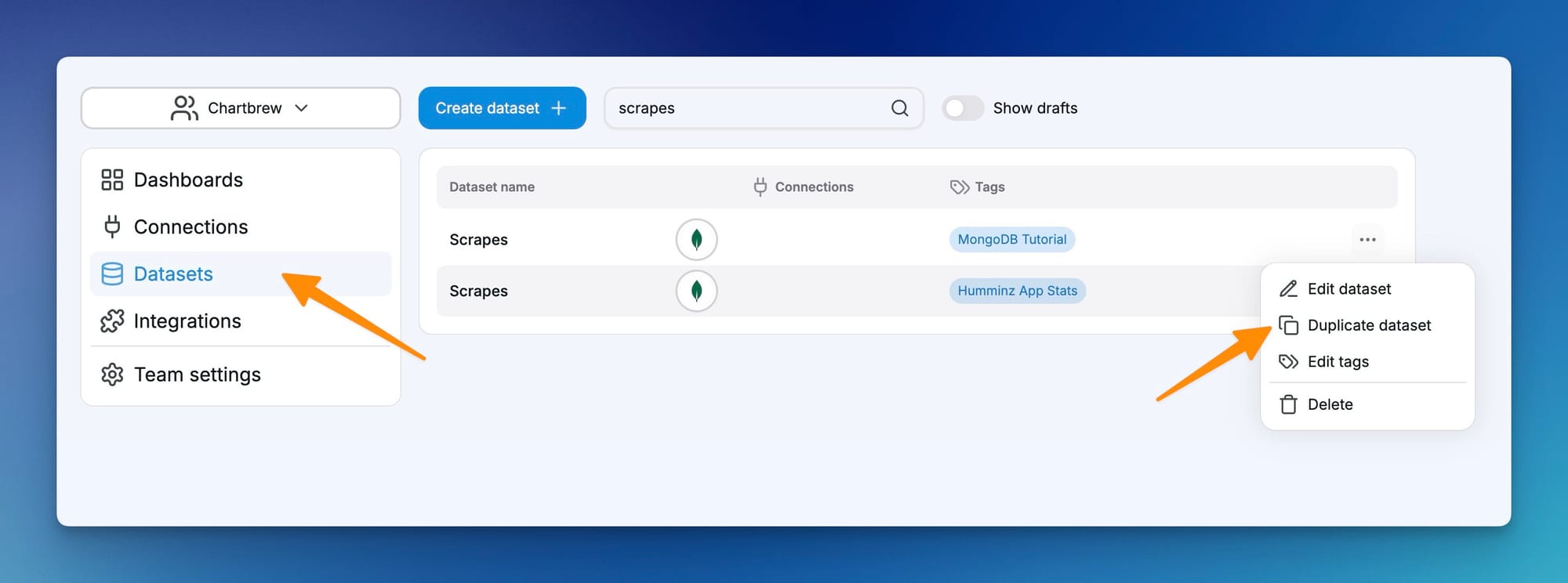
To do this, we have to create a new dataset. You can start from the previous settings by duplicating the previous dataset.
In the dataset settings screen, we create a new filter on the beds field check for all listings with a value of 3 or higher.
Since technically, Chartbrew still displays this data as a time series, we can turn on Accumulation on the chart and set its type to Single value KPI.
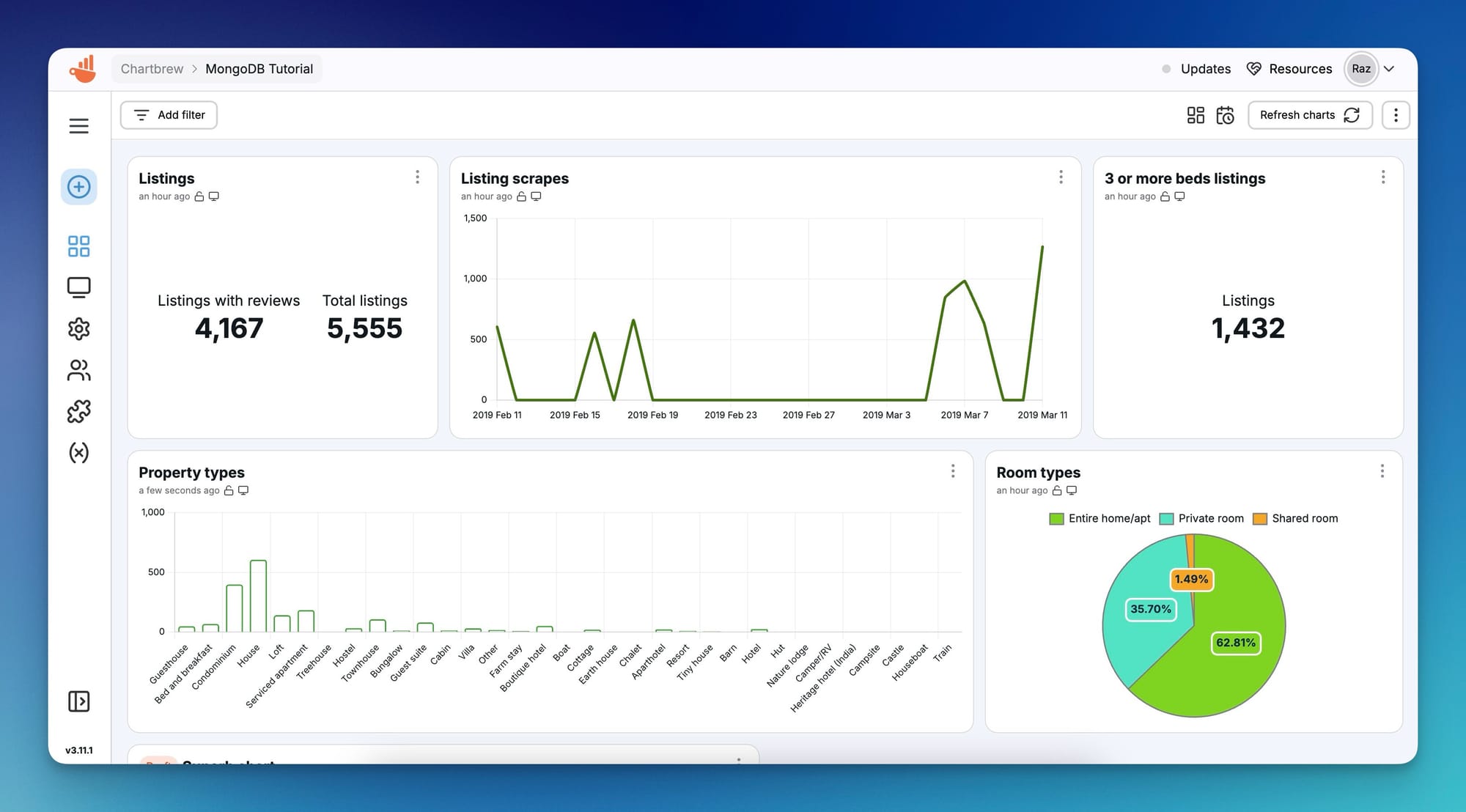
MongoDB visualization dashboard
For the final result, we can head over to the Dashboard to see our charts. Take a look at the screenshot below to see the charts we created in this tutorial, plus some extra ones to get more insights.
Next steps
In this tutorial, we went through how to connect your MongoDB database to Chartbrew through different means, and how to create two different charts. The real power of Chartbrew is to combine the data from multiple sources into a single dashboard. Try connecting to APIs and other databases along with your MongoDB and see what cool insights you can get!
Also, take a look at other useful features like:
- Building and sharing custom reports with your team or clients
- Setting up Slack data alerts to make sure you don't miss important events
- Keep your dashboard automatically up-to-date with update schedules
Do you have a Chartbrew account? Try it now for free and create your perfect dashboard: