
In this tutorial, we are going to create two KPI charts. The first one is going to show the revenue in the last 30 days and the other will show the customers and active subscriptions. Let's get started!
Connect to Stripe
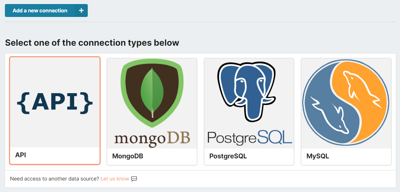
To connect to Stripe's API, head over to one of your Chartbrew's projects (or create a new one), click on Connections, and select the API options from the list.
You will then need to complete the connection form with the following:
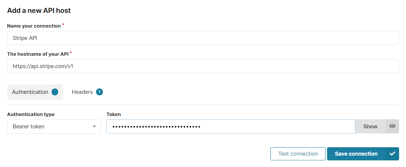
- Name: Stripe API (can be anything)
- Host: https://api.stripe.com/v1
- Authentication: Bearer token - <stripe_api_key>
You can get the API key from your Stripe account dashboard. Refer to the screenshot below to see where you can find it:
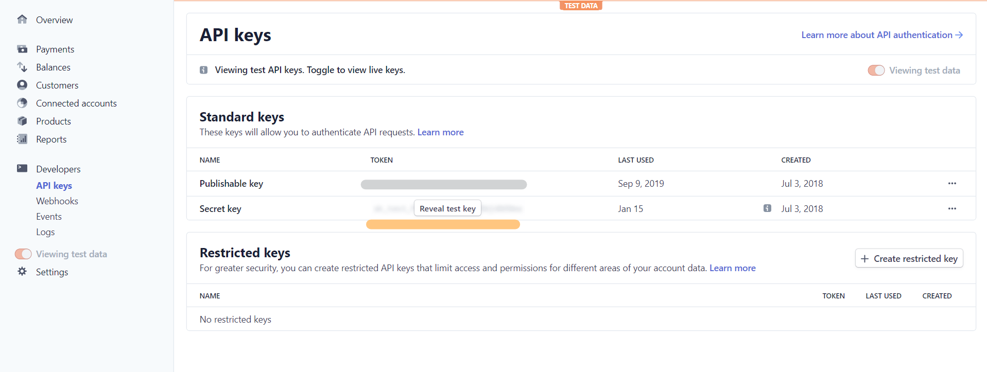
Click "Reveal test key" and copy the key in Chartbrew
When you test your connection, it will give you an error because you can't get any data from the root API path, but that's fine. It's important to keep the host as the root API path because we are going to re-use this connection for multiple charts as you will see later in the post.
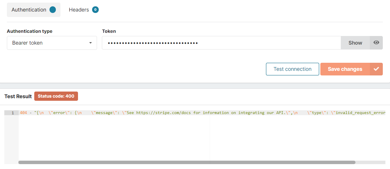
Getting an error code, but nothing to worry about
Create a revenue KPI chart
The amount of data we can pull from Stripe is quite extensive, so for this post, we are going to demo just a few things. The first thing we're going to create is a revenue chart that is going to show the total value of charges in the last month.
Click on the Create a chart button in the side menu, enter a descriptive name for it, and then we will get to the chart configuration page. Here, we need to first create a Dataset from the right side of the page and we will call it Revenue.
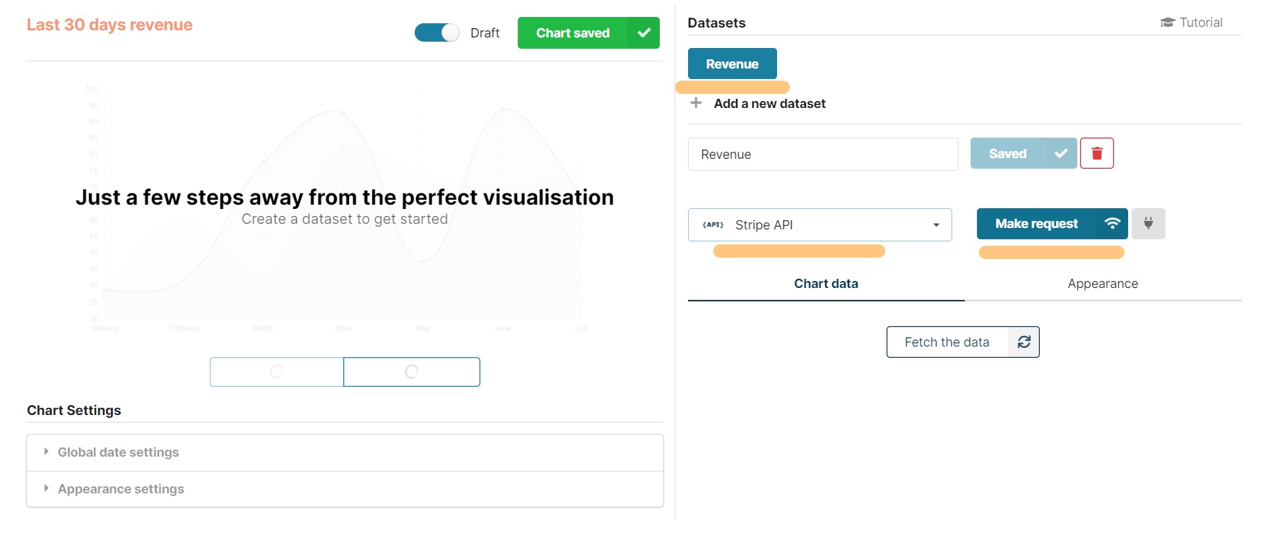
Note that we selected the Stripe API connection from the dropdown. Let's click on Make a request to get our data from Stripe.
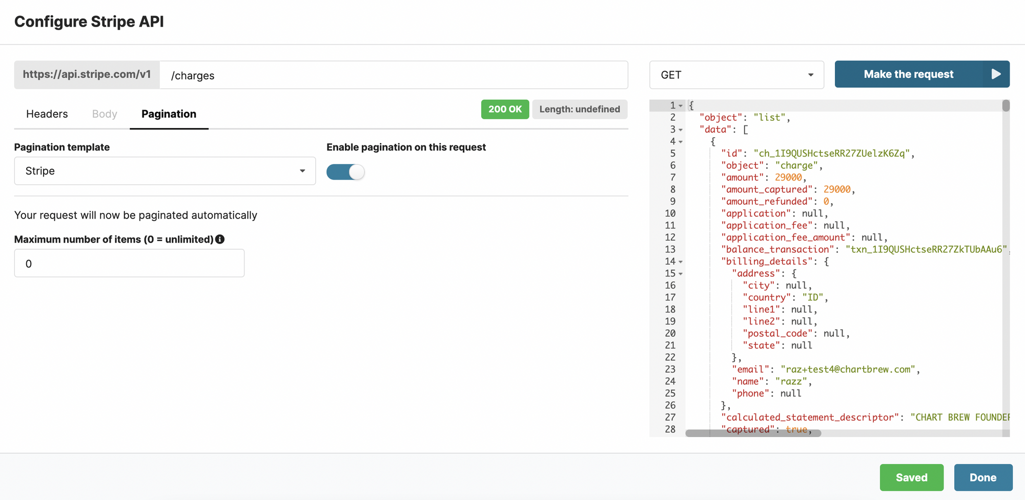
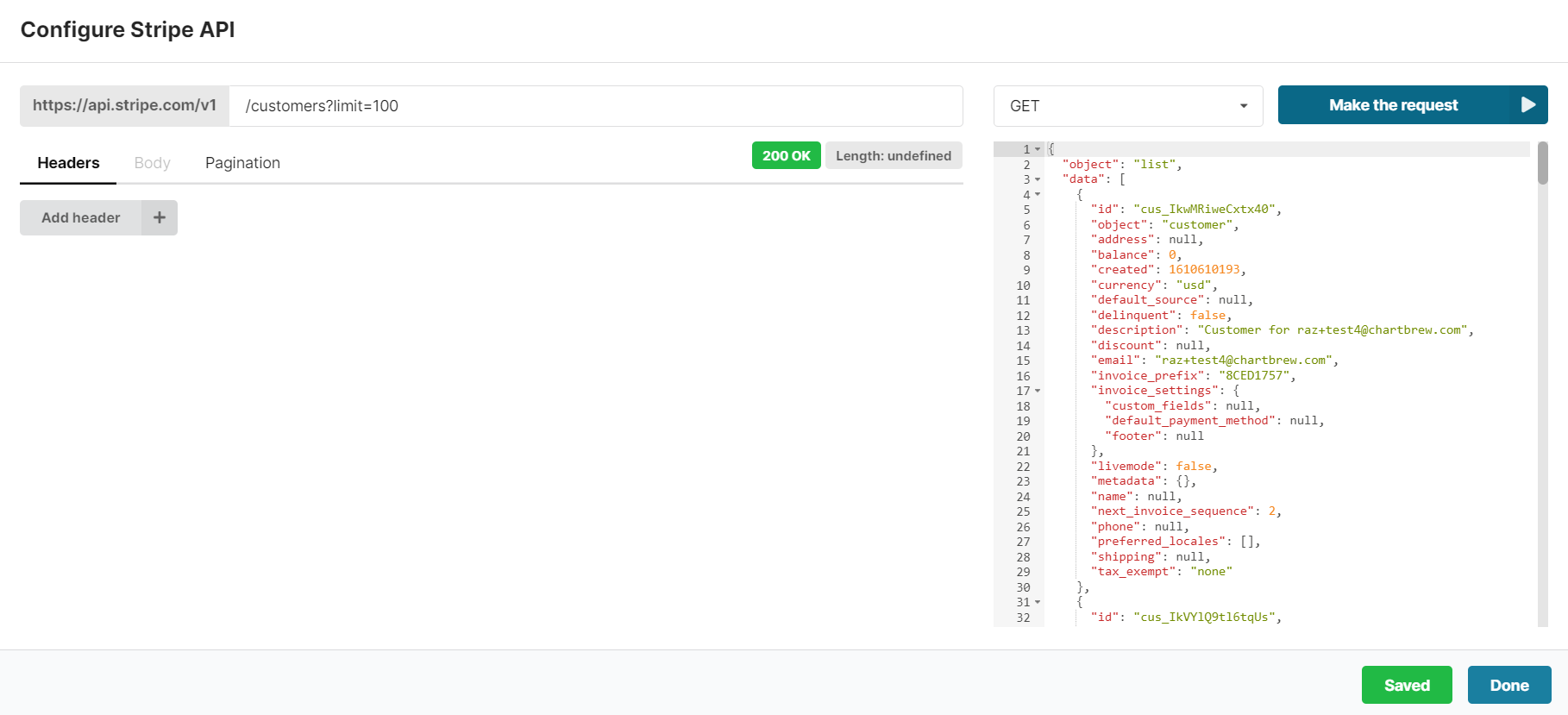
In the request screen, we will first have to configure the route from where we want to get data from. In this case, we are interested in the charges endpoint. Remember that when we created the connection we didn't put anything after the /v1? We can see the reason right here since we now can put whatever we want after the host address when we make calls.
To complete the call, we will add the route (/charges) and head over to the pagination section to make sure we get all the data from Stripe. Stripe limits us to 100 items per request, but Chartbrew can work with Stripe's pagination system to circumvent that limit. Enable pagination like in the screenshot above, and set the limit to 0 if you wish to get all the charges.
When we click on the Make the request button, it will load a bit and then populate the right section with the data from Stripe.
Click on Done, and then we get to see the first chart in the builder. Chartbrew tries to guess a decent configuration at the start, but in this case, we need to tweak the settings a little.
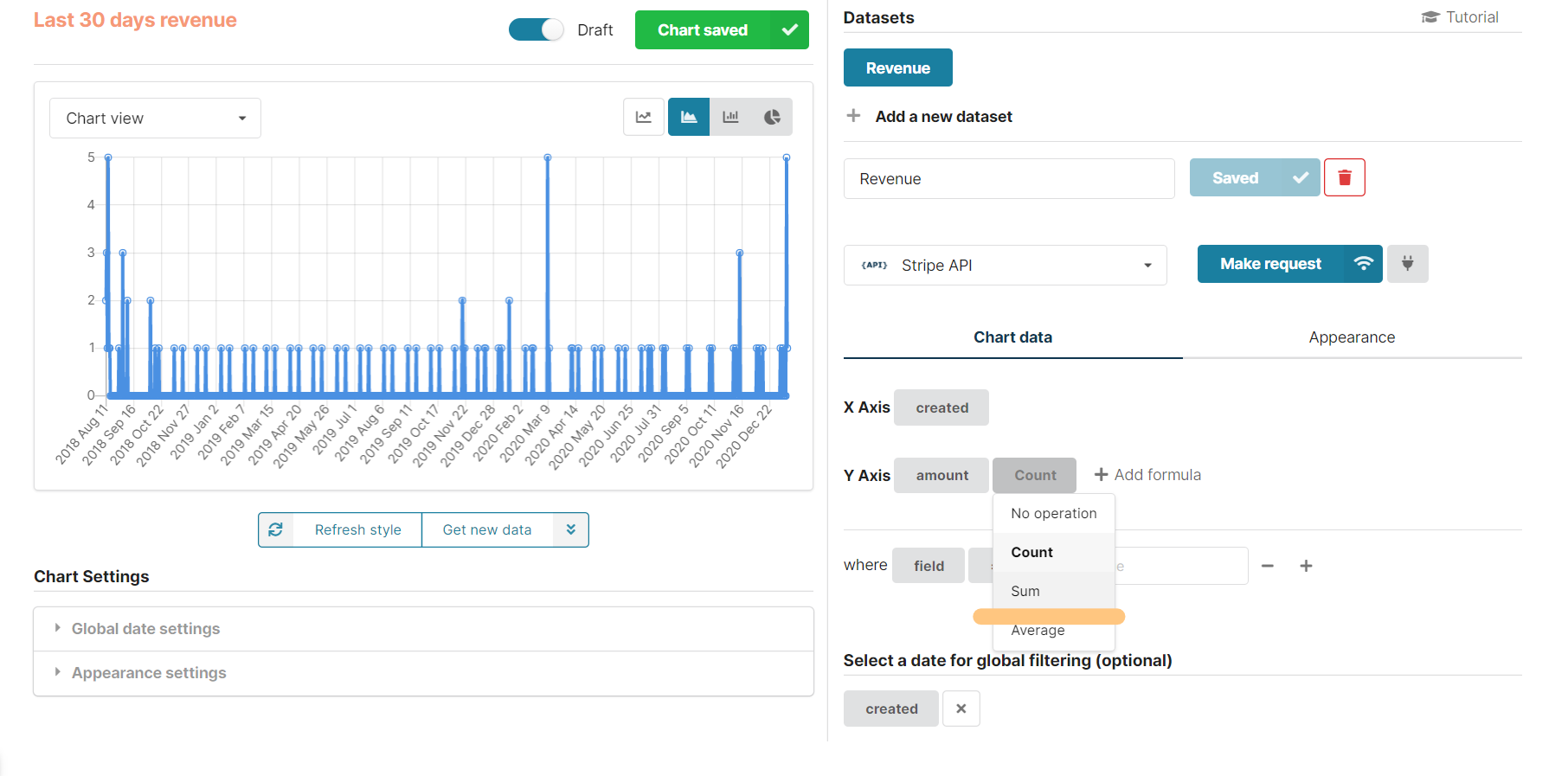
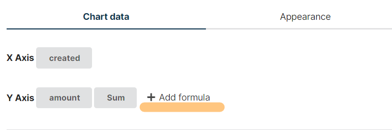
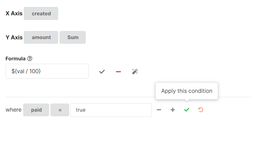
The first thing we need to do is to make sure we have the amount field selected on the Y-Axis with the Sum operation on it. The operation will add all the charge amount together in case multiple charges happened during a day (and hopefully that's the case!).
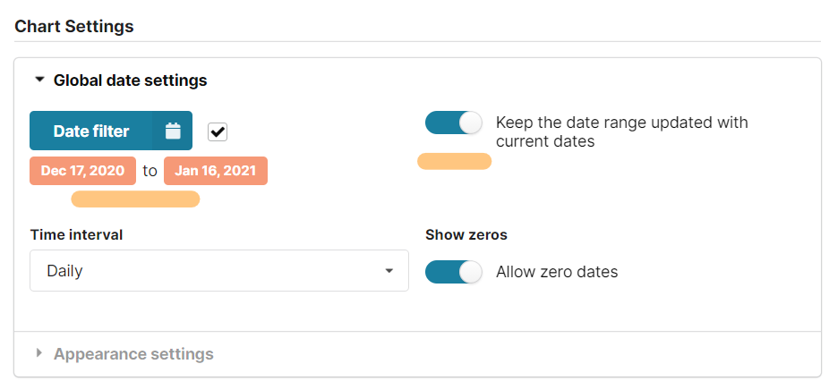
Next, we want to make sure we get only the charges that happened in the last 30 days. To do this, expand the Global date settings menu on the left and use the calendar tool to select the last 30 days. Additionally, turn on the toggle on the right to keep updating the date range with the latest day.
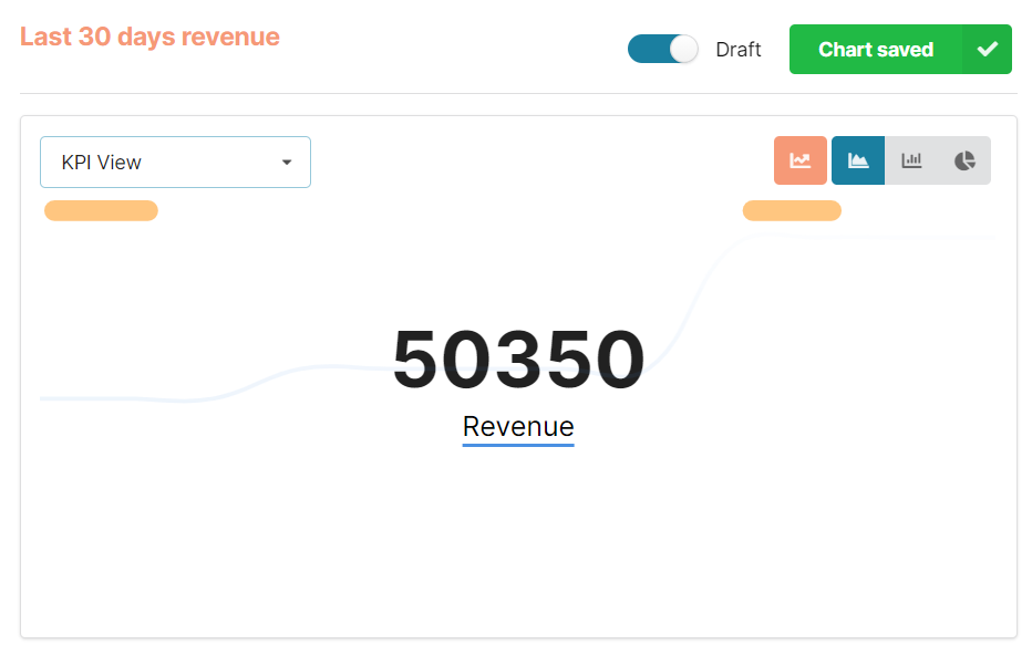
We will notice that as soon as the date filters are changed, the data will be restricted to charges that happened in the last month. Time for more settings now. We are interested in creating a KPI chart so we can see a clear value as soon as we access our dashboard. From the top dropdown, select KPI View and accumulate the chart on the right like in the screenshot below:
Stripe's amount data is represented in cents and we rarely need such a value. The value in the screenshot above is in cents as well, so let's format that to show full dollars (or any other currency you have in your Stripe account). Click on the Add a formula link next to the Y-Axis configuration like so:
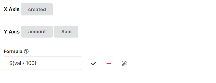
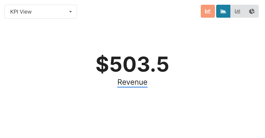
Click on the checkmark to apply the formula... and voilà:
As an extra, you might want to see only the revenue coming from completed payments. Chartbrew allows us to filter any kind of data and in the case of the Stripe charges, we need to check if the charge has been paid.
And this is how we can visualize the revenue data in Chartbrew. Here is the live chart embedded in this post:
Next, we are going to have a look at another use-case involving subscriptions.
Count the customers and active subscriptions
There are quite a few important KPIs that we can extract from Stripe's API and next we are going to gather the number of customers we have in our account, plus the number of active subscriptions. In this example, we are going to place both KPIs on the same chart. Click on Create a chart again and let's get started.
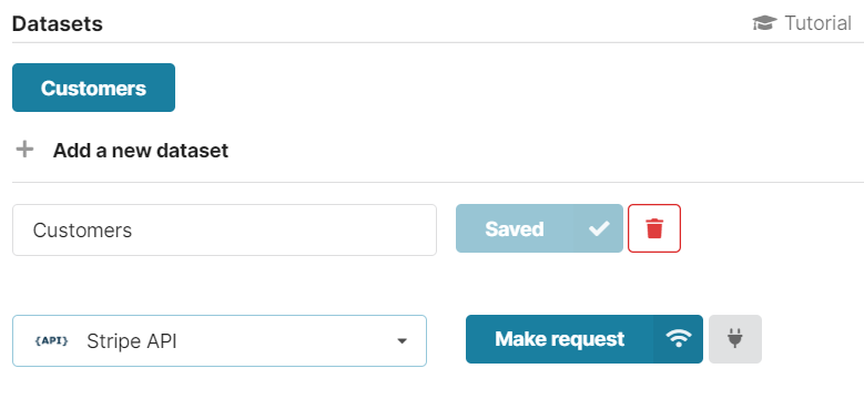
Preparing the "Customers" dataset
Making a request to the /customers endpoint
After we are done configuring the Customers dataset, we can add a new one that will get the subscription data.
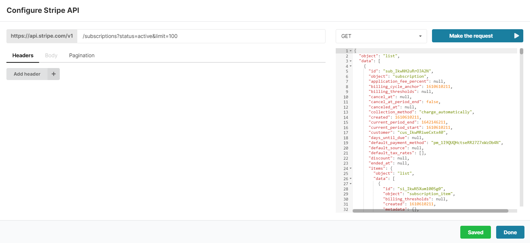
Click on the new dataset, connect it to Stripe and make the request to /subscriptions?status=active&limit=100
Next, we want to accumulate the chart and switch to the KPI view like we did for the Revenue chart and we get something like this:
A more complex example
I took the time and set up more some more charts for this tutorial. This dashboard example is made public and you can see it here:
Chartbrew - Visualize your data in one place
Chartbrew allows you to connect all your databases and APIs to create beautiful live charts and visualize your data
Chartbrew
Do you want to see any other charts or use cases? Let me know and I can update this tutorial.
Next steps
This tutorial walked you through creating KPI charts in Chartbrew using Stripe data. You can monitor your Stripe data entirely using Chartbrew, but what is more interesting is that you can combine your Stripe data with other sources. So why not try to:
- Monitor your database data alongside Stripe KPIs (see how to connect to your MongoDB database)
- Connect your email campaign API to see if there is a correlation between the campaign engagement and new Stripe conversions
Do you have a Chartbrew account? Try it now for free and create your perfect dashboard:
Chartbrew - Client reports for your team and clients
Chartbrew allows you to connect all your databases and APIs to create beautiful live charts and visualize your data in custom dashboards
Chartbrew
