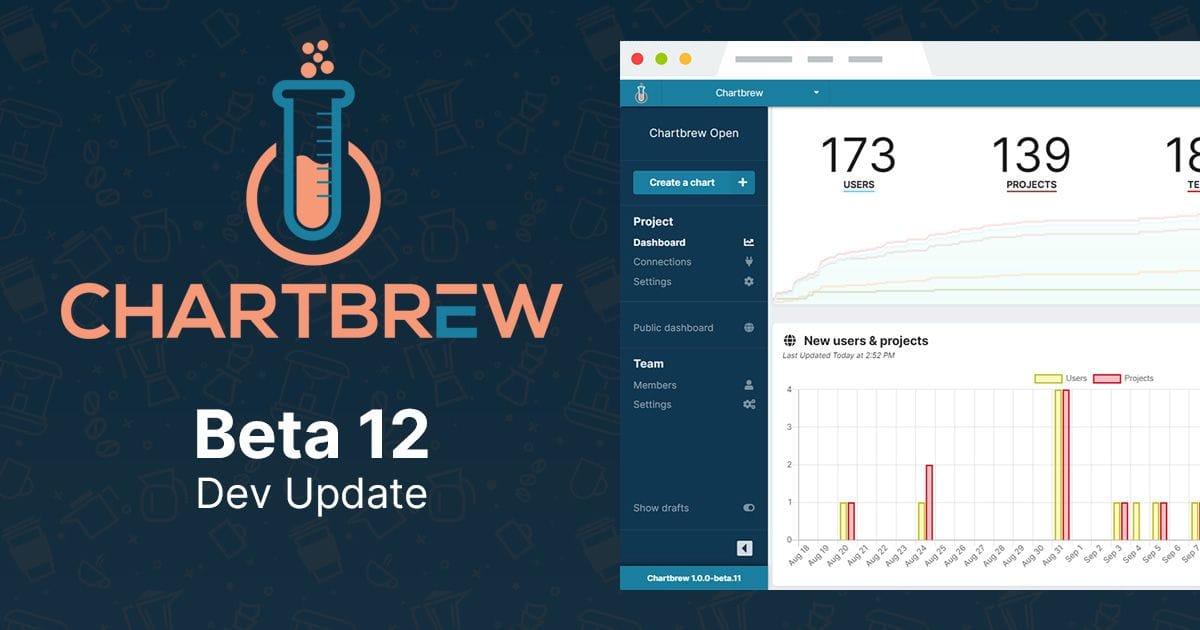
Dev Update - Chartbrew Beta 12 released
New KPI chart modes and easier deployment with Docker as part of Chartbrew Beta 12. Easier than ever to take Chartbrew for a spin ?.

Hello friends,
I'm excited to share with you the next update for Chartbrew. Beta 12 comes with a new visual mode for the time series charts which allow you to easily track your KPIs. So let's dive in and see what's new!
? KPI chart mode
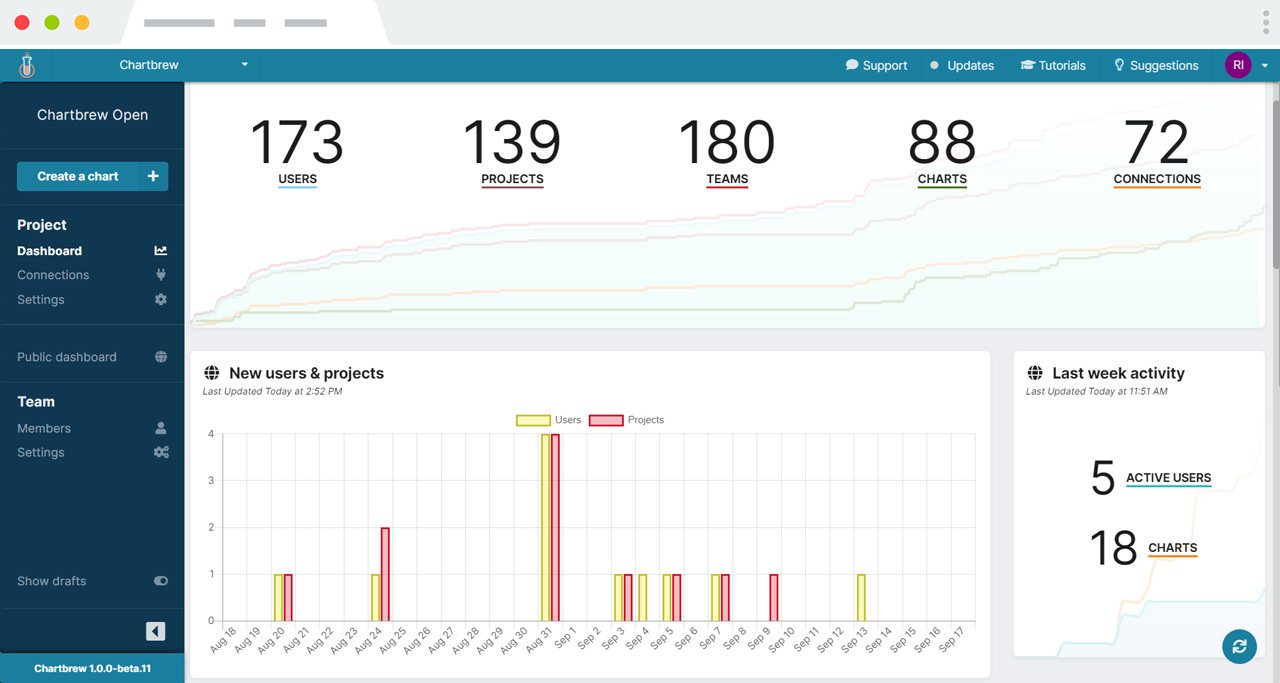
This is a glimpse of what you can create now ✨
The new KPI mode can be changed in the Chart Editor when selecting an aggregating time series chart. Instead of showing the usual chart axis, the new KPI mode displays the total value in a clear format along with the faded chart lines or bars.
Or check this live chart embedded from Chartbrew's open dashboard
How to create one of these charts?
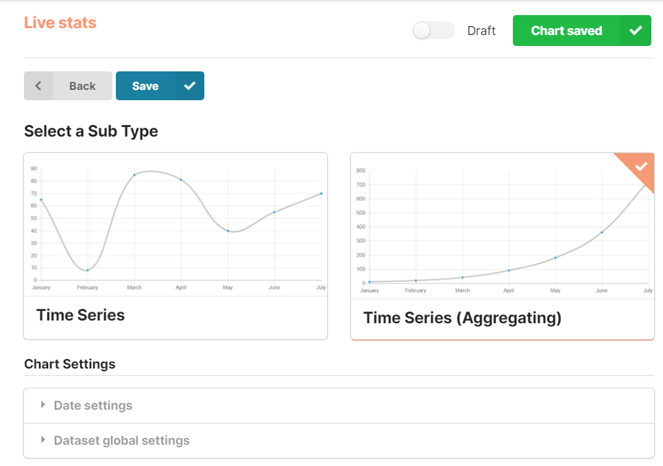
First, create a new chart or edit an existing time series you already created. The KPI mode can only be activated on aggregating charts at the moment. In the editor, click on the "Chart Type" button and select a Line or Bar chart, then make sure the "Aggregating" type is selected like in the picture below. ?
Once the right type of chart is selected, you will see a new dropdown on the top of the Chart preview which lets you select between two modes (Chart and KPI). Select the KPI view and as soon as you pull some data in you will be able to see the numbers appearing.
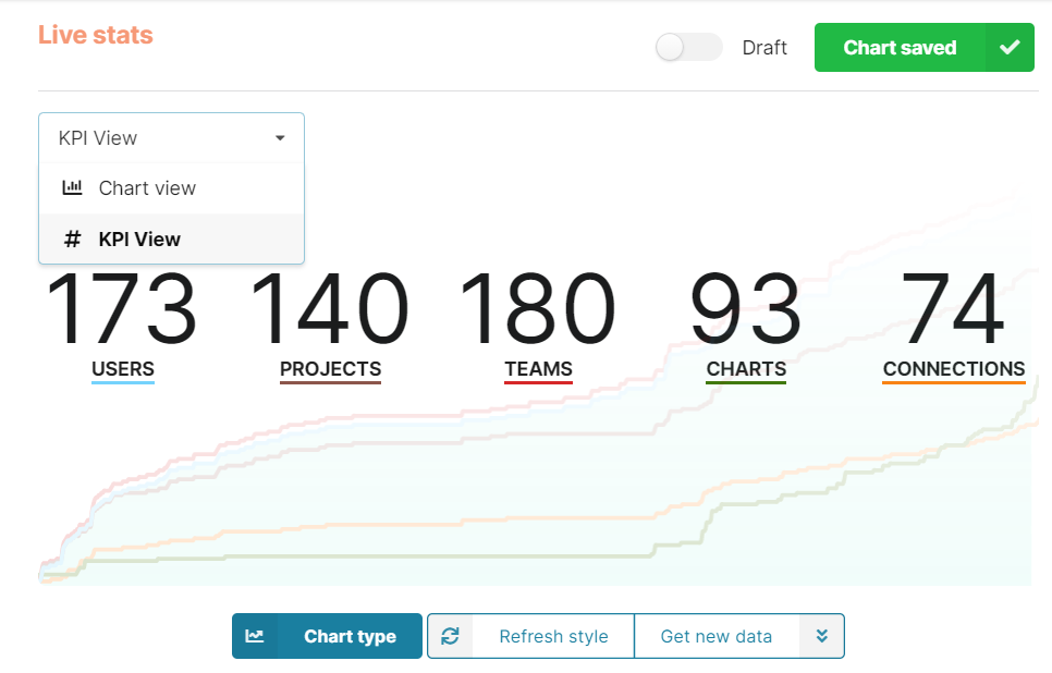
Furthermore, you can edit the chart as you would the rest. You can still change the colors of the lines or bars or filter by date. When selecting a new color, you will see a faded preview behind the numbers and also a matching slim-colored border below the labels of each stat.
What do you think about this new feature? If have any feedback, don't hesitate to get in touch. You can DM me on Twitter or join our community on Discord to discuss it.
? New Docker container
The Docker configuration has been reworked as part of the new Beta. I had help from the Chartbrew community on Discord to make it easier and faster to run Chartbrew. There is an official Docker image that you can quickly set up now.
docker pull razvanilin/chartbrew
docker run -p 3210:3210 -p 3000:3000 \
  -e CB_SECRET=<enter_a_secure_string> \
  -e CB_API_HOST=0.0.0.0 \
  -e CB_DB_HOST=host.docker.internal \
  -e CB_DB_NAME=chartbrew \
  -e CB_DB_USERNAME=root \
  -e CB_DB_PASSWORD=password \
  -e REACT_APP_CLIENT_HOST=http://localhost:3000 \
  -e REACT_APP_API_HOST=http://localhost:3210 \
  razvanilin/chartbrew
Check the docs for full configuration
Changelog at a glimpse
- ✨ New KPI chart mode for aggregating charts
- ✨ Released an official Docker image
- ✨ Updated the Docker setup and removed the rsync dependency
- ✨ Better environmental variables support in the client app (read below)
- 🐛 Fixed visual bug where empty spaces appear in the dashboard
- 🐛 Fixed issue with aggregating data on weekly, monthly, and yearly time intervals
- ⚡ Reduced the size of the client bundle by upgrading react-ace and removing the huge brace dependency
- ⬆️ Chore dependencies updates
Thanks, everyone
Chartbrew is getting closer and closer to the full release. It really helps to receive as much feedback as possible, and I'm grateful to everybody that uses Chartbrew at the moment. Also, a big shoutout to the folks over on Discord for helping me out.
Until next time!
Cheers,
Raz - @razvanilin
Chief keyboard basher at Chartbrew?
Join our community over on Discord if you need help with Chartbrew or have any suggestions.
