How to visualize Supabase.io data with Chartbrew
Supabase.io makes it easy to create your database. In this tutorial, we will go through visualizing this data with Chartbrew just as easily.

Supabase.io is an amazing tool where you can spin up a PostgreSQL database in just a couple of minutes. You can then use this database remotely by querying it directly or using the API overlay that Supabase offers with their tool. Being a remote database, Chartbrew can connect to it to help you visualize the data. There are two ways that you can connect to the data source and you can check both of them below.
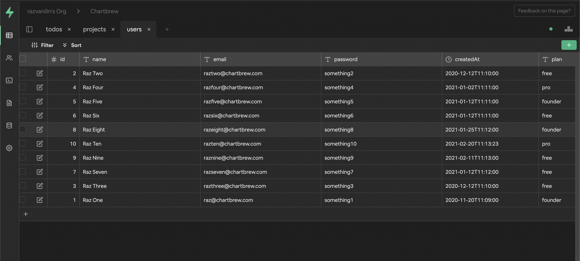
This tutorial is going to show you how to visualize one table in the database. For this purpose, I created a new database and a dummy table with some user data in Supabase.
Connect to Supabase using the API
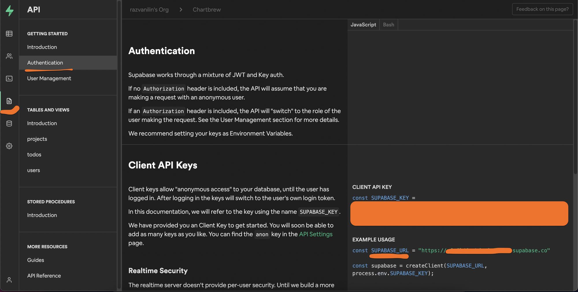
Once you have the database set up at supabase.io, head over to the API authentication settings to get your API key and URL. We are going to need these to authorize the connections we make from Chartbrew.
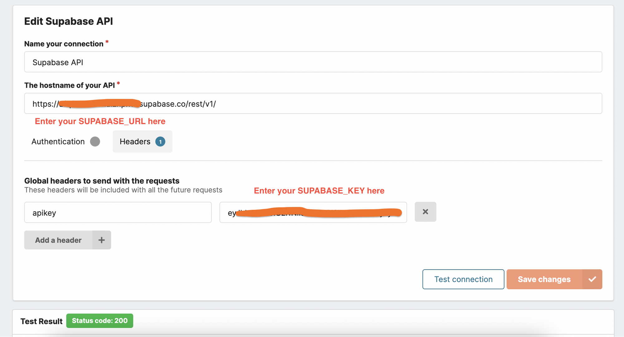
After you get the API connection info, it's time to head over to your Chartbrew dashboard and create a new connection. Select the API connection from the list, and complete the fields using your SUPABASE_KEY and SUPABASE_URL variables.
After this, you can start creating charts from the data you have in your database. Let's take it for a spin and see how this works.
Create a chart with the Supabase API connection
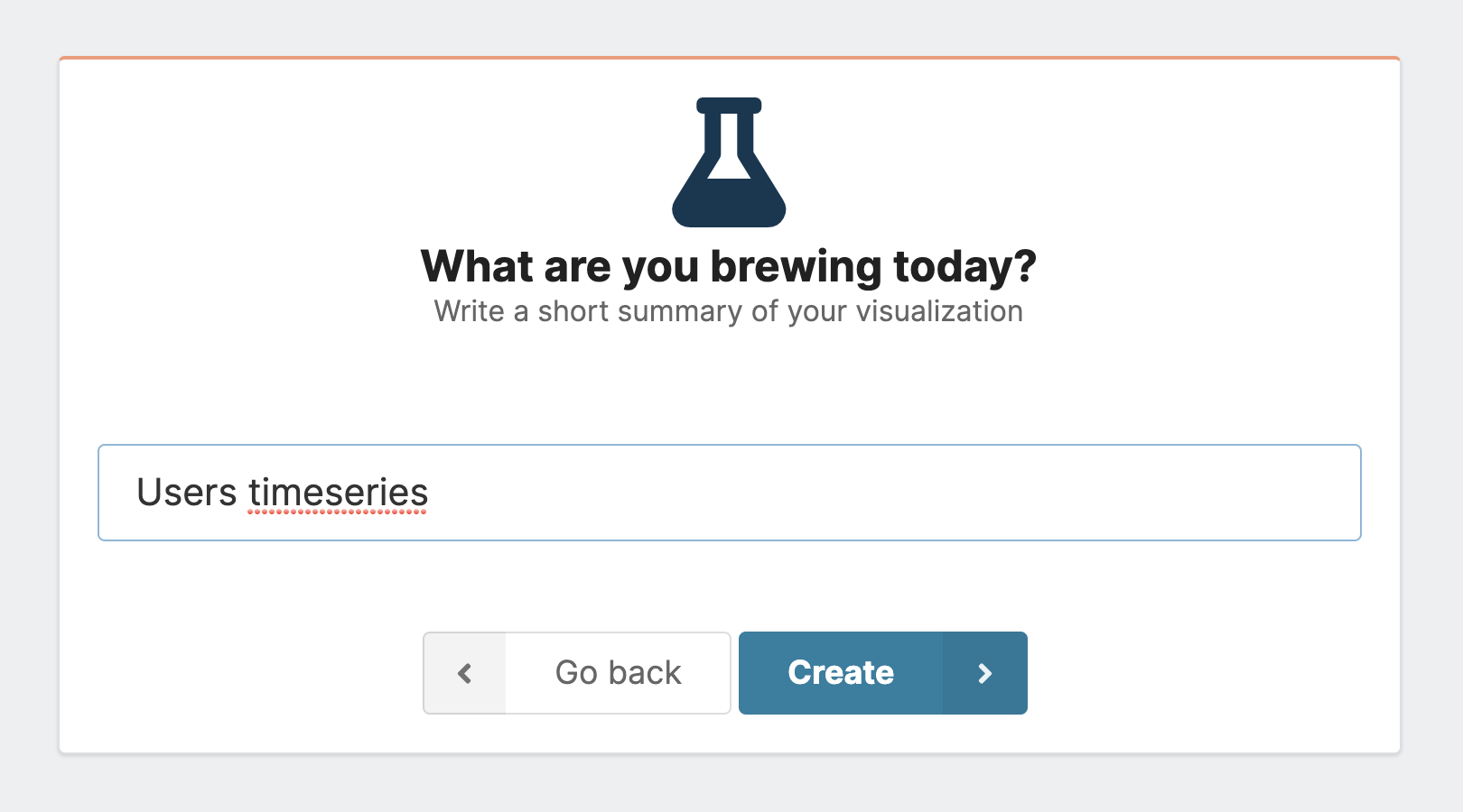
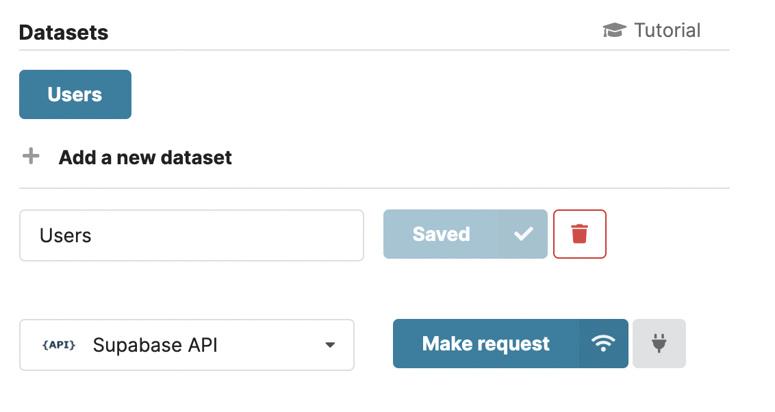
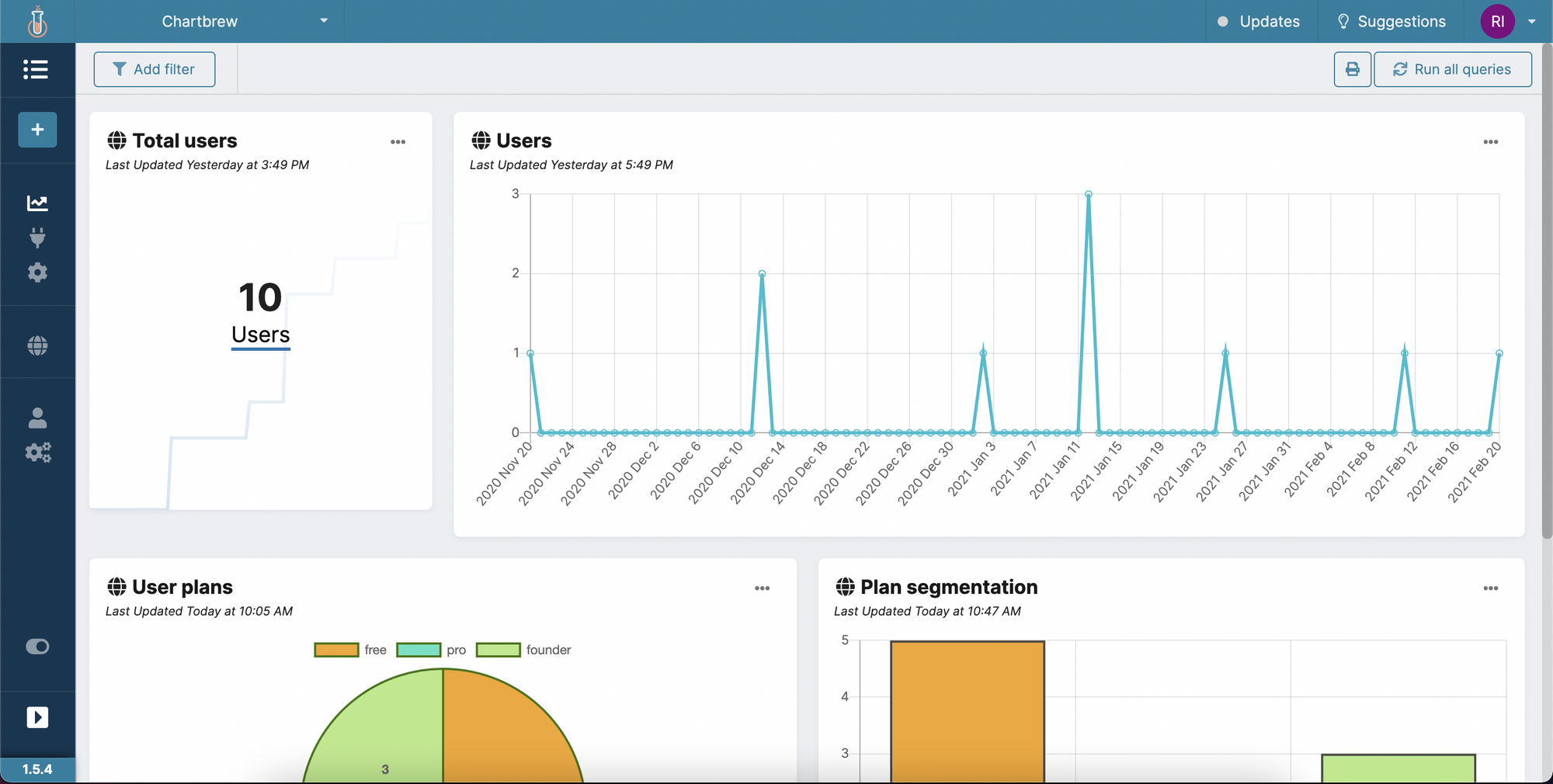
Click on the Create a chart button in the sidebar of your Chartbrew project and give a name to it. Afterward, create a new dataset and connect it to Supabase API.
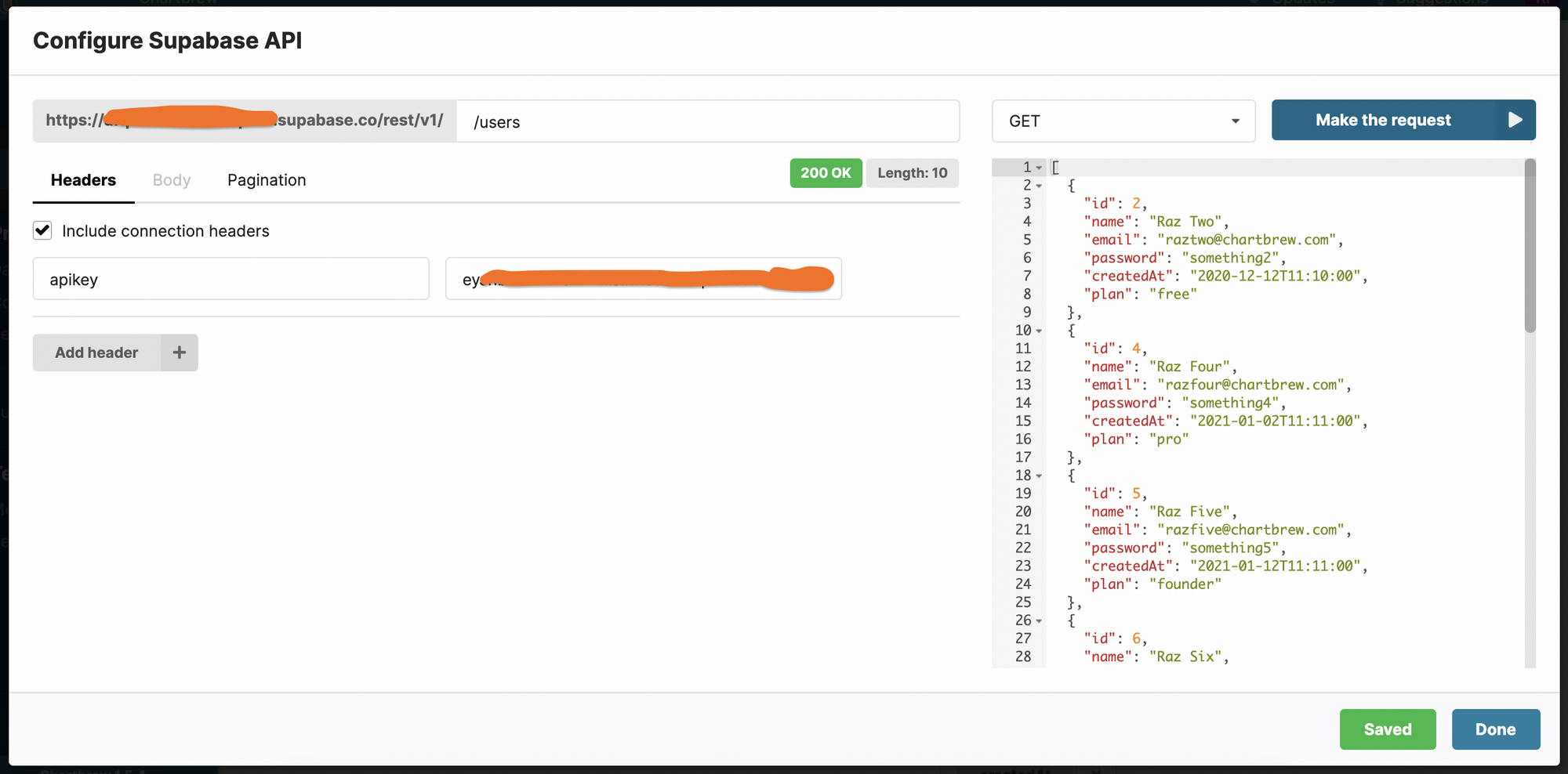
Click on Make request to open up the API request editor. In the editor, we just need to point out which table we want to query for data. The Supabase API documentation comes in handy now. In this example with the users table, the request needs to be made to the /user route:
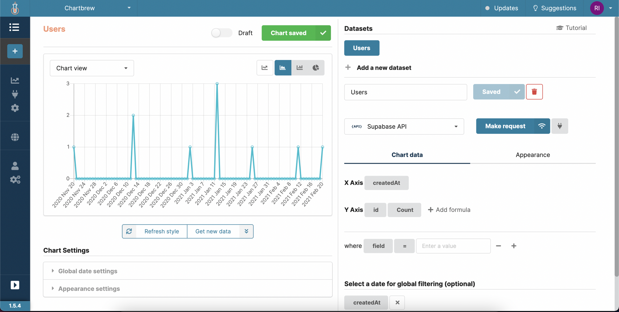
Based on this data format, Chartbrew will attempt to automatically create a time-series chart.
Connect to Supabase using the database connection URL
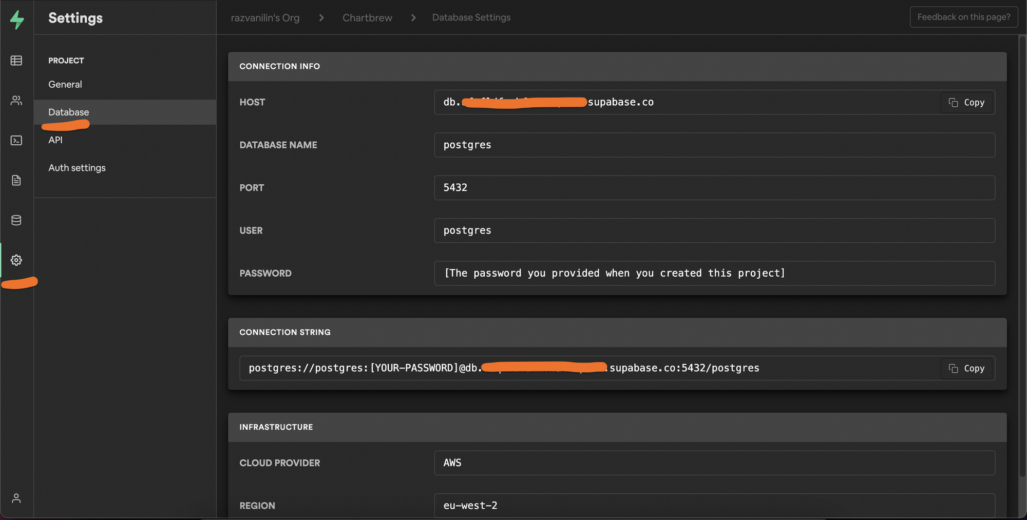
You might want to connect to the Supabase database directly because, in Chartbrew, you can write PostgreSQL queries to get the data you want. So if you prefer to use SQL rather than API queries, this is the connection method for you. To enable the connection, we will need the connection string from Supabase. Head over to the database settings menu like in the screenshot below and copy the connection string.
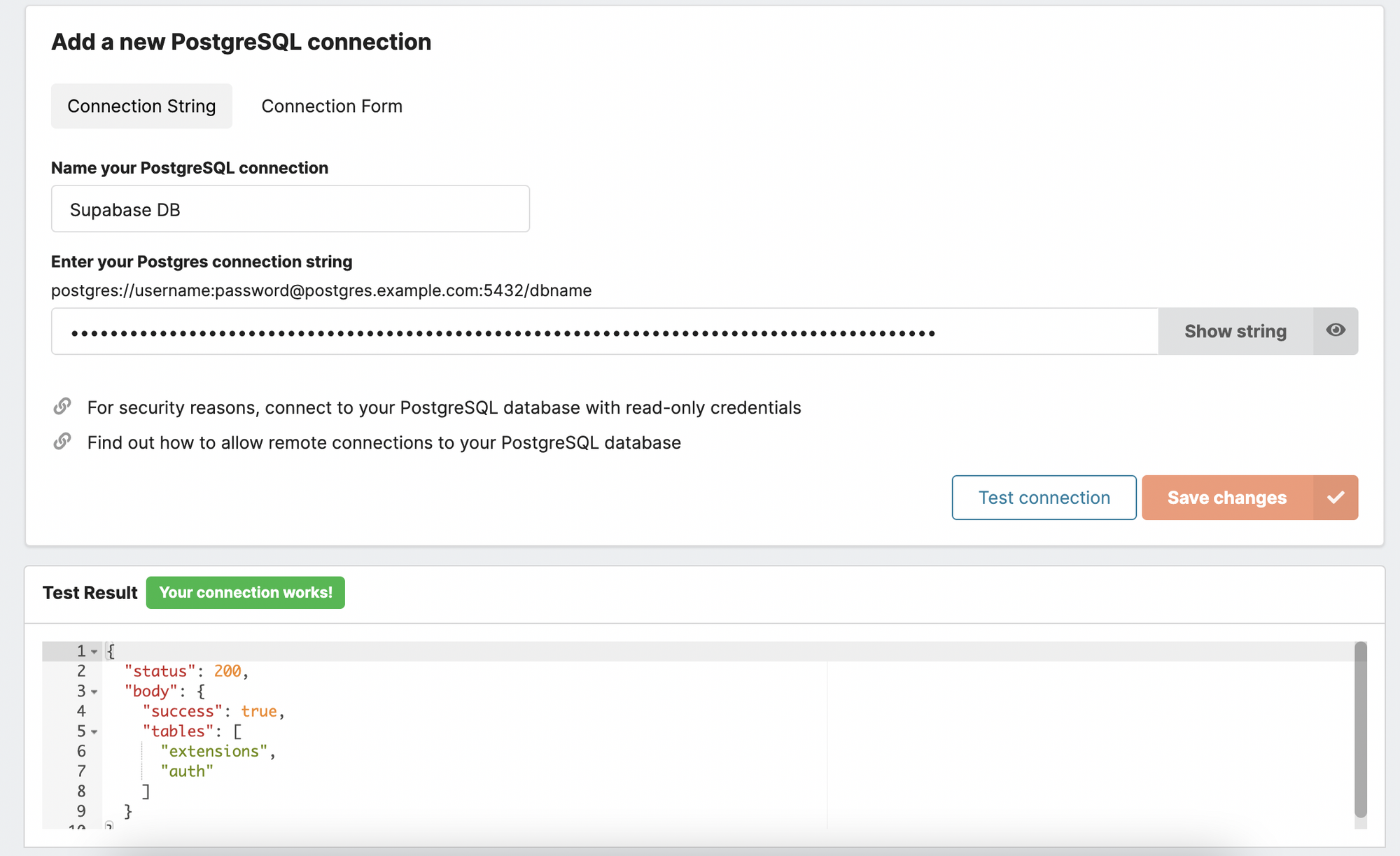
Once you have the connection string, it's time to switch over to Chartbrew and create a new PostgreSQL connection. Name your new connection and paste the string in the designated field. If you test the connection you should get some information about your database in the test container.
Write a PostgreSQL query and create a new chart
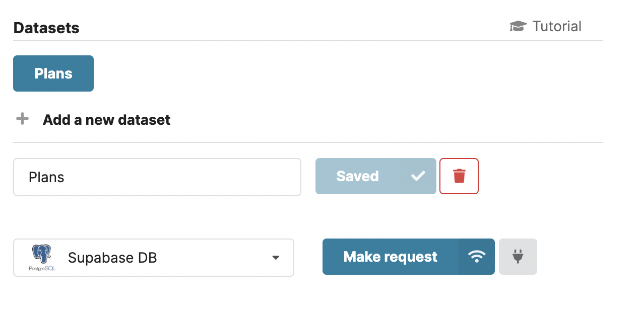
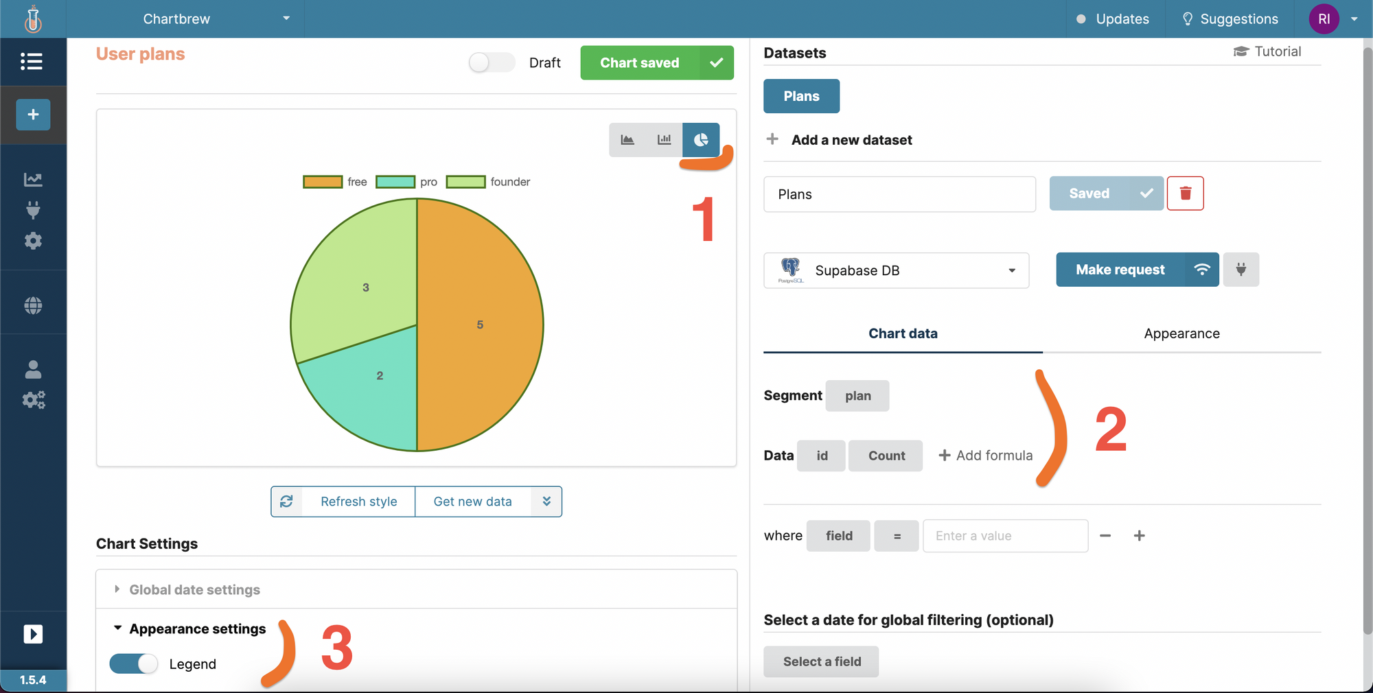
For this example, we are going to query the same users table and create a pie chart showing the distribution of plans which can be free, founder, and pro. We create a new chart as before, but this time, we have to choose the new connection for the dataset.
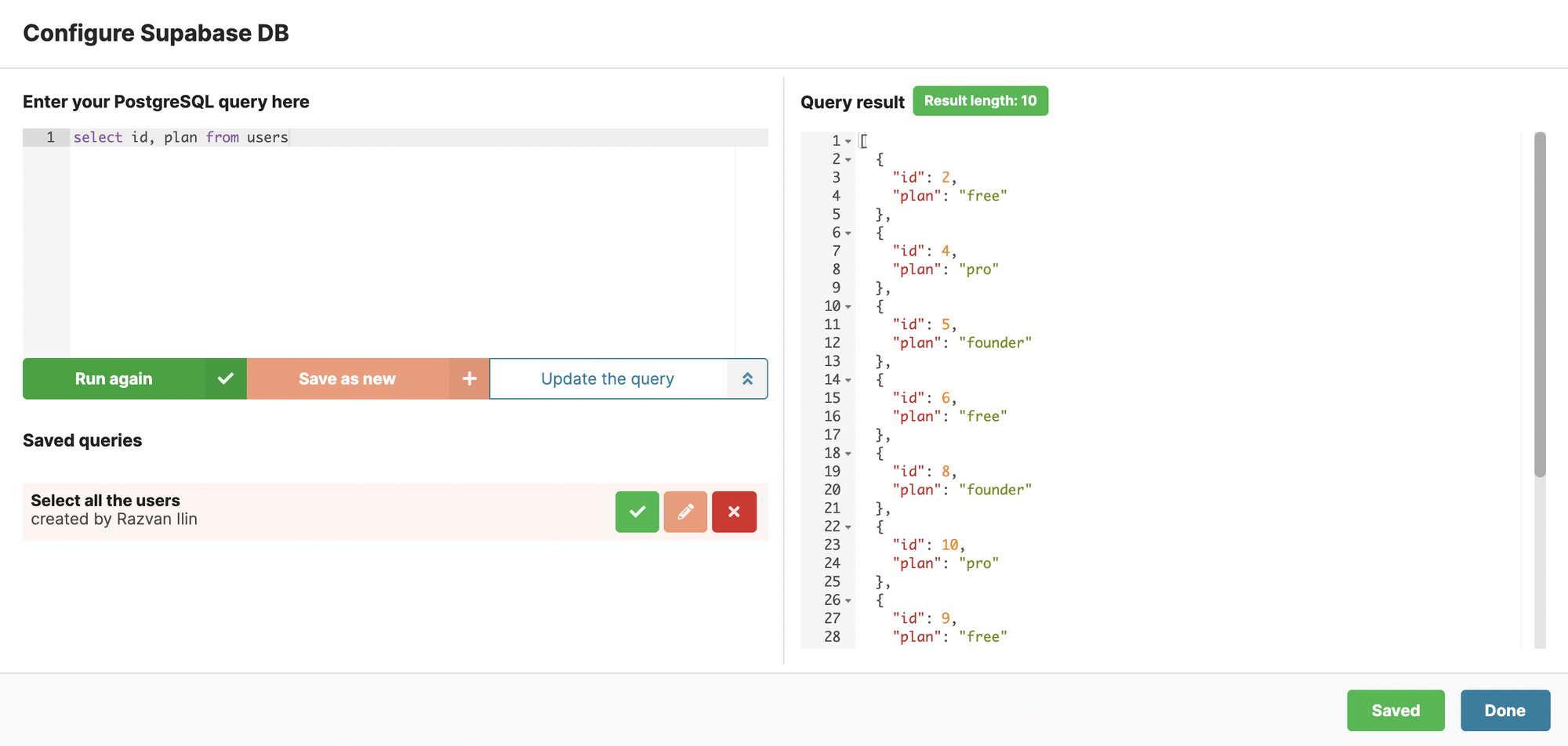
When we make the request to the new connection, you will see that we can now write a SQL query instead of preparing an API request. Let's select the users and create a pie chart based on the plans of each of the users.
Now that we have the data, we have to tell Chartbrew what to plot. First, we need to select the Pie Chart option, then make sure we segment over the plan field and count the IDs for each plan. To make the chart more readable, we can turn on the legend in the Chart settings section. The colors of the segments can be changed from the Appearance tab on the right.
Live charts and sharing options
Now that we connected successfully to Supabase using the API and database connection string, let's have a quick look at some extra things we can do with Chartbrew.
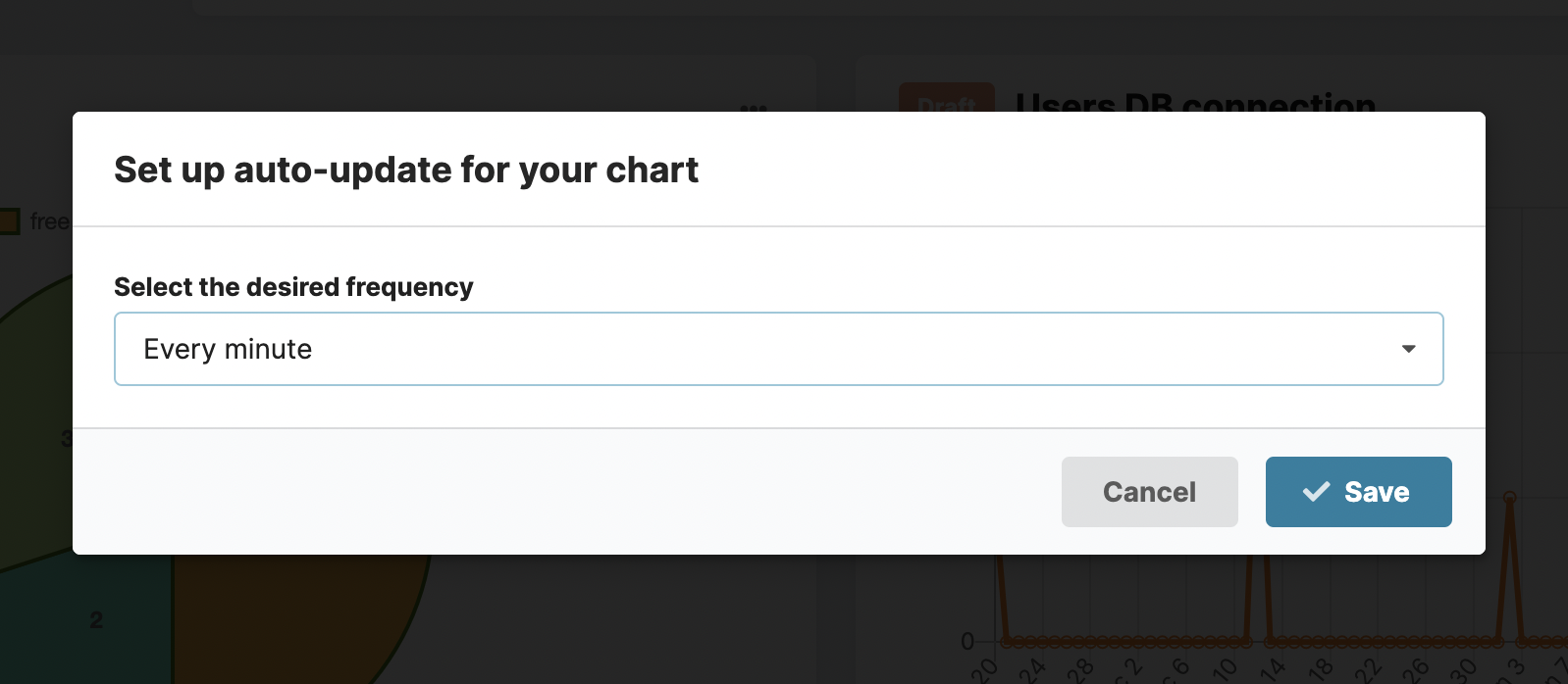
You might want to keep your charts up-to-date with the latest data that is registered in your database. Chartbrew can auto-update your chart with the latest data by re-running your query or your API request in the background. Head over to the dashboard and click on the menu icon for the charts you want to activate the auto-update feature for.
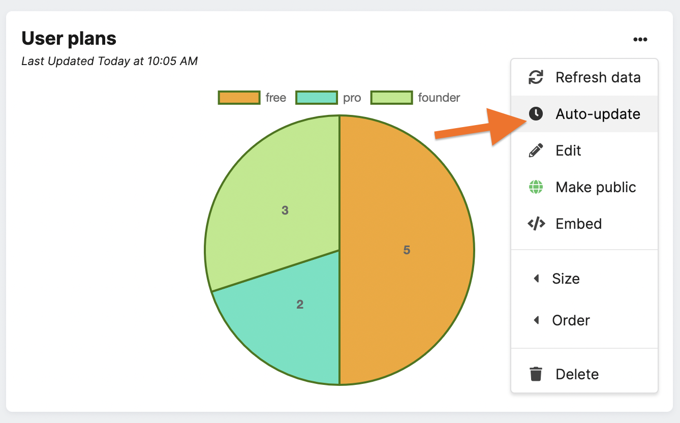
Now that the charts are going to keep being updated with live data, we can also share them in other spaces. From the same chart menu, select the Embed option to get the chart URL or the <iframe> code used for embedding on other sites.
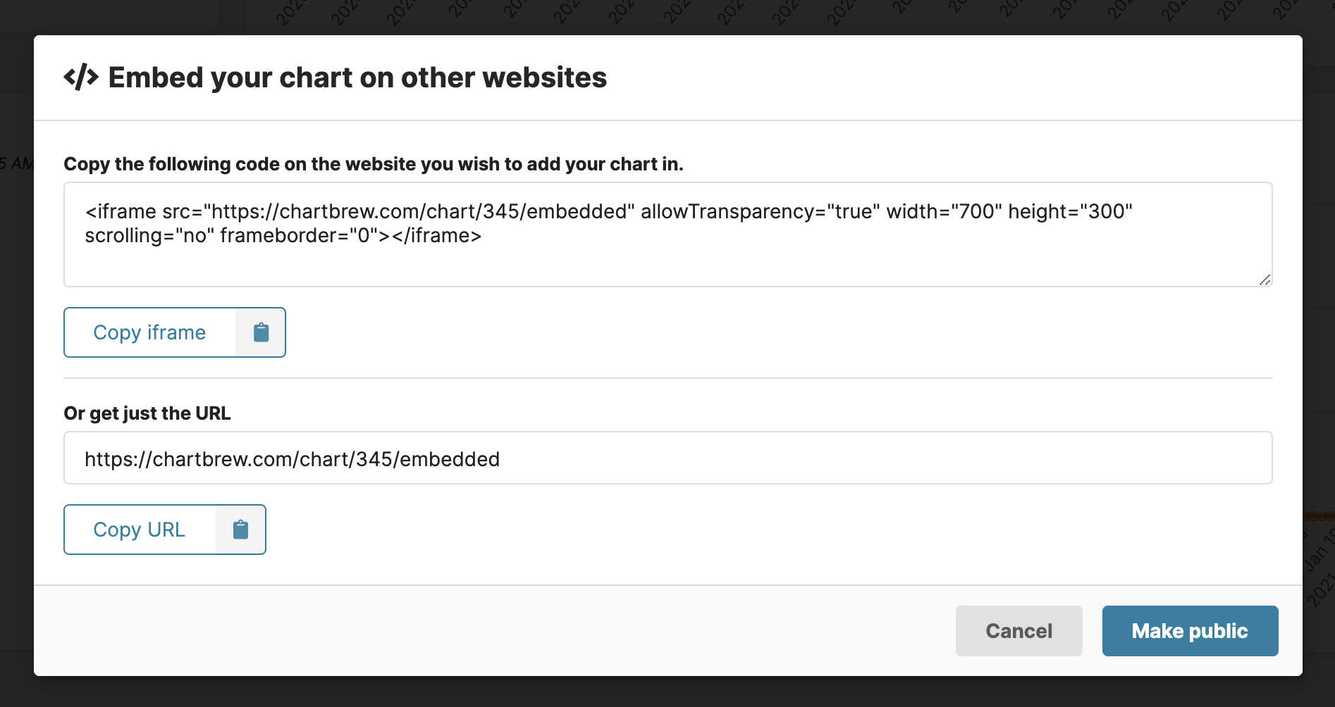
Make sure you make the chart public, otherwise the chart will not show externally.
Take a look at this demo with live charts embedded in a Notion document.
And this is how you can create your very own dashboard to visualize the data from Supabase.io. You can start visualizing in just a few minutes by creating a free account at chartbrew.com.
Next steps
Chartbrew allows you to have multiple datasets displayed on the same chart. This is amazing for comparison use cases or spotting patterns from different data sources. Try doing the following:
- Create two or more datasets in the same chart to compare the series with one another
- Create a new connection to another API that you're using such as an email service or payment provider (e.g. Stripe)
- Create charts from other data sources in the same dashboard
