Chartbrew Beta 9 and the new Chart Builder design
It's been a while since the last update but the main reason was that I needed to rethink a core part of how the data was structured in Chartbrew. It was that elephant that didn't want to leave the room and I had to address it. One thing I knew for sure was the wizard-like chart interface pre-beta 9 was in theory good for guiding users but not powerful enough and had too many limitations.

The main thing that was wrong with that approach was that it only fit one mental model in which the user knew exactly how they wanted the visualisation to look like. What the new interface caters for is the flexibility to approach a problem from any angle. Maybe instead of knowing how the visualisation should look like, the user just knows what data is available to work with.
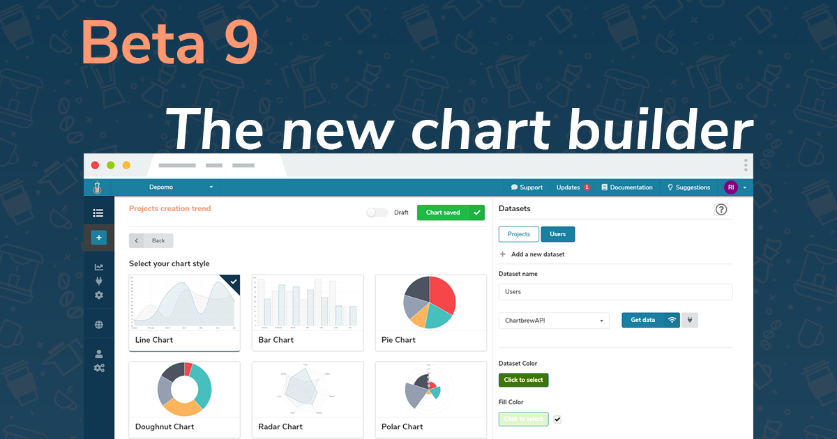
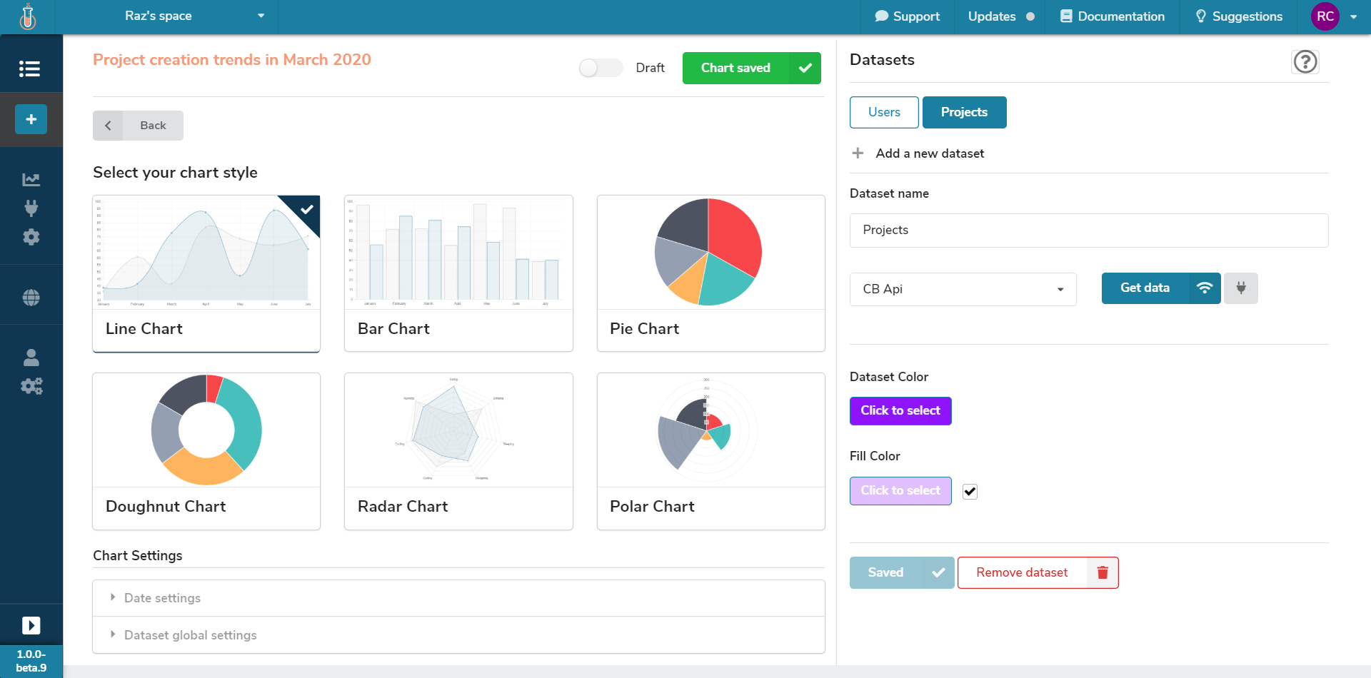
If you have a look at the picture above you can see that now there are two main sections in the UI, the chart and the data. This enables the user to proceed either with the type of visualisation or with the data first.
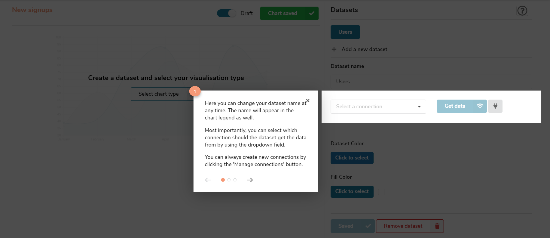
The downside of more flexibility is that the learning curve can be higher. I haven't tested this UI with users that much (planning to pursue that now), but I invested some time into implementing a quick walk-through to explain how the new interface works. I used the reactour library for this and I recommend it to anyone using react since it's so simple to implement.
Data sources, unite
I've been talking mostly about the UI, but some of the biggest changes were done under the hood. The architecture and the data structure was altered quite significantly to allow multiple data source to be used in the same chart. Each dataset connects to any data source registered within the project. So these can be multiple lines in the same line chart or multiple comparison bars in a bar chart.
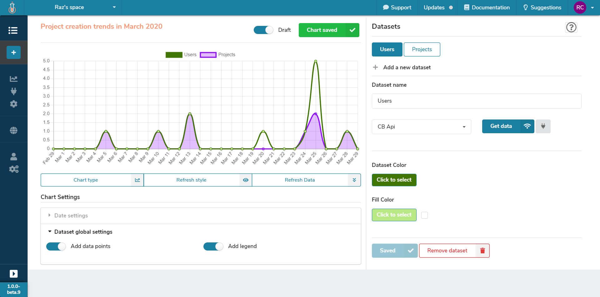
In the picture above, the two datasets are Users and Projects. Each of these datasets can connect to any data source and then as you can see from the chart in the picture, it draws both on it.
I wanted to see the correlation between the new signups and new projects in this particular example. The desired behavior I'm looking for is that for each signup there is at least one project created. As you can see from the chart, this is not the case on March 20th and 25th. I'll put the interactive chart below as well:
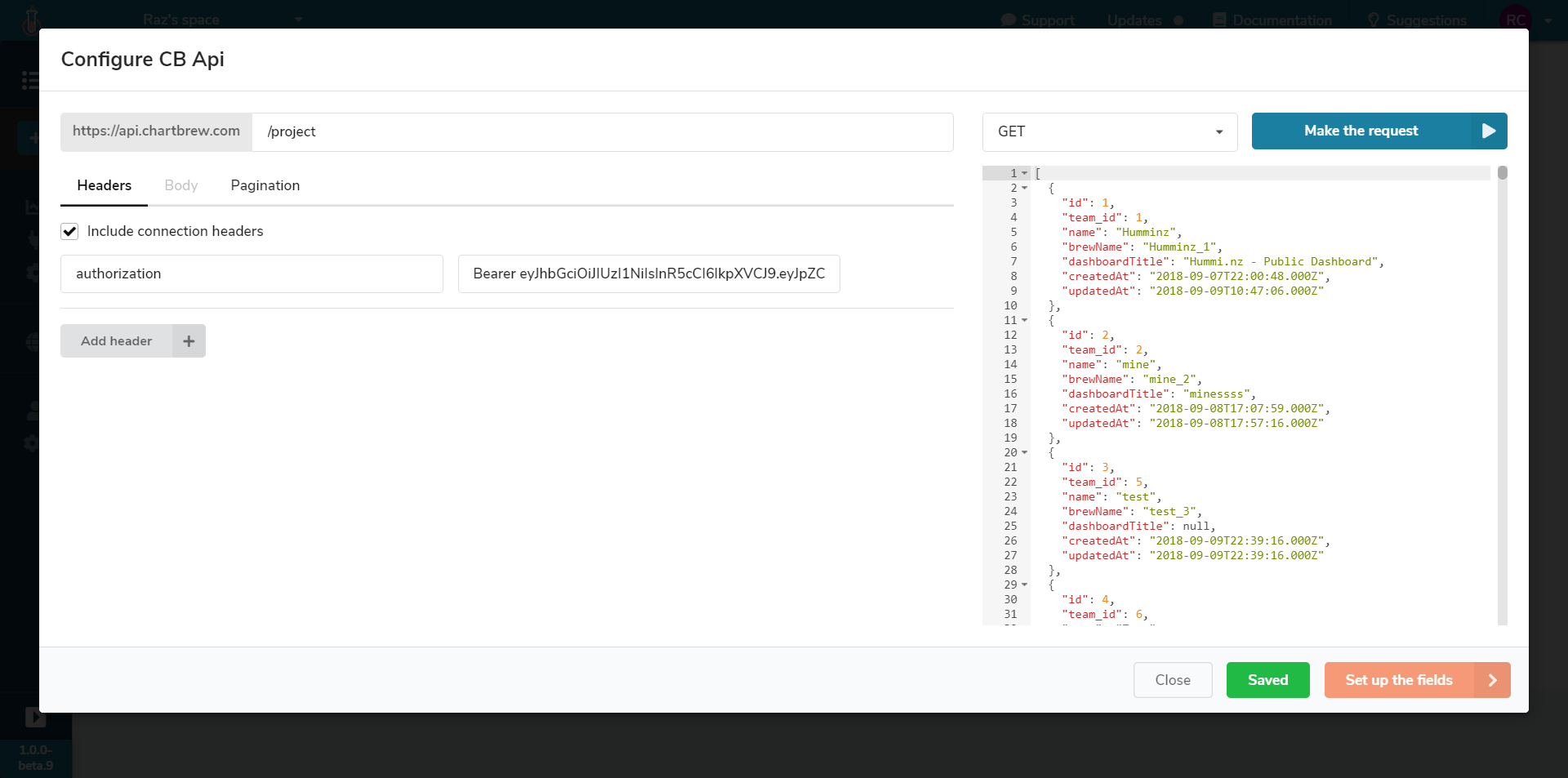
Data request configuration
Each connection type (APIs, MongoDB, MySQL & PostgreSQL) has different configuration screens, but they can all be accessed from the same chart builder interface. When the configuration is done, the modal can just be closed and the building can continue.
Same chart selector, different package
Back on the chart side, the type of chart can be selected as in the previous design as well. The main difference is that it can be done right on top of the Chart Preview section. No need to go on a different page. You can tell by now that this new design is completely against navigating to different pages while building the chart. Focus is the answer.
Upgrading & Technicalities
If you use the managed version at chartbrew.com there's no need to worry about any technicalities other than checking out the new design and starting brewing right away. For the folks that are self-hosting, I wrote a migration guide and published it in the docs so you can check it out. Don't panic, though, it's just a few commands and you should have the new version up and running in no time. Any problem with that, feel free to open a new issue in the repository or DM me on Twitter about it.
Feedback needed
Feedback is always welcome at this stage and would love to hear from you if you decide to give the new design a try. I'm on the lookout for use cases as well because it will give me a better idea of which direction Chartbrew could go.
If you made it all the way to the end, give me a shout and I'll set you up with 3 months of the Basic plan for free (usually $9/month).
Cheers,
Raz - founder of Chartbrew
Psst, we have a Chartbrew Discord community that you can join - https://discord.gg/KwGEbFk
