
In this tutorial, we are going to create an Airtable connection in Chartbrew and visualize the data. We are going to use an Airtable template already created for this tutorial. The data contains pageviews and visitor sample data and we are going to create a few Airtable charts using that.
If you are not using Chartbrew currently, you can get started in two ways:
Get the tutorial Airtable data
To get started, click the link below to access the data we will use for this tutorial:
Airtable | Everyone’s app platform
Airtable is a low-code platform for building collaborative apps. Customize your workflow, collaborate, and achieve ambitious outcomes. Get started for free.
Airtable
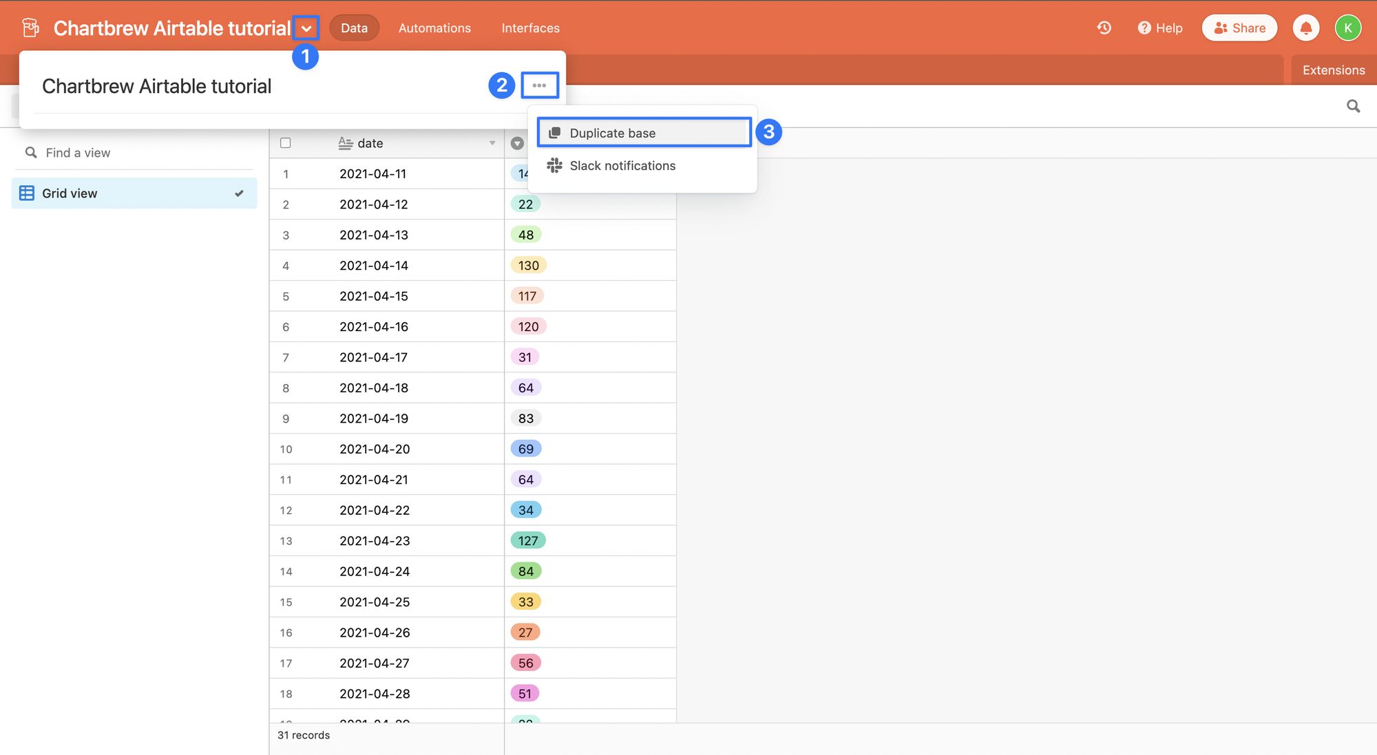
Once there, you'll have to duplicate the data in one of your Airtable spaces. Click on the title of the document and then select "Duplicate base". Select where you want to duplicate it and make sure you check the box to include the records too.
Awesome! Now that we have a base, we can go ahead and connect Airtable to Chartbrew.
Create an Airtable connection in Chartbrew
Before we create the connection in Chartbrew, we have to generate a new Airtable Personal Token to authenticate the data requests from Chartbrew. You can generate yours from the account page here.
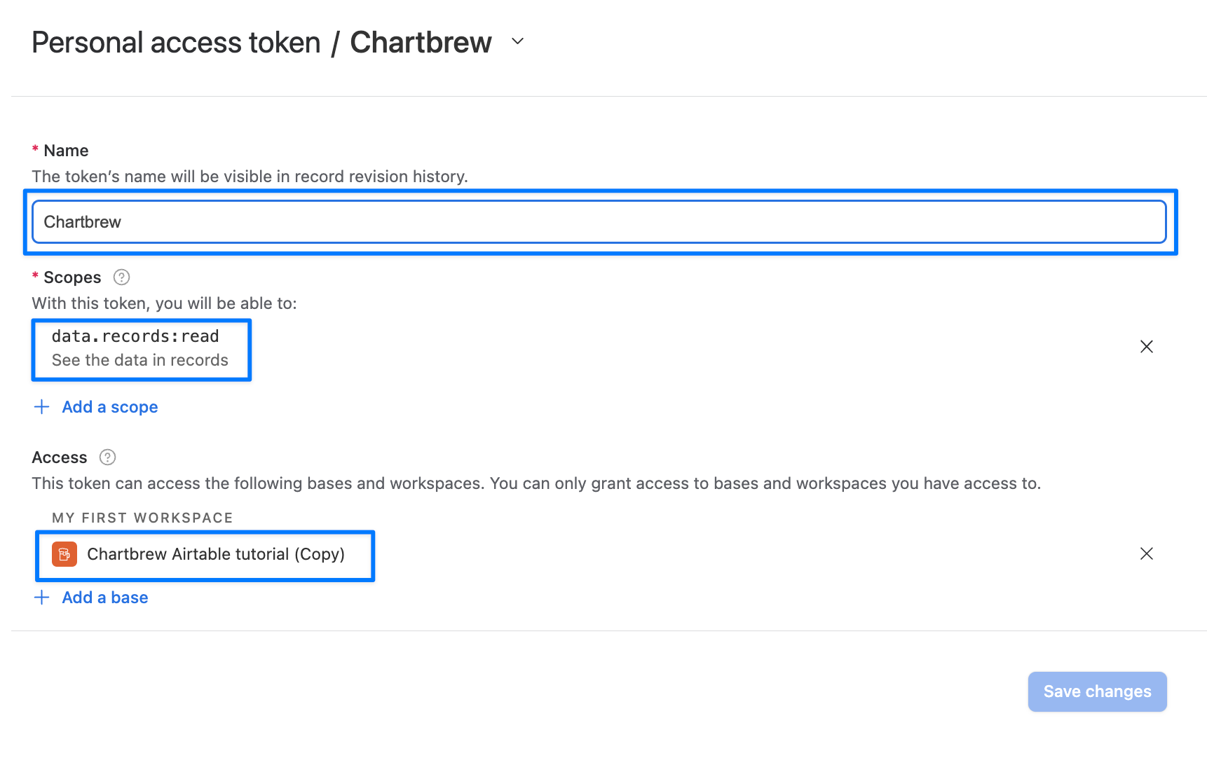
- Name: Chartbrew (can be anything)
- Scopes: data.records:read
- Access: Chartbrew Airtable tutorial (your workspace)
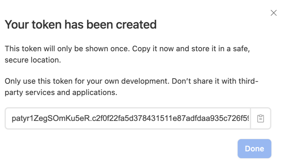
After clicking the Create token button, you will receive the token we will need for the Chartbrew authentication. Copy this code as we will use it in the next steps.
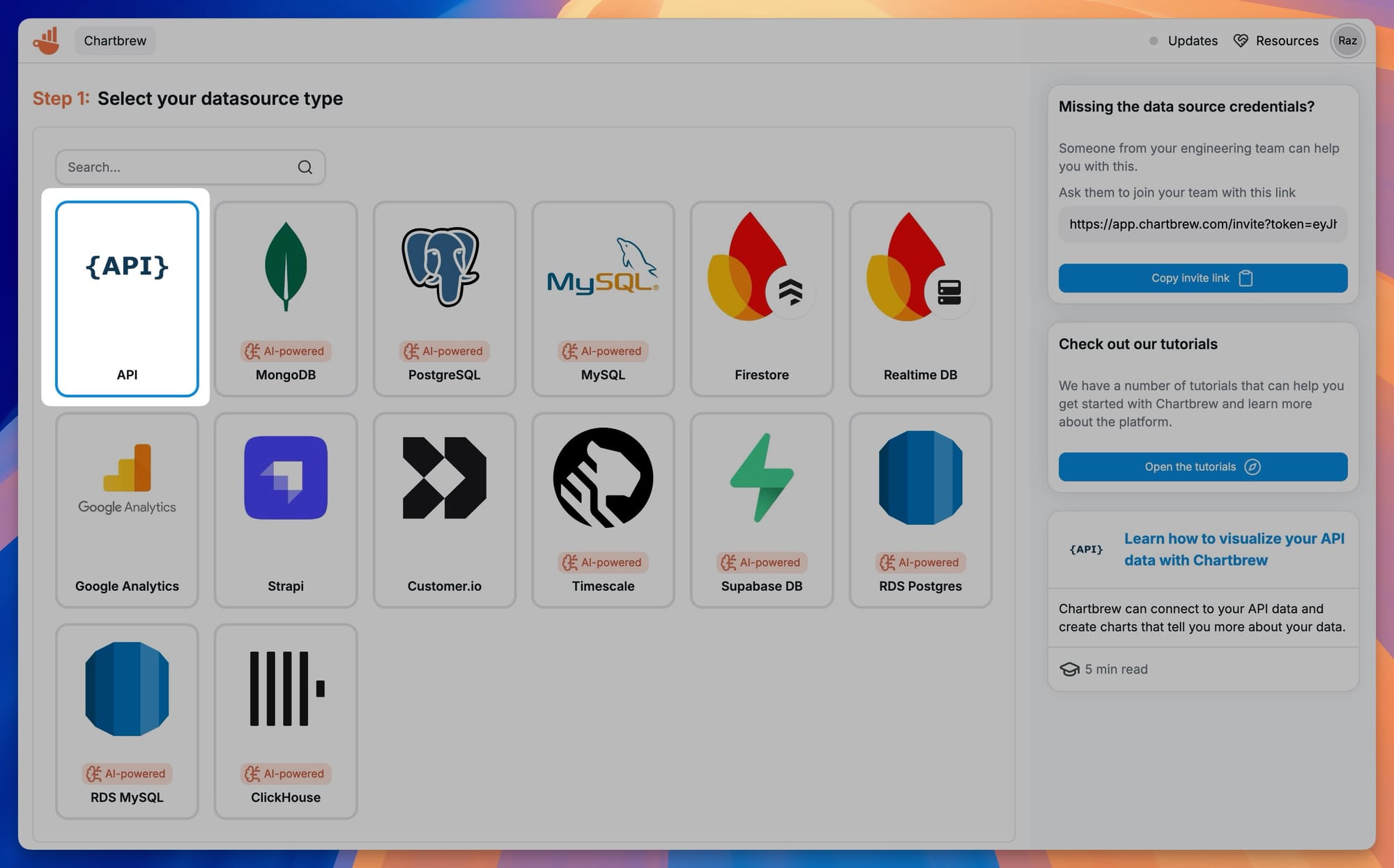
Next, create a new project or use an existing one in Chartbrew. On your Chartbrew's home page, select the Connections tab in the side menu and click on the Create connection button.
Select the API option from the list.
Complete the form with a Name, Host, and authentication token.
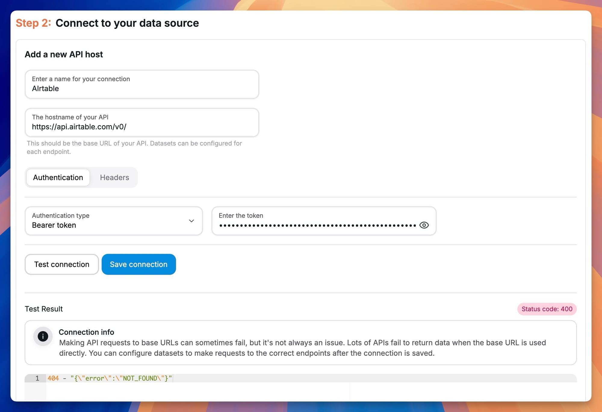
Copy the token in the Bearer token field and save the connection. If you test the connection you should get a "404, not found" error, but that is to be expected since we are trying to get data from the root API URL.
- Name: Airtable (can be anything)
- Host: https://api.airtable.com/v0/
- Authentication: Bearer token
Create a time series chart with Airtable data
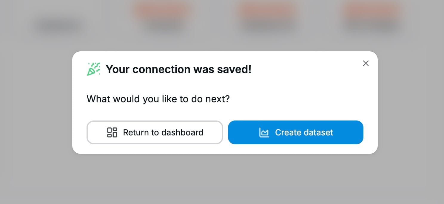
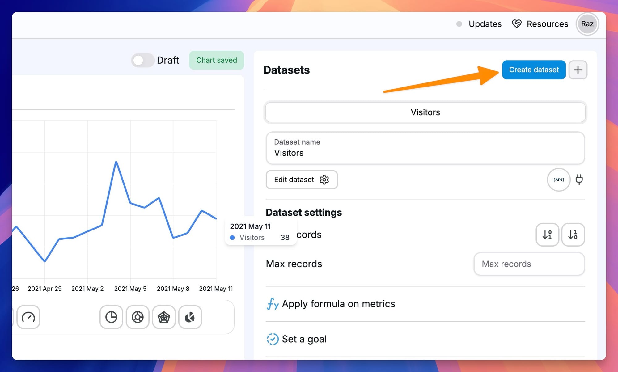
Next, we are going to create our first dataset. Click on the Create dataset button after saving the connection. You can also create datasets from the Dataset tab on the homepage.
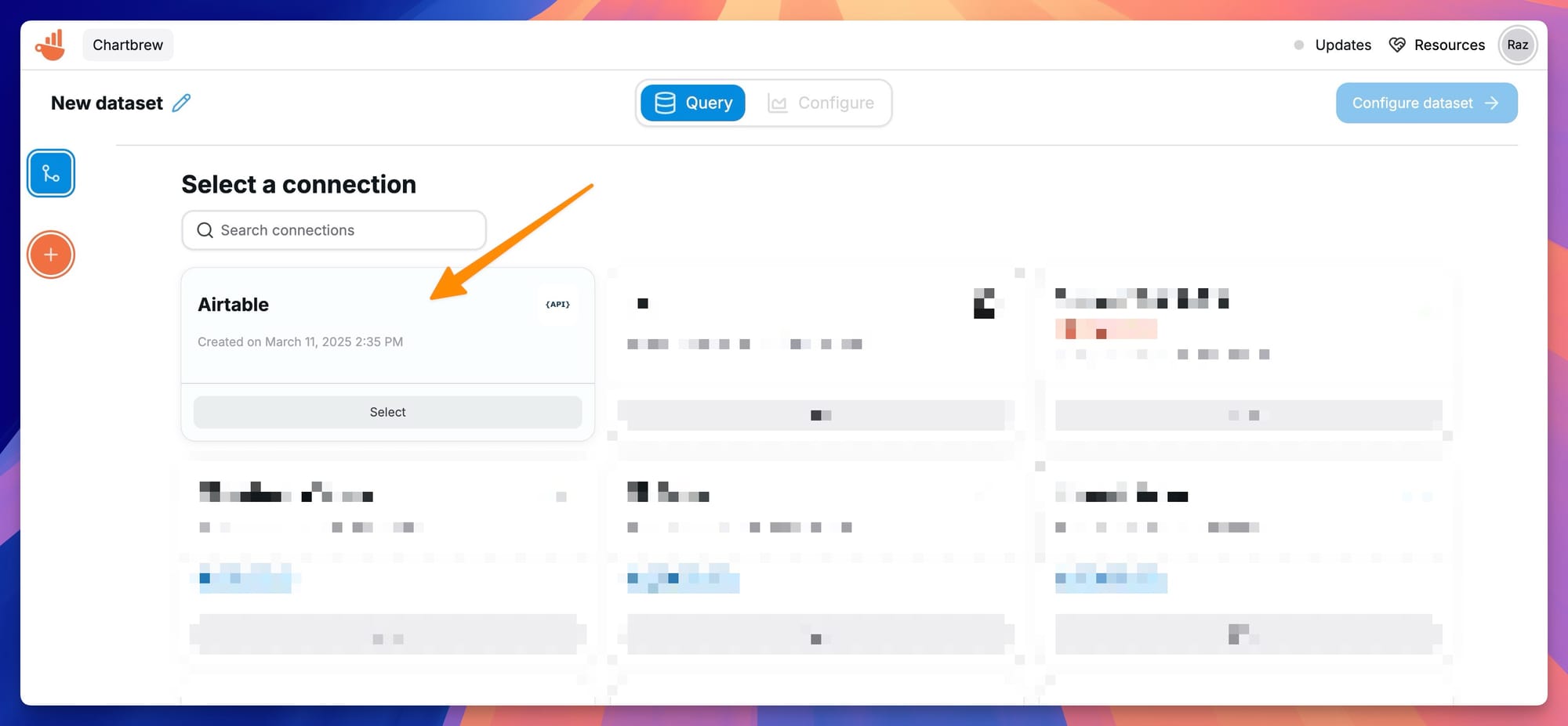
Select the Airtable connection created earlier as the data source for our dataset.
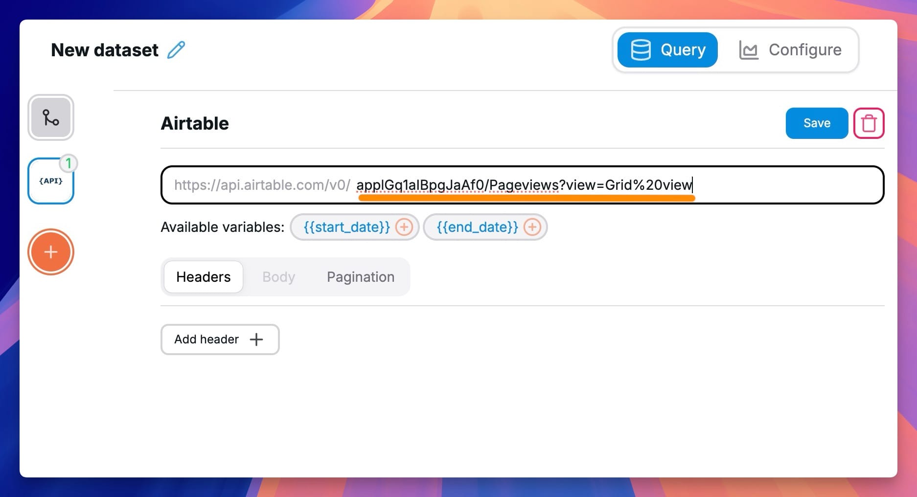
Next, we are going to configure the data request. In order to find the right endpoint where to send the request, we have to consult the API docs in Airtable. Head over to the Airtable API docs and select your new base.
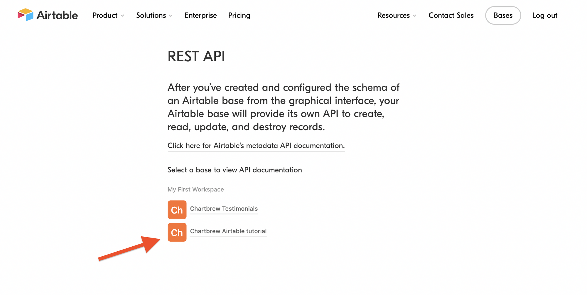
Once there, you will see both Visitors and Pageviews tables in the side menu. To start, select the Visitors Table and click on List records. The left view will show you how to request data. Copy the bit after the root of the API endpoint as shown in the picture below.
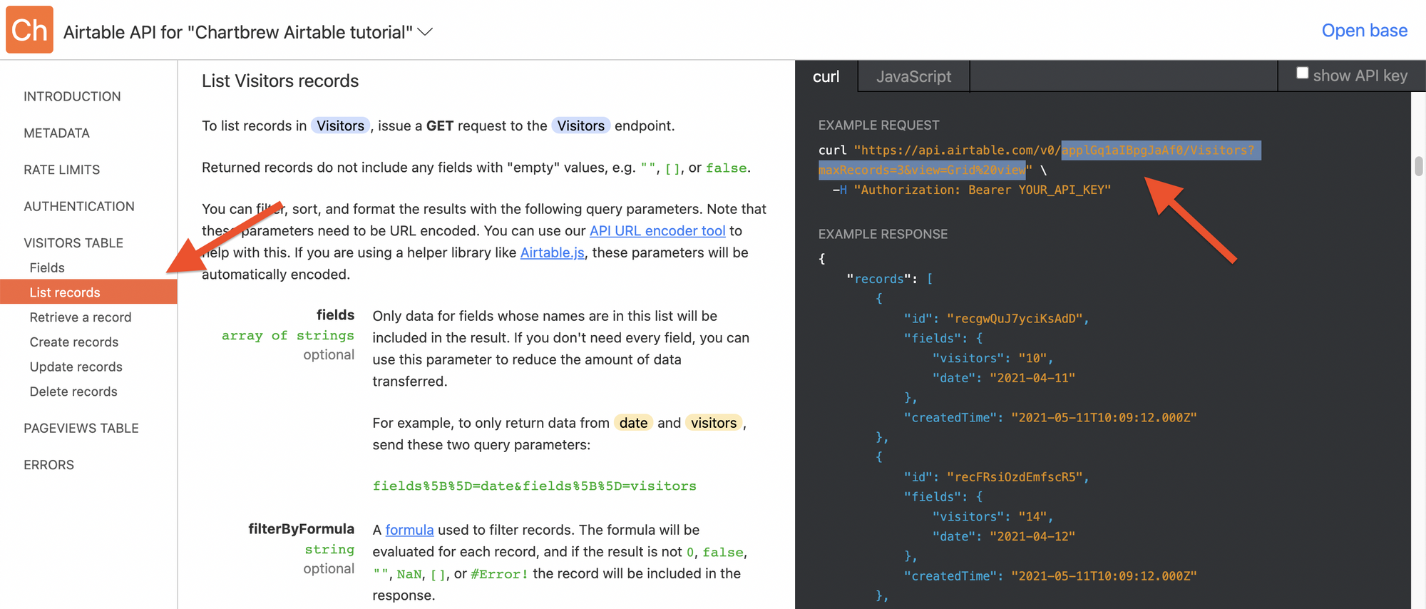
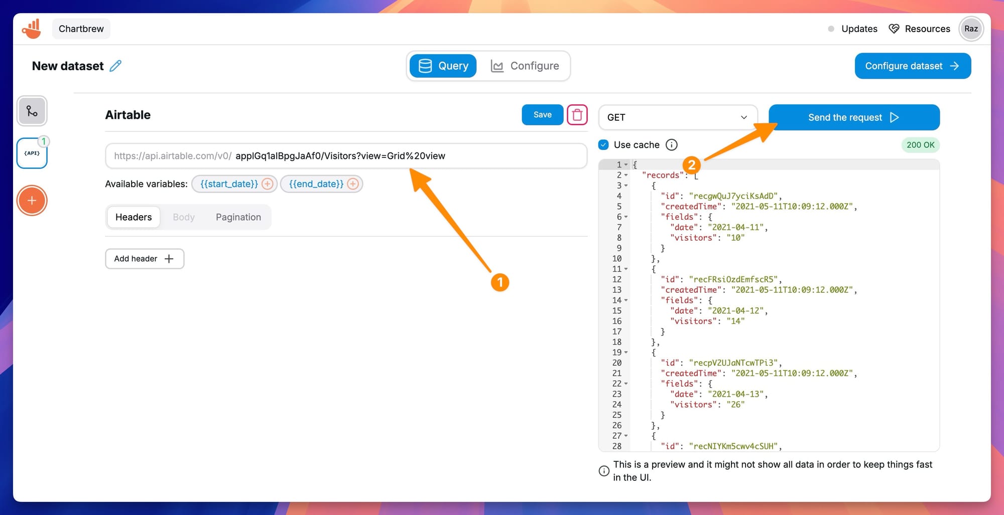
We can now paste this part of the URL in Chartbrew to match the URL shown in the Airtable docs. You can delete the maxRecords=3 bit since we want to get all the data. After you do that, press the Run the request button and you should get the data in a JSON format in the left section.
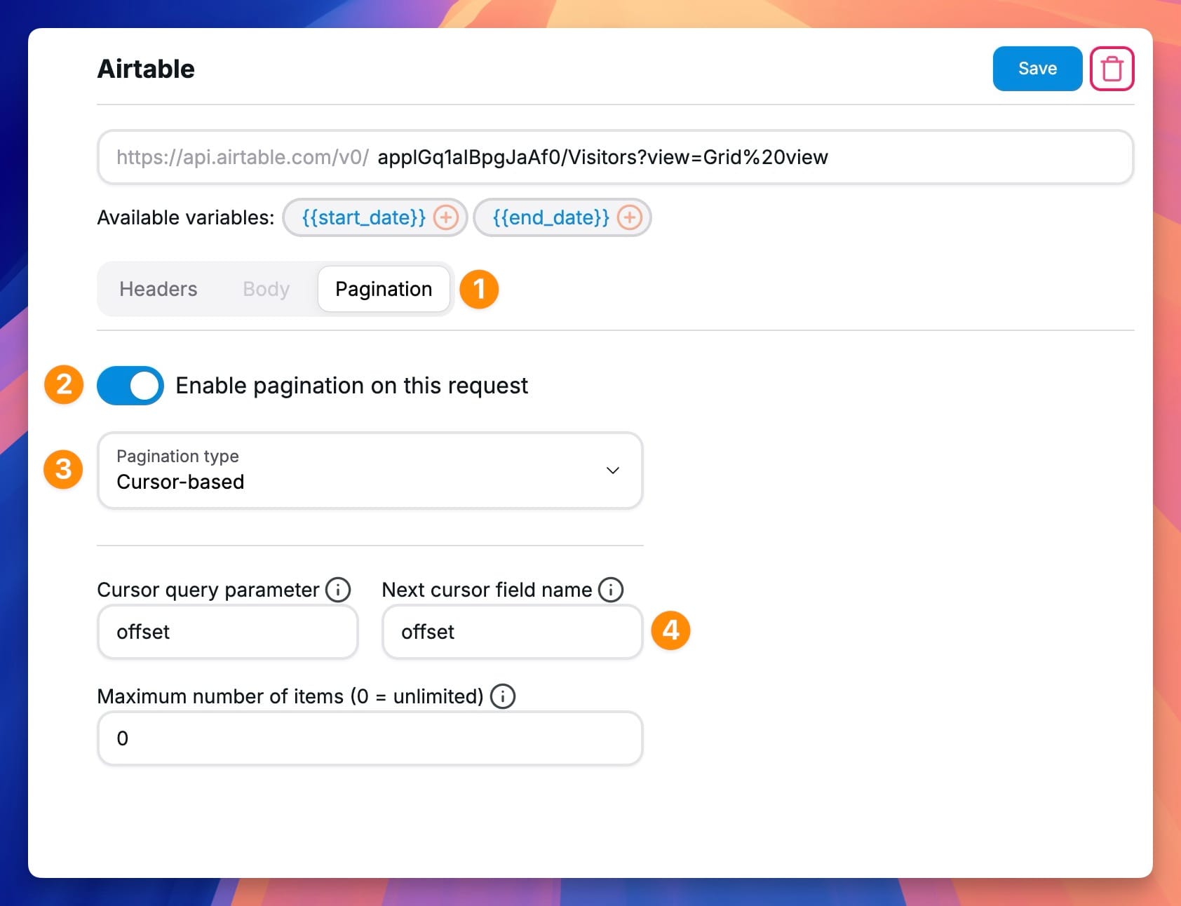
Another important step in making sure you get all the required data is to paginate requests. Airtable limits the number of records returned per request, but Chartbrew can automatically make multiple requests to get all the data.
For the Chartbrew pagination to work well, you'll have to set:
- Enable the pagination
- Pagination Type: Cursor-based
- Cursor query parameter: offset
- Next cursor field name: offset
- Max items: set to any value you want or "0" for all
You can check the example below.
Now that we have the data coming in, we can go ahead and visualize it.
-
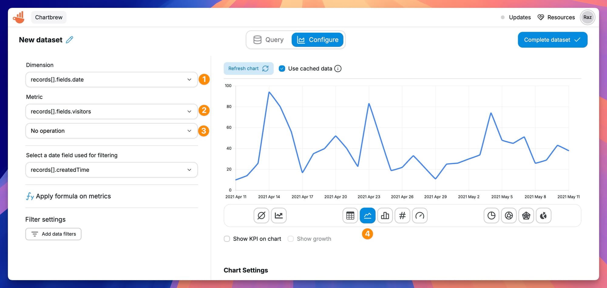
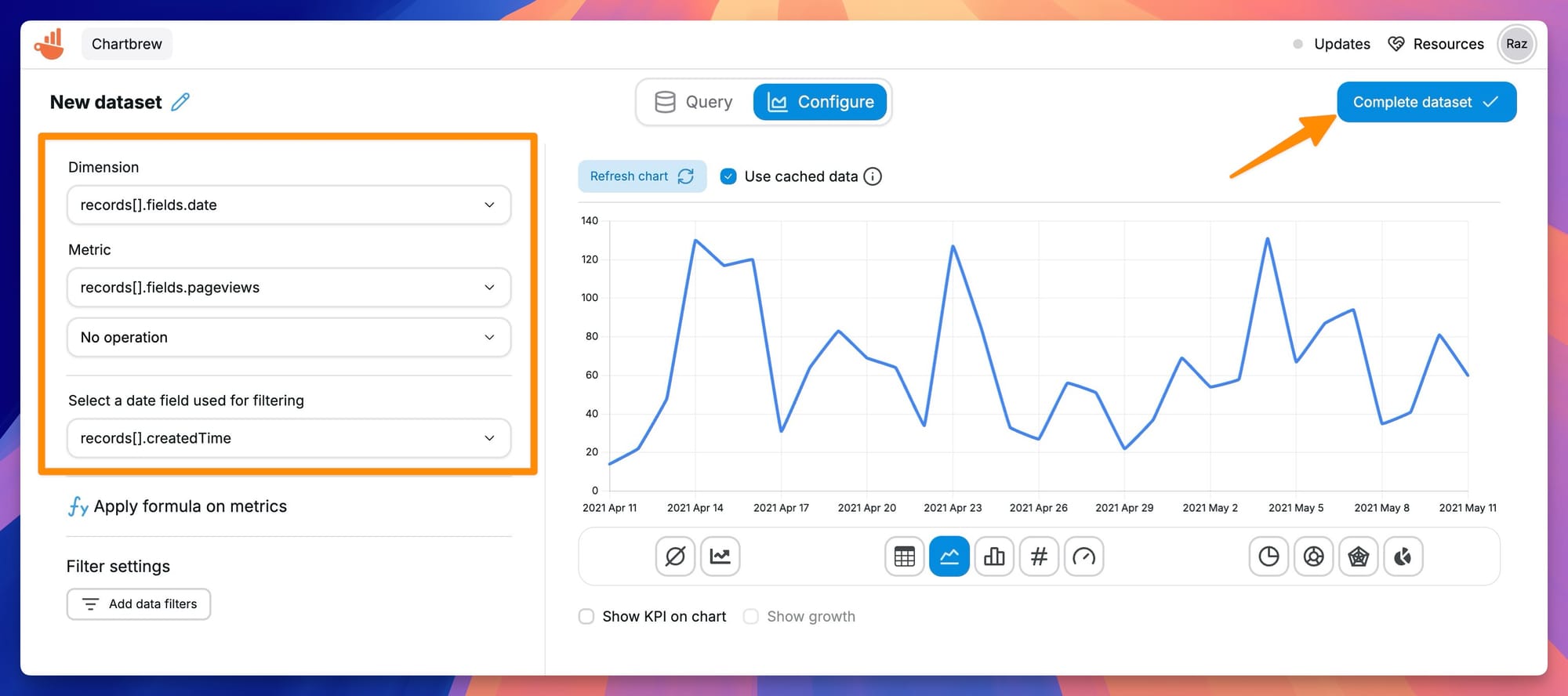
Click on the Configure dataset button in the top corner and prepare the X-Axis and Y-Axis so that Chartbrew knows how to plot the data.
-
Our goal is to show the number of visitors per day.
-
We need the date field as the dimension and the visitors number as the metric. Also, we don't need to apply any operation on the metric because the number of visitors is already aggregated in the original dataset.
Great! We now have a dataset that gets the number of visitors by date. We can use this dataset in any chart on any dashboard in Chartbrew. To create our first chart, click on the Complete dataset button in the top corner, name your dataset, and select a dashboard where you want to create the chart.
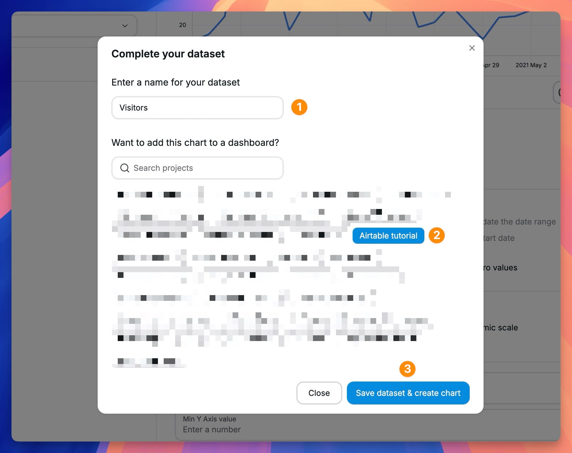
The chart is going to appear in the project you selected. If you don't select any project, your dataset will be added to your list, and you can always come back and use the dataset in your charts.
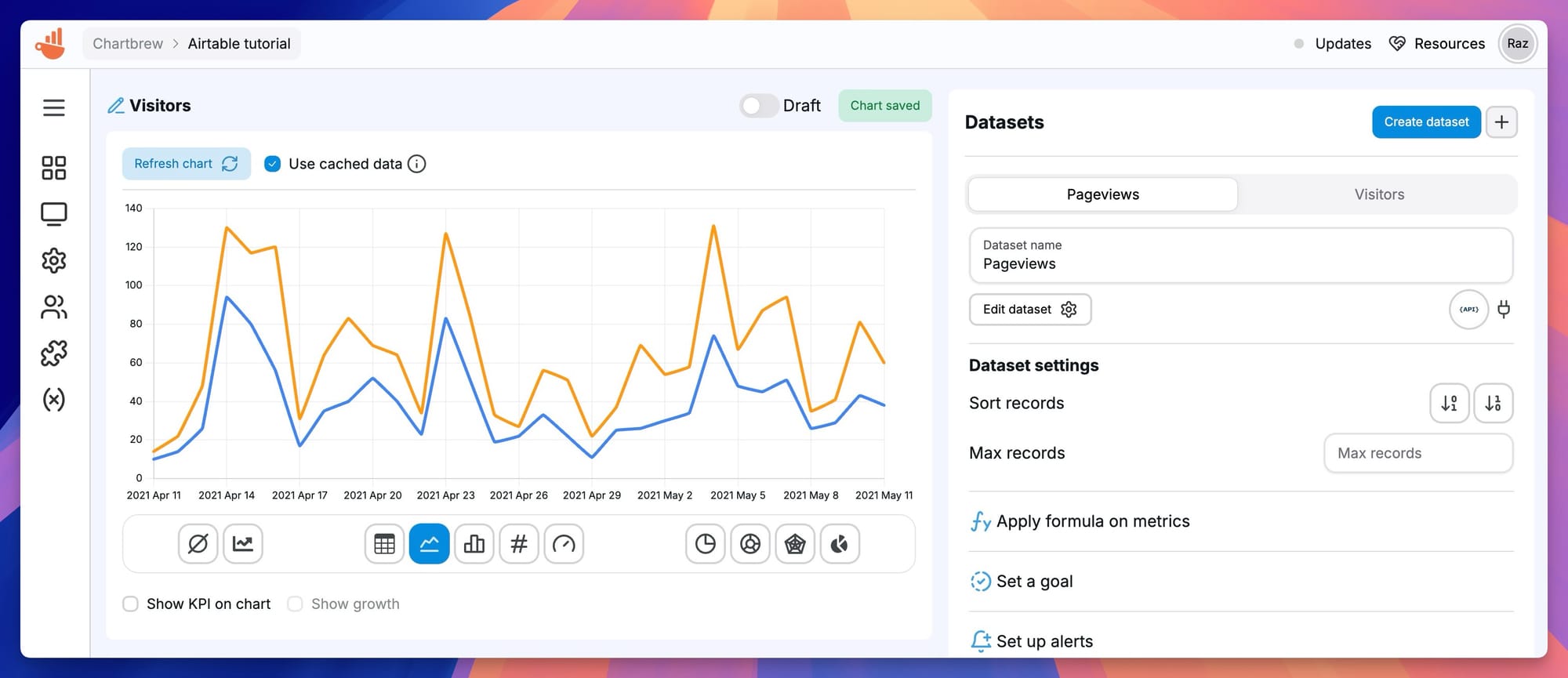
In Chartbrew, we can also have multiple datasets on the same chart. Let's add data from our second table Pageviews on the same chart. On your dashboard, click on the chart title to head over to the editor.
Inside the chart editor, find the Create dataset button and configure the dataset like the first, but get the data from the Pageviews table this time.
Make sure you consult the Airtable API docs again for the right endpoint.
Configure the dimension and metric like before, then click on the Complete dataset button to head back to your chart.
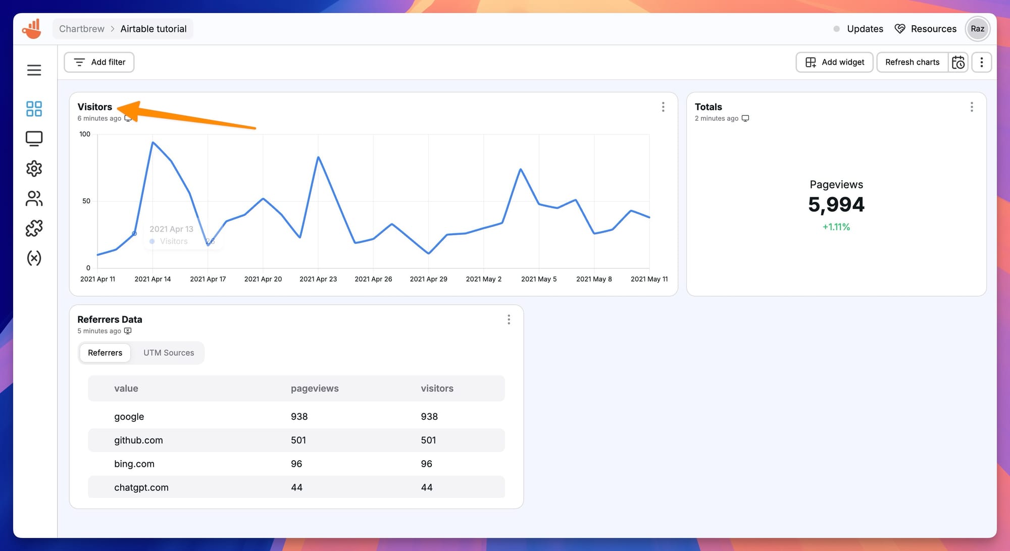
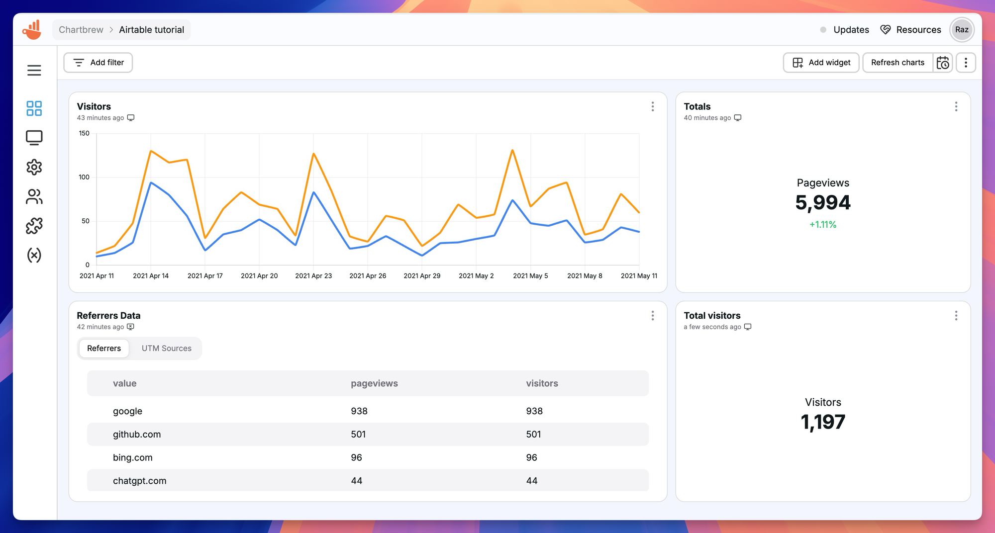
And now you should have a chart that shows both datasets in a single chart view.
Visualize Airtable KPIs
KPIs (key performance indicators) are an essential part of any reporting dashboard. Chartbrew offers support for creating KPIs, so let's go through this process next.
On your dashboard, clikc on the Add widget button and select Add chart.
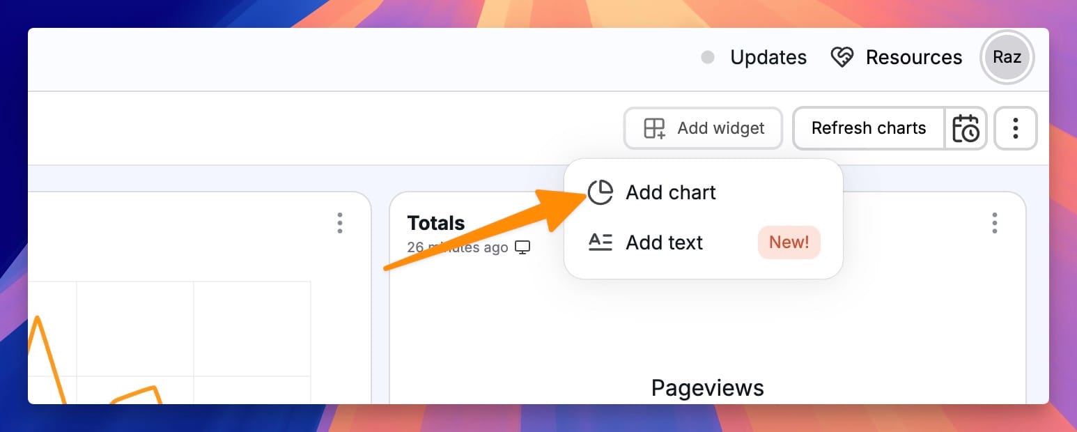
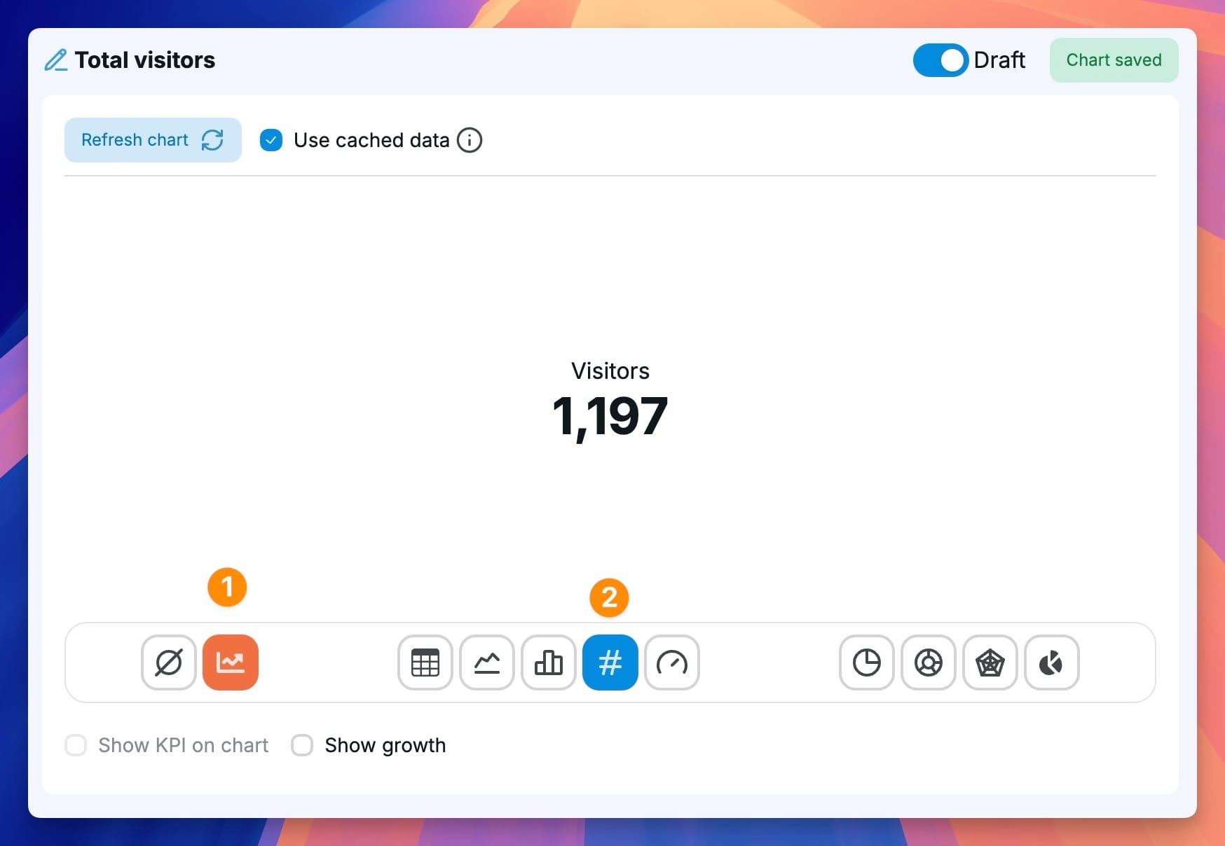
For this example, we are going to create a Total visitors KPI, so you can enter that as a name. When asked to select a dataset, click on All then select the Visitors dataset.
Chartbrew is going to show us a line chart to begin with, but we will transform it into a KPI instead. To do this, click on Accumulate dataset and then on the Display as a KPI option under the chart.
And that's it! We now have a dashboard with Airtable charts. You can now combine this data with other data sources.
Next steps
Charts and dashboards in Chartbrew have extra features that you can play around with. Some things you can do moving forward:
- Set your charts to auto-update so you get fresh data from your Airtable source
- Embed your charts on external sites like Notion, Blogs, Personal websites, etc
- Create a public dashboard and share your unique link with your audience
- Connect other data sources to your dashboard. See the tutorials section for inspiration
